Executive Summary:
- Capital flows into Bitcoin remain positive, although they have declined in magnitude since first reaching $100k. This highlights a period of declining sell-side pressure as the market approaches a near-term equilibrium.
- Sell-side pressure from long-term investors has also declined, alongside volumes deposited to exchanges for sale.
- Several measures of volatility are tightening up, with the market trading within a historically narrow 60-day price range, often a sign that the market is almost ready to move again.
Capital Flows Approaching Equilibrium
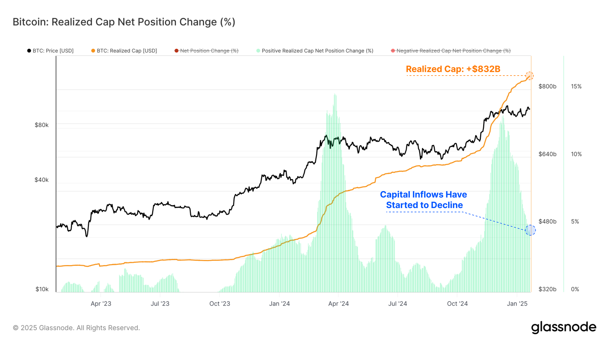
As the price hit the $100k level, net capital inflows into Bitcoin surged, signifying investors were locking in substantial profits. These capital inflows have since started to decline in magnitude as the market consolidates and acclimatises to the new price range.
This slowdown in profit-taking represents a net reduction in sell-side forces, thus requiring less fresh capital to maintain prices within the trading range.
The Realized Cap is currently trading at an ATH value of $832B, and is growing at a rate of $38.6B/month.
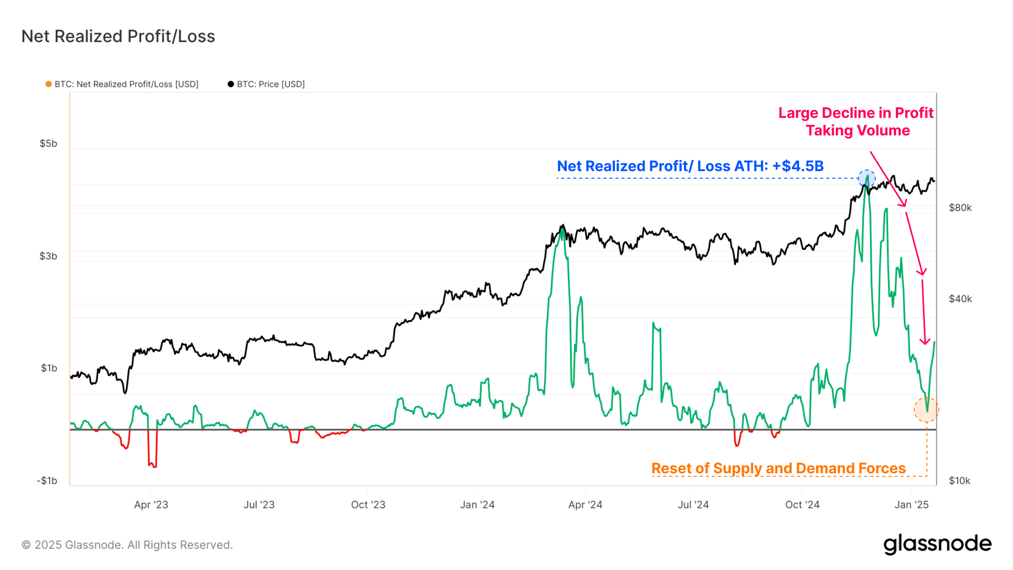
The Net Realized Profit/Loss metric is the first derivative of the Realized Cap, allowing us to discretely observe the magnitude of net capital flows occurring on-chain, denominated in USD.
As the market digests the profit-taking distribution pressure, the balance of realized profit and loss volumes gradually trends back towards the neutral position. This suggests that a reset of supply and demand forces is taking place, and that the majority of coins transacting at the moment are not locking in a large value delta relative to the price the coins were first acquired.
Profit taking volumes reached a peak of +$4.5B in December 2024, and have now declined to a value of +$316.7M (-93%).
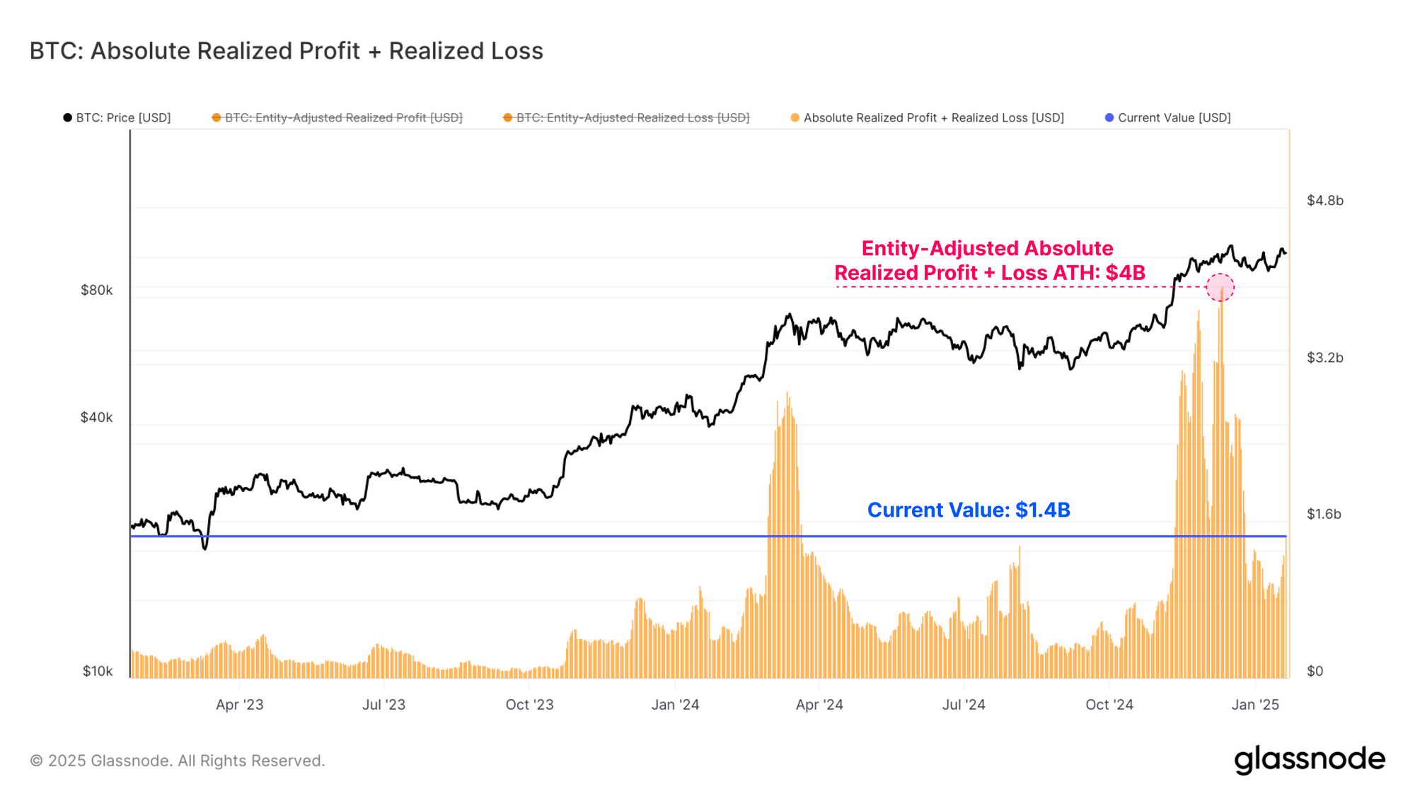
The absolute magnitude of Realized Profit and Realized Loss (Entity-Adjusted) are another set of tools which helps us gauge the direction and sentiment of capital flowing in and out of Bitcoin.
When we sum realized profit and loss together, we can see this combined metric has experienced a sharp decline from its ATH of $4B, down to a value of $1.4B. Despite this -65% decline, the current value remains elevated from a historical standpoint, highlighting the scale of day-to-day demand absorbing this capital during bull market conditions.
Supply Side Slows
We have established that there is a noteworthy decline in overall sell-side pressure. We can confirm this view using metrics like Coinday Destruction, and exchange inflow volumes to further investigate these dynamics.
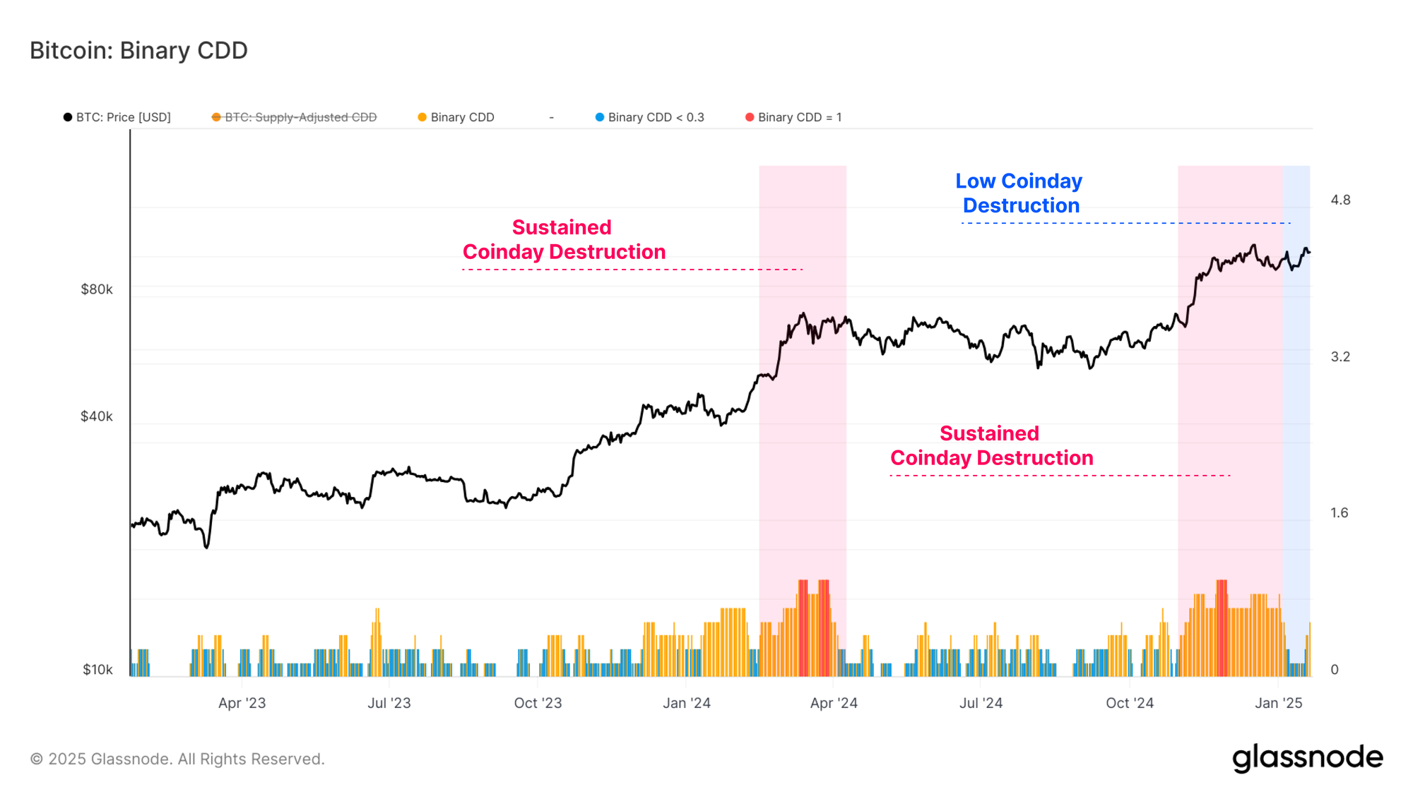
The first tool we can employ to better profile investor distribution pressure is the Binary CDD metric. This metric tracks the expenditure of ‘holding time’ across the market, tracking when holders of old supply are transacting increasingly large volumes.
We saw a sustained period of heavy coinday destruction in late 2024, and early January. Over recent weeks, this metric has started cooling off, as relatively light coinday destruction took over.
This suggests that a significant number of investors who had planned to take profits have likely done so within the current price range. Generally speaking, this indicates that the market may need to go ‘somewhere else’ in order to entice and unlock the next wave of supply.
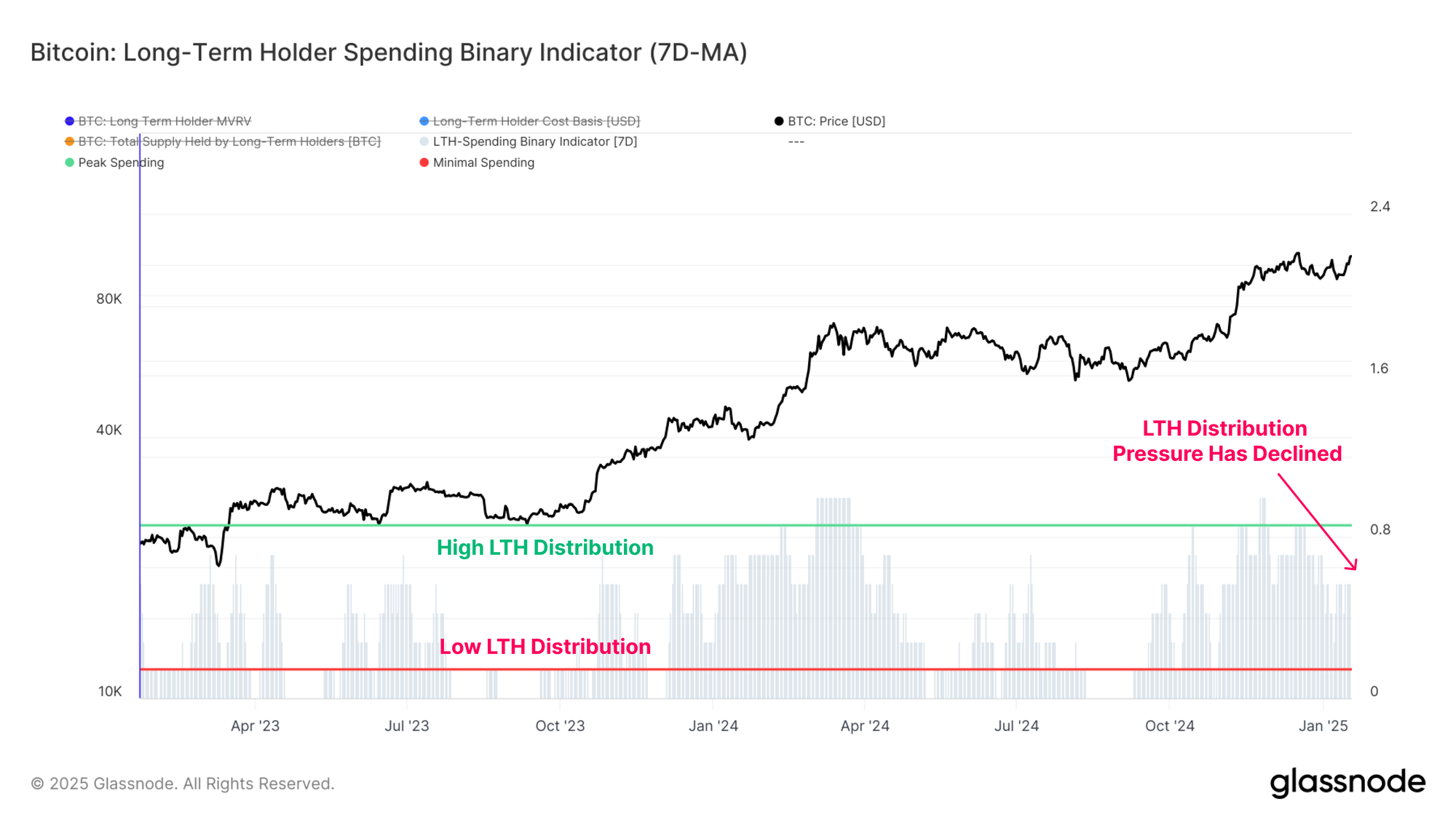
The Long-Term Holder (LTH) Binary Spending Indicator is another metric we can use to evaluate the duration of sustained sell-side pressure. This tool focuses specifically on long-term investors.
Aligned with the heavy profit-taking volumes from before, we can see a significant decline in the total LTH Supply as the market reached $100k in December. The rate of LTH Supply decline has since stalled out, suggesting a softening of this distribution pressure in recent weeks.
Currently, the total LTH supply is starting showing signs of growth back to the upside, suggesting that accumulation and HODLing behaviour is now larger than distribution pressure for this cohort.
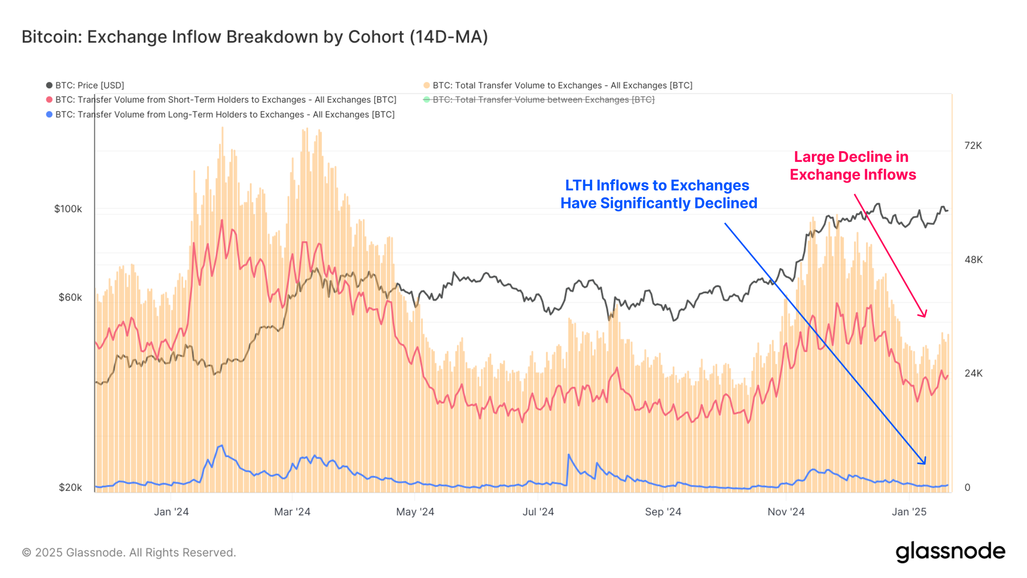
Centralized exchanges remain the primary venue for speculation and trade, and process billions of dollars in flows on any given day. Exchange inflows have markedly declined from a peak of $6.1B to $2.8B (-54%), which underscores a considerable reduction in recent speculative activity.
Notably, LTH inflow volumes to exchanges have declined from $526.9M in December, to a current value of just $92.3M, a -83% decline in deposit volumes.
This further supports the thesis that long-term investors may have completed a large tranche of their profit-taking within this price range.
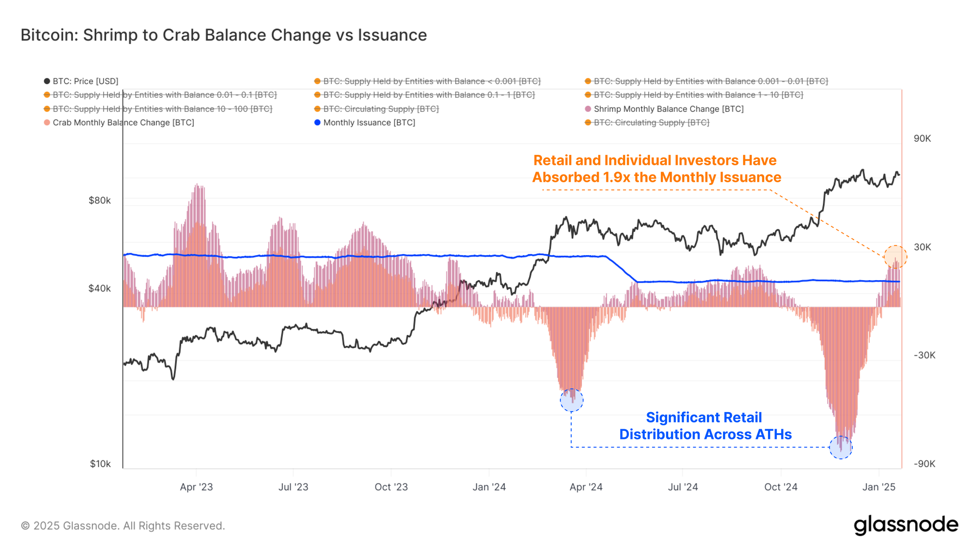
In order to further profile the supply and demand balance, we can compare the rate of various cohorts balance change, normalized by to the volume of BTC mined. This provides a relative measure compared to new issuance which was theoretically absorbed by each cohort.
Focusing on the Shrimp-Crab cohort (holding <10 BTC) as a proxy for retail and individual investors, we note that this cohort has absorbed around +25.6k BTC over the last month. This compares to monthly issuance of around +13.6k BTC minted by miners.
As a result, these retail and individual holders have effectively absorbed 1.9x the volume of new supply coming to market via primary production.
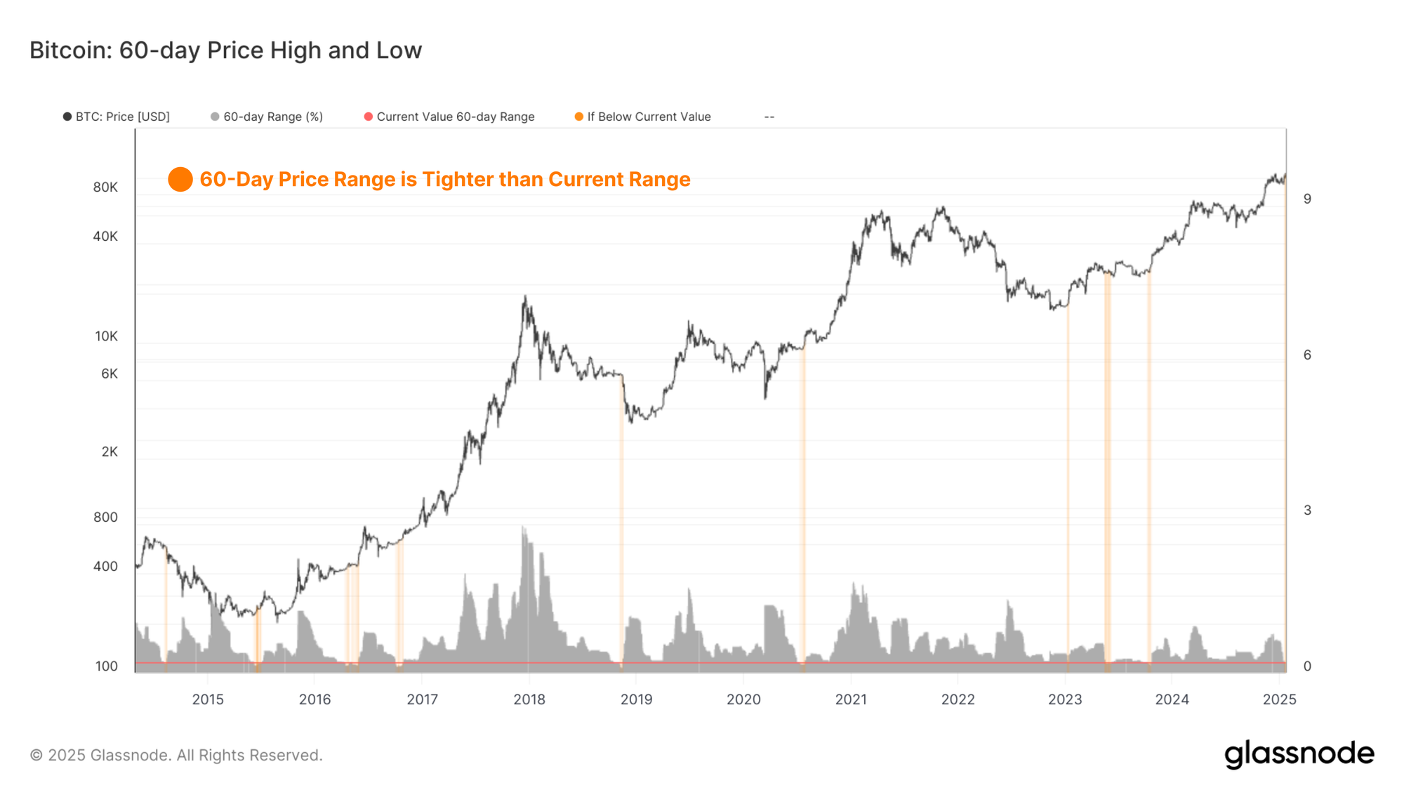
Coiling Volatility
A strong degree of confluence can be noted between both on-chain models, and the historically narrow 60-day price range, allowing investors to preempt regimes of heightened volatility.
By measuring the percent range between the highest and lowest price ticks over the last 60 days, we can see the compression or market volatility over time. The chart below highlights periods which have a tighter 60 day price ranges than the current trading range. All of these instances have occurred prior to a significant burst of volatility, with the majority being in early bull markets, or prior to late stage capitulations in bear cycles.
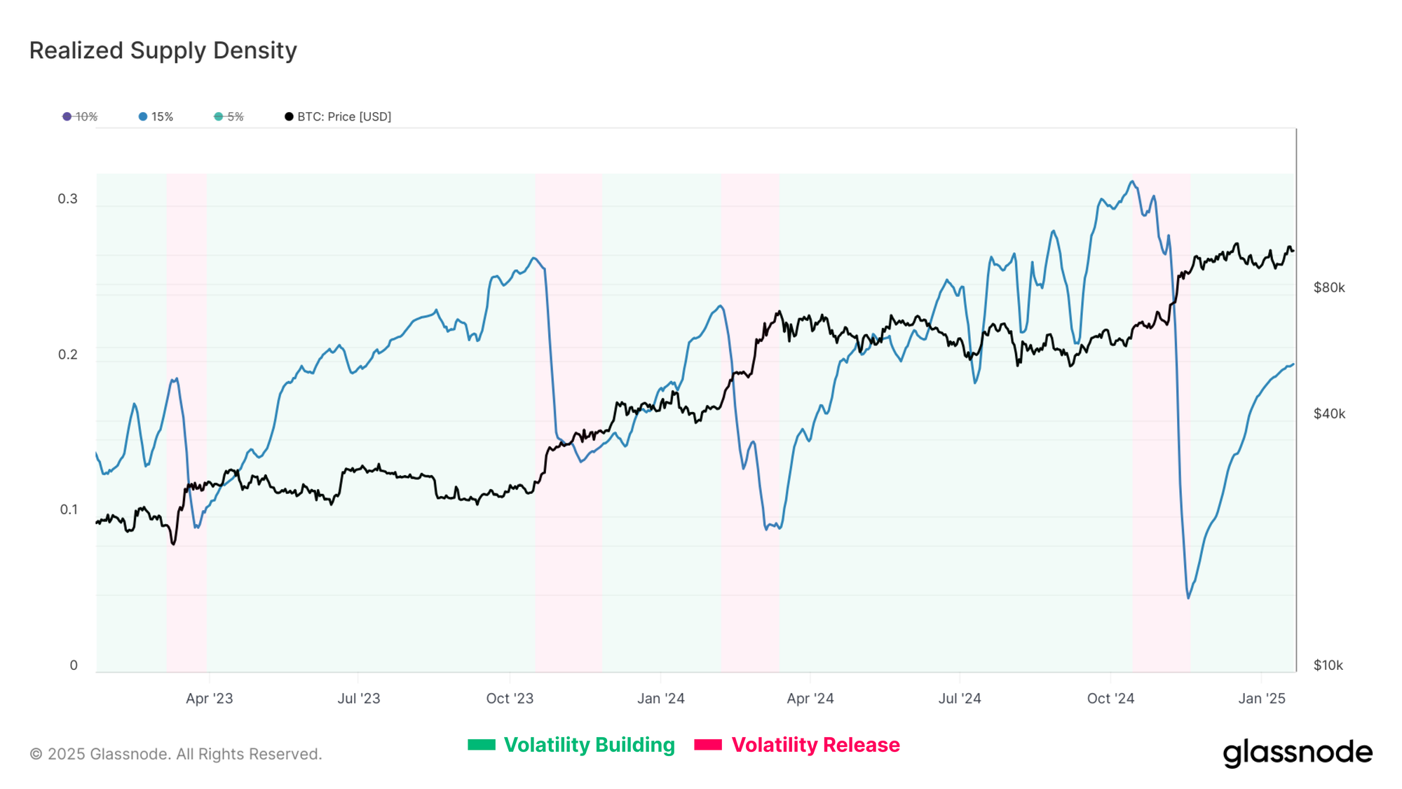
Sustained sideways price action within a narrow range allows for a large proportion of the circulating supply to redistribute and concentrate at a relatively higher cost basis.
The Realized Supply Density metric quantifies the supply concentration around the current spot price within a ±15% price move. When supply is highly concentrated around the spot price, small movements in price can significantly affect investor profitability, which in turn can amplify market volatility.
After the Bitcoin price peaked in December, it started to consolidate, creating a dense concentration of supply with a cost basis close to the spot price. Currently, 20% of the supply resides within a ±15% of the spot price.
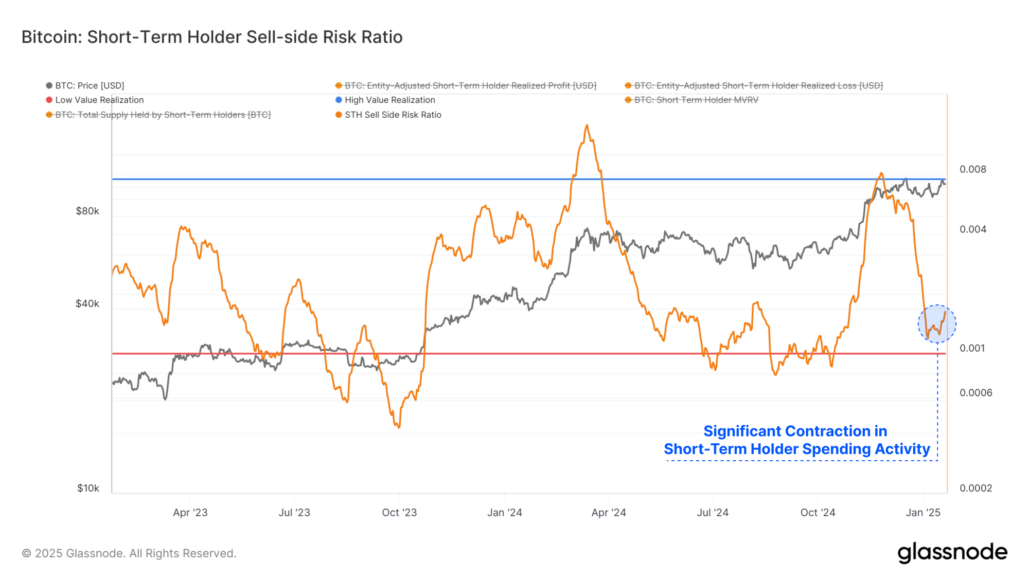
The Sell-Side Risk Ratio describes this phenomenon from a different perspective. This metric assesses the total volume of both realized profit and loss locked in by investors relative to the asset size (measured via the Realized Cap). We can consider this metric under the following framework:
- High values indicate that investors spend coins at a significant profit or loss relative to their cost basis. This condition indicates that the market likely needs to re-find equilibrium and usually follows a high volatility price move.
- Low values indicate that most coins are being spent relatively close to their break-even cost basis, suggesting a degree of equilibrium has been reached. This condition often signifies an exhaustion of ‘profit and loss’ within the current price range and usually describes a low volatility environment.
There has been a significant contraction in Short-Term Holder spending activity in recent weeks, leading the Sell-side risk to decline very sharply. This often signals that all of the profit and loss taking events which investors planned for, have now been executed. It tends to signal that the market is near a local equilibrium, and is a precursor to the next wave of volatility.
Summary and Conclusion
Bitcoin has experienced intense intraday whipsaws in price, surging to a new ATH of $109k before crashing and subsequently stabilizing above $100k. This heightened degree of market indecision is compounded by the challenging and uncertain macro backdrop heading into, and across the US Presidential inauguration.
In this article, we evaluated and analyzed the conditions preceding the explosive yet wavering price action. We present a framework to identify signposts for impending volatility by utilizing the confluence of diminishing on-chain volume and capital flows, alongside a tightening price range.
Disclaimer: This report does not provide any investment advice. All data is provided for information and educational purposes only. No investment decision shall be based on the information provided here and you are solely responsible for your own investment decisions.
Exchange balances presented are derived from Glassnode’s comprehensive database of address labels, which are amassed through both officially published exchange information and proprietary clustering algorithms. While we strive to ensure the utmost accuracy in representing exchange balances, it is important to note that these figures might not always encapsulate the entirety of an exchange’s reserves, particularly when exchanges refrain from disclosing their official addresses. We urge users to exercise caution and discretion when utilizing these metrics. Glassnode shall not be held responsible for any discrepancies or potential inaccuracies. Please read our Transparency Notice when using exchange data.
- Join our Telegram channel.
- For on-chain metrics, dashboards, and alerts, visit Glassnode Studio.