Financial markets are shaped not only by fundamentals but also by the psychology of their participants. Across cycles, price swings are amplified by emotional extremes, with fear driving market sell-offs and greed fueling euphoric rallies.
On-chain data allows us to measure these emotions in economic terms, by observing when investors choose to realise their holdings at a profit or at a loss. Cost Basis Distribution (CBD) provides a breakdown of the supply of coins by their acquisition price and offers a unique lens into these decisions.
In previous research, we showed how spikes in loss-driven spending can identify local market bottoms. In this extended analysis, we reveal that the same methodology can be applied to profit-driven spending to identify local market tops. The result is a complete framework for detecting market extremes, from capitulation to euphoria.
Cost Basis Distribution - A Quick Recap
CBD reflects the total supply held by addresses with an average cost basis within specific price buckets. This, in effect, gives a clearer view of how investors’ cost bases shift over time due to buying or selling activity and allows mapping out the behaviour of market participants over time.
Tracking these upward and downward shifts helps us understand not only the sentiment behind buying and selling decisions, but also potential inflection points, where the market might pivot.
How to read CBD Heatmaps:
Color Intensity (Supply Distribution): A color scale, ranging from cooler shades (lower supply) to warmer shades (higher supply), shows where the token supply is concentrated. Example: A red band means a high supply at that particular price range. A green or blue band indicates a smaller supply.
Vertical Axis (Cost Basis): Each horizontal “slice” corresponds to a price range at which some portion of the token supply last moved.
The Psychology of Market Extremes: A Hypothesis
Market behavior is often shaped by the intense psychological pressure experienced by investors who are deeply underwater on their positions. Across various assets, we frequently observe that holders with significant unrealized losses tend to capitulate near local or global bottoms.This pattern suggests that forced selling, driven by emotional and financial distress, plays a key role in shaping market reversals.
Visualizing Capitulation in Action
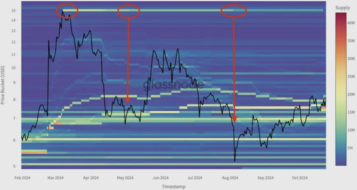
Uniswap: Supply Redistribution at Local Bottoms
The Uniswap chart below illustrates a common CBD trend:
- Supply originally accumulated near the $15 peak gradually shifts from warmer to cooler colors over time.
- This color transition visually represents distressed investors selling their holdings at lower prices, a classic sign of capitulation.
- As this supply changes hands at depressed levels, it often finds buyers willing to step in, potentially forming a local bottom.
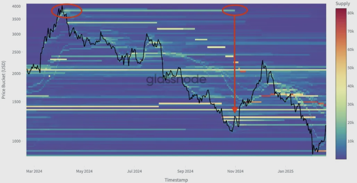
Maker: Repeating the Pattern
A similar pattern emerges with Maker (MKR):
- Supply that was previously accumulated at a local top is eventually capitulated at lower price levels.
- As market participants under extreme pressure liquidate their positions, we again see a turning point forming, suggesting that capitulation often aligns with the formation of local bottoms.
This pattern highlights the psychological cycles at play in the market, with confidence at the top, distress-driven selling at the bottom, and eventual opportunities for contrarian buyers.
From Bottoms to Tops: Observing the Other Extreme
After observing how CBD reveals patterns of capitulation at local bottoms, it is natural to ask whether the same perspective can be applied to the opposite end of the cycle, local tops.
If loss-heavy selling signals the exhaustion of sellers at market lows, then profit-heavy selling signals the exhaustion of buyers at market highs. Viewing the Cost Basis Distribution from a local top perspective allows us to spot moments when long-held profitable positions are being unwound into strength, a hallmark of market euphoria and distribution.
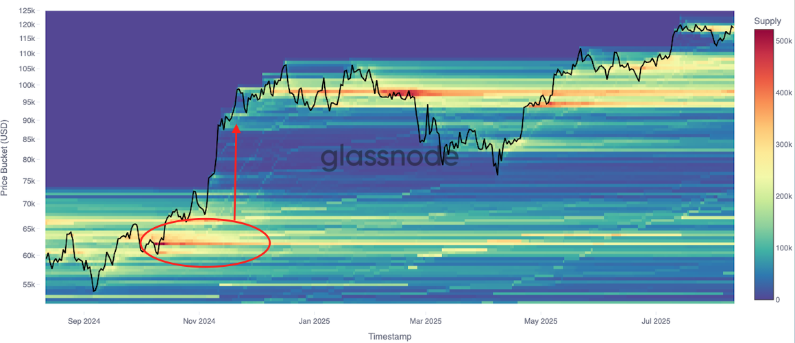
Bitcoin: Large-Scale Profit Realisation into Market Highs
In the months preceding the late 2024 surge, Bitcoin’s CBD heatmap shows a substantial band of supply forming in the $60k–$65k range. This reflects significant accumulation from buyers entering during a consolidation phase.
As the market broke out toward $90k and beyond, this concentrated supply began to unwind, with the warm accumulation colors fading as long-term holders sold into the rally, locking in substantial gains.
This pattern reflects classic distribution during euphoria:
- Early entrants, sitting on sizable unrealised profits, start selling into strong demand.The wave of profit-taking coincides with peak momentum, often marking or preceding local market tops.
- By identifying these large supply exits at elevated prices, CBD offers a clear on-chain view of when profitable cohorts are distributing into strength, a condition that can precede trend exhaustion.
XRP: Supply Redistribution at Local Tops
The XRP chart below illustrates a common CBD top formation pattern:
- In the months leading up to the late 2024 rally, a large band of supply formed in the $0.60–$0.70 range (highlighted in red).
This reflects a cohort of investors accumulating positions at relatively low prices. - As price surged above $2.50, supply in this band rapidly thinned, with warm colors fading as holders realized profits into the rally.
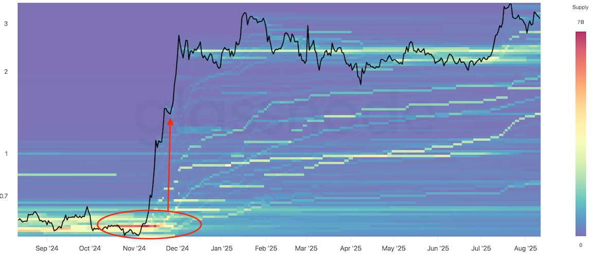
This behaviour reflects mass profit-taking, often driven by a mix of greed and caution. Historically, such events have coincided with or slightly preceded market tops.
This pattern highlights the psychological cycles at play in the market, with confidence and profit-taking at the top, distress-driven selling at the bottom, and eventual opportunities these extremes create for contrarian investors.
From Observation to a Data-Driven Hypothesis
Market turning points, whether highs or lows, tend to occur when sell-side pressure reaches an extreme.
- In downtrends, this is driven by fear and loss-realisation. At local bottoms, peak capitulation often marks the transition of supply from weak hands to stronger hands.
- In uptrends, it’s driven by greed and profit-realisation. At local tops, peak profit-taking often signals a transfer from early, in-profit holders to late-cycle entrants.
Our hypothesis is that by measuring the magnitude and concentration of realised profits and losses, we can quantify these extremes and build symmetrical metrics for both tops and bottoms.
Constructing Market Excess Metrics
- Weighted Sell Volumes
Not all profits or losses have the same psychological impact. A trader selling at a 50% loss experiences significantly more financial and emotional pressure than one selling at a 10% loss. To account for this, we apply a quadratic function to the difference between the average cost basis and the selling price. This weighting highlights extreme profit and loss events and minimizes the distraction of smaller, less impactful movements. - Smoothing for Clarity
Market data is noisy. To filter out one-off events and focus on sustained behaviour, we apply a 7-day exponential moving average (EMA) to the weighted sell volumes. - Non-Linear Economic “Impact”
Traditional realized PnL metrics treat each unit of profit or loss equally, but in reality the behavioral response is non-linear, with large outcomes having an outsized effect. Quadratic weighting ensures the metric captures the disproportionate impact of big wins and deep drawdowns.
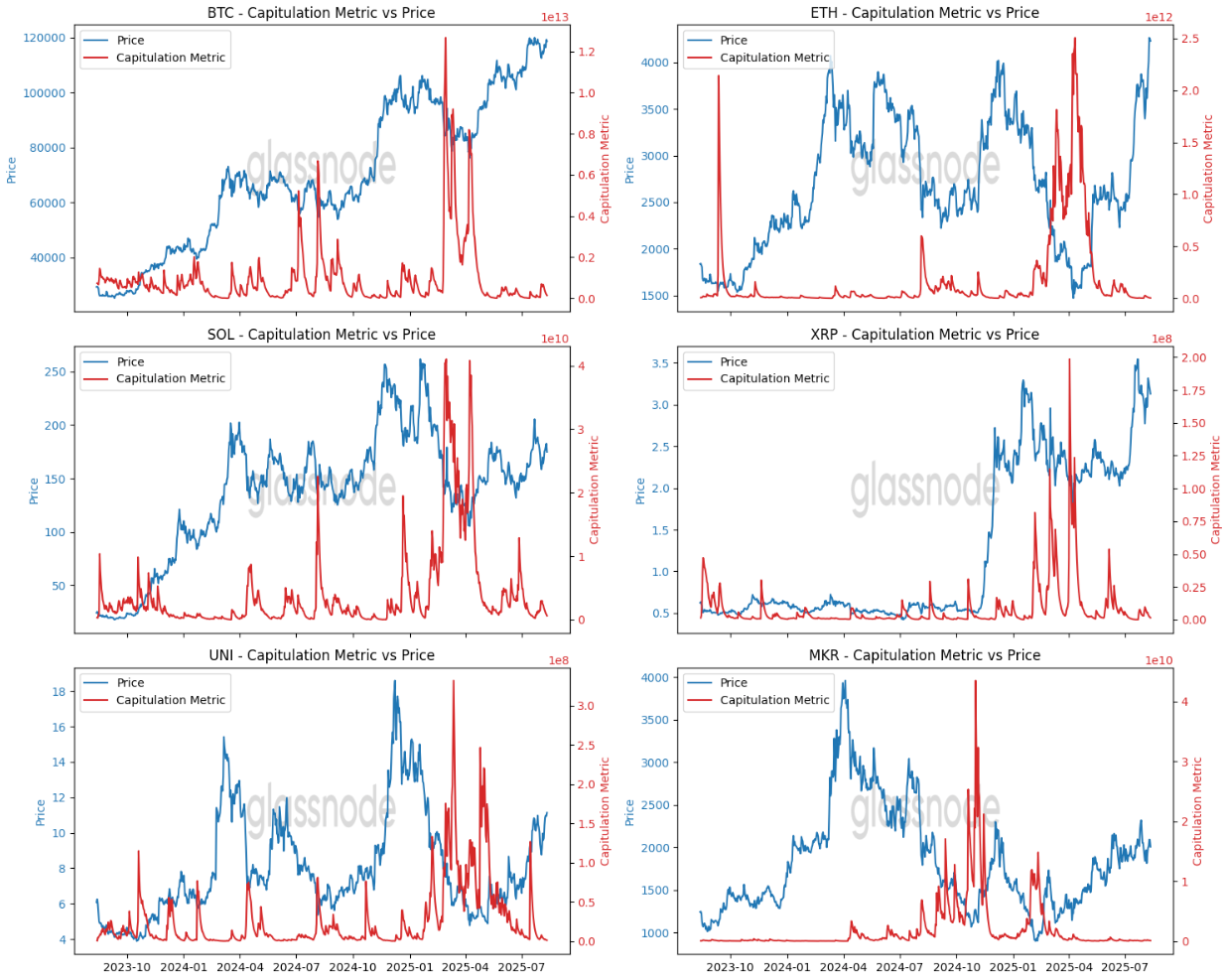
Visualising Market Extremes: What the Data Reveals
- Loss-weighted spikes aligns with major market bottoms.
Red line – Capitulation Metric: Measures loss-weighted selling pressure, with spikes indicating periods of intense distress and forced selling, often coinciding with local market bottoms.
- Profit-weighted spikes aligns with major market tops.
Green line – Local Top Metric: Measures profit-weighted selling pressure, with spikes indicating periods of widespread profit-taking and market euphoria, often aligning with local market tops.
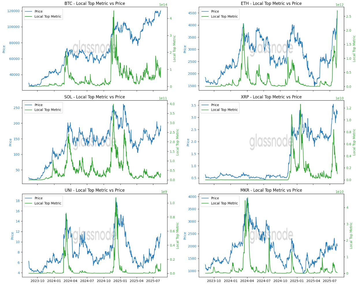
By quantifying both maximum pain and maximum greed, the Market Excess Metrics provide a symmetrical framework for spotting potential reversal zones.
- Bottoms: Peak loss-realisation → sellers exhausted → potential rebound.
- Tops: Peak profit-realisation → buyers exhausted → potential correction.
Conclusion
By refining how we measure extreme sell-side pressure, whether driven by distress or euphoria, the Market Excess Metrics transform on-chain data into a behavioral map of the market. While no single indicator can perfectly time reversals, combining these metrics with broader market context and technical analysis enhances the ability to navigate volatile conditions, whether aiming to buy the fear or sell the greed.