Mapping Volatility Through Time: Implied Volatility Heatmaps

insights.glassnodeОпубликовано 2026-03-23Обновлено 2026-03-23

Введение

Glassnode introduces two new implied volatility (IV) heatmap metrics—IV Moneyness Heatmap and IV Delta Heatmap—that visualize how options markets price risk across strikes and maturities over time, rather than at a single point. These tools help identify volatility regimes, such as periods of calm, stress, and transitions between them. The heatmaps display IV using color gradients, with red indicating high volatility and blue indicating low volatility. Key patterns include elevated put-side IV during drawdowns (signaling hedging demand), tail-risk repricing in deep out-of-the-money options, and regime shifts that inform trading strategies like hedging in low-vol environments or selling premium in high-vol periods. Available in Glassnode Studio, these metrics provide a dynamic view of market expectations and risk sentiment.

Options markets encode information about how participants expect prices to move. With the release of our interpolated IV metrics earlier this year, users gained access to a clean, structured volatility surface across deltas and maturities.

Now, we are extending that foundation with a new set of metrics that track how implied volatility evolves over time: the IV Moneyness Heatmap and the IV Delta Heatmap.

These metrics allow you to observe how the market prices expected movement across strikes and maturities; not just at a single point in time, but across weeks, months, and years.

Explore the live metrics in Glassnode Studio. Now available to Professional plan users for all major liquid markets, with 10-minute, hourly, and daily resolutions.

Explore heatmaps

From Snapshots to Regimes

A single IV curve gives insight into how the market is pricing risk right now. But since markets are dynamic, a snapshot view misses the broader context: Was volatility rising or falling into this point? Has the skew been shifting gradually or did it change suddenly?

The IV Heatmap captures these dynamics by plotting implied volatility across strikes over time. Instead of a single curve, it provides a continuous map that reveals volatility regimes: extended periods of calm, episodes of stress, and the transitions between them.

This allows us to observe how the market priced the buildup to a major move, how quickly fear dissipated after a drawdown, or whether elevated put demand persisted for days or weeks. Such patterns are hidden in a single snapshot view.

The IV Moneyness Heatmap

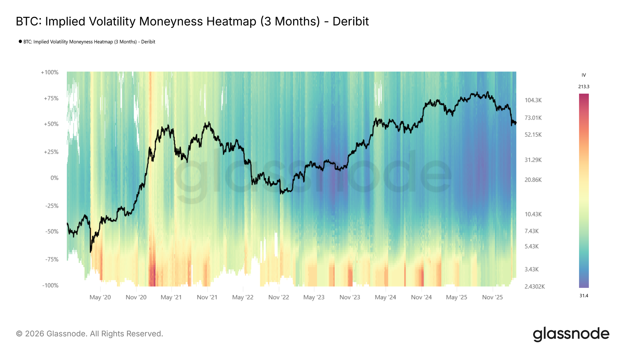
The moneyness heatmap plots implied volatility as a function of distance from spot price (% from spot) over time. Moneyness ranges from -100% to +100%, with puts below the center line (negative moneyness) and calls above it (positive moneyness). The at-the-money level runs horizontally through the middle. Warmer colors (red to dark red) indicate higher IV, while cooler colors (blue to dark blue) indicate lower IV.

IV is sampled at each target maturity and interpolated across moneyness to produce a smooth, continuous surface. The metric is available at four standardized tenors (1 week, 1 month, 3 months, and 6 months) with lookback windows ranging from 1 month to the full available history.
Visit live chart

Looking at the BTC moneyness heatmap (3m tenor), volatility regimes are clearly visible: elevated IV in 2021, a return to high volatility in spring 2024 and again around the turn of 2025, followed by a sharp compression into a very low-vol environment (dark blue).

How to read it:

  • Dark blue across both sides indicates a low-volatility regime, where the market expects limited movement.
  • Red bands on the put side (below center) signal elevated demand for downside protection.
  • Asymmetry between the put and call sides reflects directional skew, showing how much more the market is willing to pay for protection versus upside exposure.
  • Vertical color shifts, or abrupt changes in intensity across all moneyness levels, mark regime transitions.

The IV Delta Heatmap

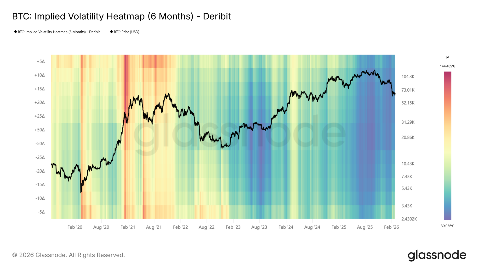
The moneyness heatmap shows IV at fixed distances from spot, a natural and intuitive way to view the surface. The same information can also be expressed in terms of delta, which normalizes each strike by its probability of expiring in the money. The IV Delta Heatmap applies this representation, built on the interpolated IV metrics described in this metric launch article. Deltas range from 5D puts to 50D (at-the-money) to 5D calls, across the same tenors and lookback windows.
Visit live chart

Examining the BTC delta heatmap (6m tenor), one notable feature emerges: during the 2021 bull run, call-side IV (above center, particularly the 5D call region) was significantly elevated compared to put-side IV. The market was pricing in large upside moves, reflecting the euphoric momentum of that period. This call-side dominance is a pattern that tends to appear during strong rallies and is clearly visible in the delta representation.

Reading the Heatmap: Patterns and Implications

Below, we identify some of the primary observable patterns in the heatmaps, describe how they present, and outline their practical relevance.

Elevated Put-Side IV: Risk Hedging in Action
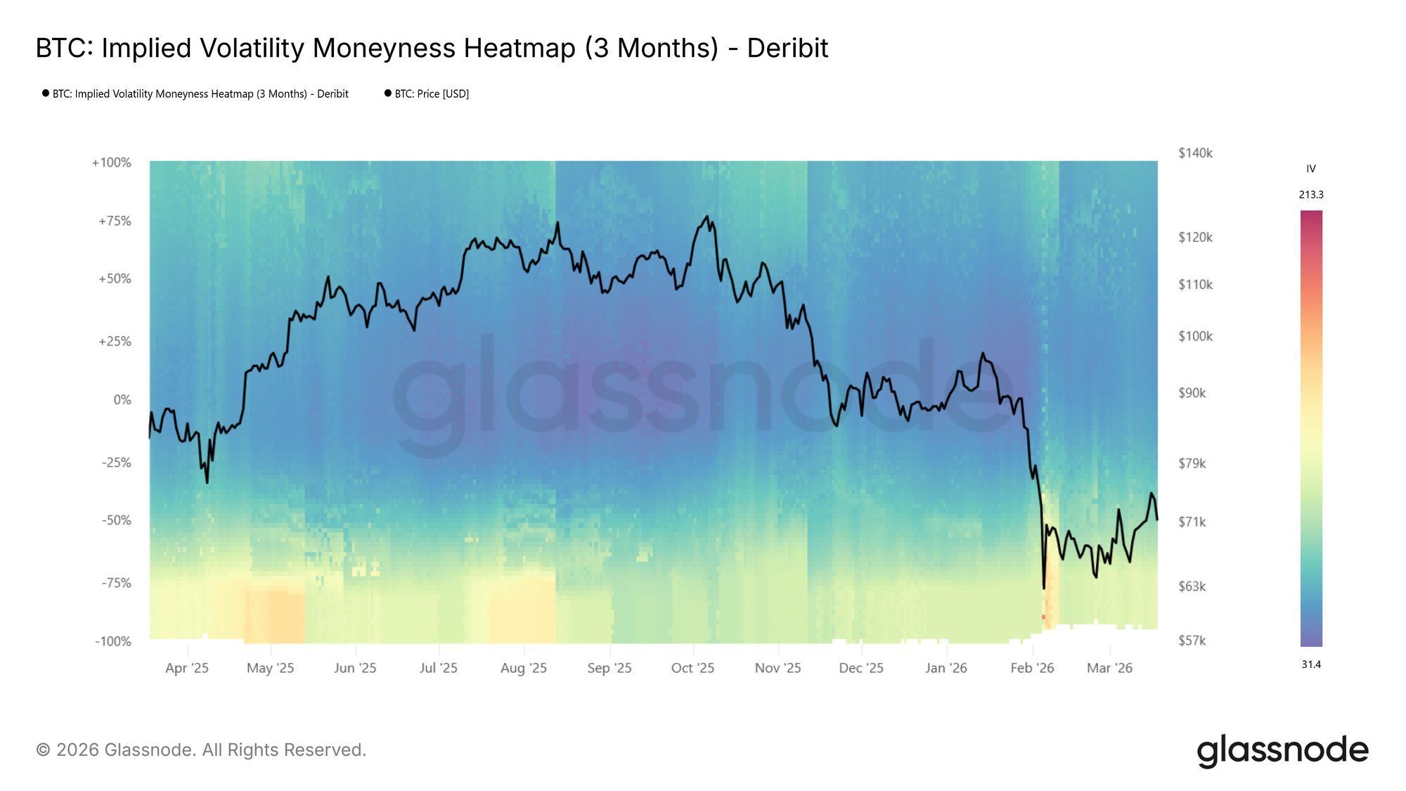
During the recent drop to $60k the put side IVs spiked strongly, shown by the transition to warm colours on the put side as price moved lower in the BTC moneyness heatmap (3m tenor) above.

During sharp drawdowns, risk hedging activity increases. Put demand rises as participants seek downside protection, pushing implied volatility higher on the put side. On the heatmap, this appears as a warm band emerging below the center line where colors were previously neutral, often intensifying to dark red as price falls further.

This is also reflected in rising expected price dispersion. Higher IV across a broader range of strikes signals growing uncertainty about where price will settle.

📈 Trading implications: Elevated put-side IV during drawdowns confirms active hedging demand. If the red band persists, the market is pricing continued risk. If it fades quickly, fear may be receding.

Tail Risk Repricing: When Outer Strikes Light Up

Sometimes the most telling signal is not where IV is already elevated, but where it wasn’t and suddenly is. During calm markets, deep OTM strikes tend to show very low IV because few participants are actively pricing or hedging at those levels. When that changes, and previously dark regions of the heatmap begin to brighten, the market is repricing tail risk.

This is distinct from a general rise in volatility. A broad increase lifts the entire surface. Tail repricing, by contrast, shows up as the warm band widening vertically into moneyness levels that had been ignored. Participants are starting to consider outcomes they had previously deemed too unlikely to hedge against.

📈 Trading implications: Watch the edges of the heatmap. If warm colors begin creeping into deep OTM levels that were previously dark blue, the market is assigning meaningful probability to larger moves. On the put side, this typically accompanies severe stress as participants hedge against outsized drawdowns. On the call side, the same pattern can emerge during euphoric rallies as the market starts pricing in large upside moves.

Low-Volatility Regimes: Cheap Protection, Expensive Later

Extended periods of subdued IV appear as dark blue across the heatmap. These regimes often correspond to consolidation phases, where the market expects limited movement in either direction.

📈 Trading implications: Crucially, low IV means option premiums are compressed. For hedgers, this presents an opportunity: downside protection via puts is relatively cheap, making it an attractive time to insure portfolios. For directional traders, buying options (calls or puts) in a low-vol environment is a pure volatility play: if IV expands, the position benefits regardless of direction.

However, prolonged compression often precedes volatility expansion. Here, it makes sense to watch for the first signs of color shifting from dark blue toward red as an early warning.

High-Volatility Regimes: Income Generation

The inverse holds as well. When the heatmap is dominated by warm colors across a wide range of strikes, option premiums are elevated. This creates opportunities for income-oriented strategies: selling options (covered calls, cash-secured puts) captures rich premiums, and benefits from the eventual mean-reversion of volatility back toward lower levels.

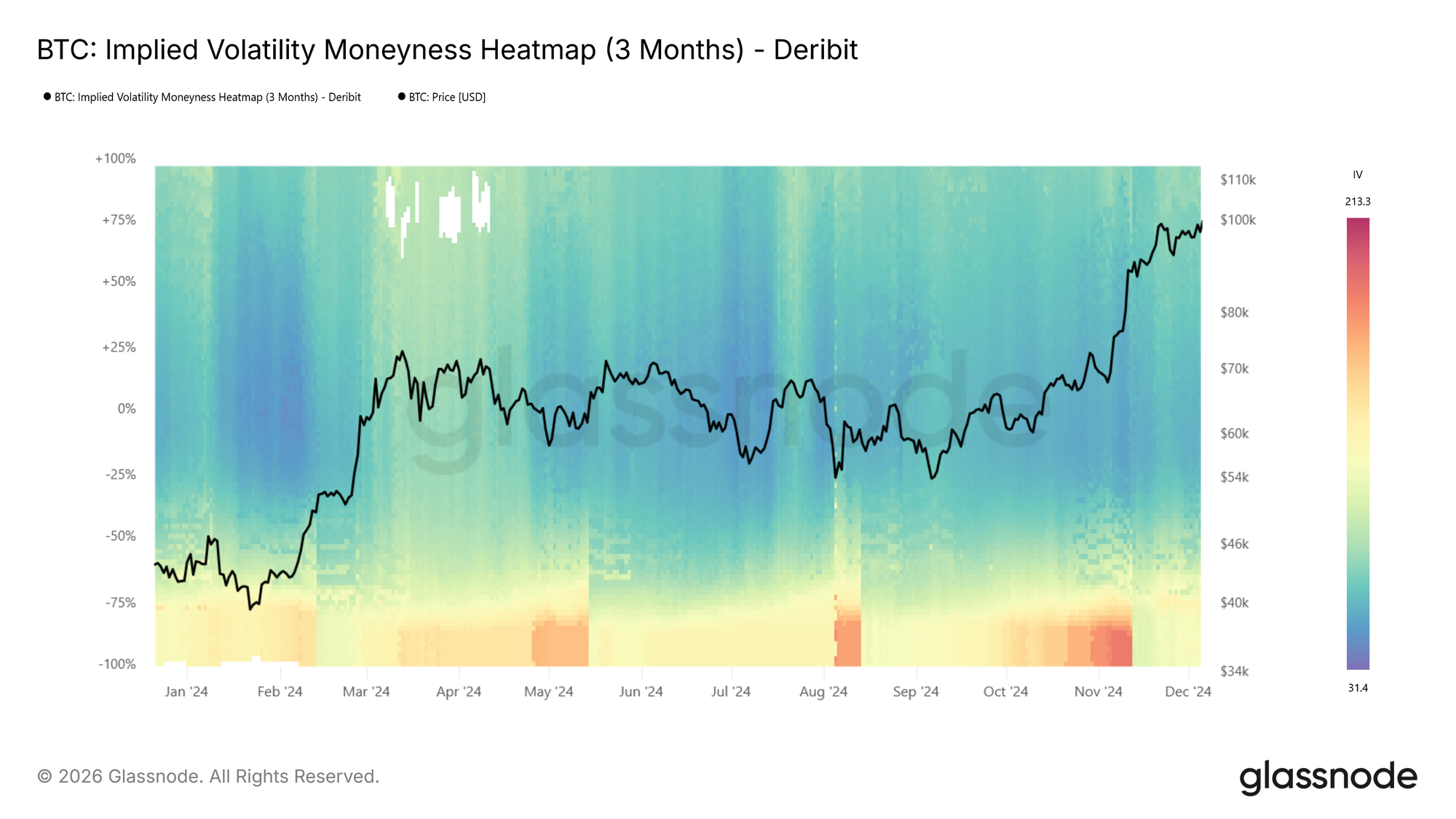
At BTC moneyness heatmap (3m tenor) below, we see an example showing a transition from hot (red) to cool (blue), e.g., the local top in spring 2024 followed by IV compression.
Regime Transitions

The most actionable signals often come at transition points: when the heatmap shifts from blue to red (or vice versa) across multiple moneyness levels simultaneously. Unlike a transient spike that fades within a day or two, a regime transition is a sustained shift in the baseline level of expected volatility.

📈 Trading implications: Regime shifts warrant reassessing position sizing, hedge ratios, and strategy selection. A transition from low to high vol may favor momentum and long-volatility positions, while the reverse may favor mean-reversion and premium-selling strategies.

Vol Regime Quick Reference
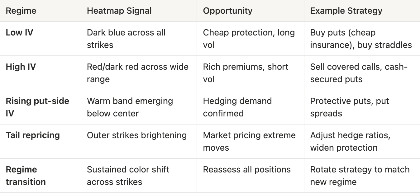
What to look for:

  • Color intensity changes: Shifts in the overall level of expected volatility
  • Put/call asymmetry: Directional risk sentiment. Is the market more concerned about downside or upside?
  • Term structure divergence: Compare the 1-week heatmap to the 3-month heatmap. If front-end IV spikes while longer-dated IV stays flat, the market sees the stress as temporary
  • Width of elevated regions: A narrow red band at specific moneyness levels suggests targeted hedging; broad red indicates widespread uncertainty

Conclusion

The IV Moneyness Heatmap and IV Delta Heatmap bring a temporal dimension to volatility analysis. Rather than asking “what does the vol surface look like now?”, you can now ask “how has it changed, and what regime are we in?”

Whether you are a discretionary trader identifying volatility regimes, or a systematic fund screening for vol regime transitions via our API, these heatmaps provide a structured, visual lens into how the options market prices risk over time.

If you want to learn more about our options data and metric offering, or gain access to these metrics, contact our dedicated team today.


  • Follow us on X for timely market updates and analysis
  • Join our Telegram channel for regular market insights
  • For on-chain metrics, dashboards, and alerts, visit Glassnode Studio

Disclaimer: This report is for informational and educational purposes only. The analysis represents a limited case study with significant constraints and should not be interpreted as investment advice or definitive trading signals. Past performance patterns do not guarantee future results. Always conduct thorough due diligence and consider multiple factors before making investment decisions.


Связанные с этим вопросы

QWhat are the two new metrics introduced in the article for tracking implied volatility over time?

AThe two new metrics are the IV Moneyness Heatmap and the IV Delta Heatmap.

QHow does the IV Moneyness Heatmap visually represent different levels of implied volatility?

AIt uses a color scale where warmer colors like red to dark red indicate higher implied volatility, and cooler colors like blue to dark blue indicate lower implied volatility.

QAccording to the article, what does a persistent red band on the put side of the heatmap typically indicate?

AA persistent red band on the put side indicates elevated demand for downside protection, signaling that the market is pricing in continued risk or fear.

QWhat trading opportunity does a low-volatility regime (dark blue on the heatmap) present for hedgers?

AIn a low-volatility regime, option premiums are compressed, making downside protection via puts relatively cheap. This presents an attractive opportunity for hedgers to insure their portfolios at a lower cost.

QWhat is a key difference between a general rise in IV and the repricing of tail risk as shown on the heatmap?

AA general rise in volatility lifts the entire IV surface uniformly. In contrast, tail risk repricing appears as a warm band widening vertically into deep out-of-the-money strikes that were previously dark blue, indicating the market is starting to assign meaningful probability to larger, previously ignored moves.

Похожее

Claude представляет мощное обновление: запись экрана + голос, одним кликом дистиллируйте навык для работы за вас

Claude представил новую функцию «Record a Skill» (Записать навык) в десктопном приложении Cowork. Теперь пользователи Pro, Max и Team могут создавать автоматизированные рабочие процессы, просто записывая свои действия на экране и сопровождая их голосовыми комментариями. Система автоматически анализирует запись, извлекает логику и шаги, а затем преобразует их в готовый к использованию Skill (навык). Это устраняет необходимость вручную писать инструкции в формате Markdown, значительно снижая порог входа для нетехнических специалистов. Функция фиксирует не только явные действия, но и скрытую логику, контекст и условия, о которых пользователь рассказывает в процессе записи. Статья отмечает, что такая технология меняет подход к управлению знаниями в компаниях, облегчая документирование и передачу экспертизы. С другой стороны, упоминается случай, когда фрилансер автоматизировал свою работу для клиента с помощью Claude, что в итоге привело к прекращению сотрудничества. Это подчеркивает двойственное влияние технологии: она повышает эффективность, но одновременно снижает зависимость от конкретного исполнителя, перенося конкурентное преимущество работника в область уникальных, сложно автоматизируемых задач. Функция доступна с 21 июля для пользователей соответствующих подписок.

marsbit5 мин. назад

Claude представляет мощное обновление: запись экрана + голос, одним кликом дистиллируйте навык для работы за вас

marsbit5 мин. назад

Кормление ИИ "шумом" тоже повышает точность: это исследование позволяет шуму осуществить позитивный перенос

В статье представлен новый метод полуконтролируемого обучения под названием **Semi-Supervised Noise Adaptation (SSNA)**. Вместо использования реальных данных (например, изображений или текста) в качестве исходного домена, подход использует синтетические **шумовые векторы**, сгенерированные из простого гауссовского распределения. Эти шумовые данные не несут семантического содержания, но им присваиваются искусственные метки классов, соответствующие целевым классам. Основная идея заключается в том, чтобы обучить модель формировать **дискриминативную классовую структуру** в общем пространстве представлений сначала на шумовых данных, а затем адаптировать (выровнять) эту структуру к данным целевого домена с помощью небольшого количества размеченных примеров. Для этого используется **Noise Adaptation Framework (NAF)**, который минимизирует три компонента потерь: классификацию на размеченных целевых данных, классификацию на шумовых данных и расстояние между распределениями шумового и целевого доменов. Эксперименты на наборах данных CIFAR-10, CIFAR-100, DTD-47 и других показали значительное улучшение точности по сравнению с базовым методом ERM при использовании всего 4 размеченных примера на класс. Например, на CIFAR-10 точность выросла на 12.35%. Метод также совместим с существующими полуконтролируемыми алгоритмами (UDA, FixMatch), дополнительно улучшая их результаты. Ключевой вывод исследования: для положительного переноса знаний в задачах трансферного обучения **не обязательно наличие семантически богатых исходных данных**. Достаточно сформировать в пространстве признаков четкую, разделимую классовую структуру, даже на искусственном шуме, и успешно перенести её на реальные данные. Это открывает новые возможности для сценариев, где доступ к реальным исходным данным ограничен из-за проблем конфиденциальности, авторских прав или их отсутствия.

marsbit6 мин. назад

Кормление ИИ "шумом" тоже повышает точность: это исследование позволяет шуму осуществить позитивный перенос

marsbit6 мин. назад

Телесуфлёр из Белого дома "для внутреннего пользования" заработал на инсайдерской информации более $100 000

Белый дом раскрыл дело о внутренней торговле: помощник по суфлеру, работавший на Дональда Трампа, использовал инсайдерскую информацию для ставок на рынках предсказаний и заработал более 100 000 долларов. Габриэль Перес, помощник президента и технический советник, отвечавший за работу суфлера Трампа с 2016 года, имел доступ к черновикам речей до их публичного произнесения. Используя эти знания, он делал ставки на платформе Kalshi, предсказывая, какие конкретные слова или фразы упомянет Трамп в своих выступлениях. За три месяца, делая ставки на более чем десяток речей, включая обращение о положении страны, Перес получил прибыль в размере шестизначной суммы. Его деятельность была выявлена системами мониторинга Kalshi, которая заблокировала его средства и передала дело в Комиссию по торговле товарными фьючерсами (CFTC). В отличие от предыдущих аналогичных случаев с военным и инженером Google, против Переса не были выдвинуты уголовные обвинения. Согласно сообщениям, CFTC договорилась о урегулировании, по которому он вернет прибыль и прекратит такую деятельность. Трамп, назвав его действия «предосудительными», отстранил Переса от работы без сохранения зарплаты. Этот инцидент подчеркивает уязвимость рынков предсказаний, особенно категорий «упоминаний», для манипуляций со стороны инсайдеров. Ранее были случаи, когда сами ораторы (например, генеральный директор Coinbase) намеренно упоминали ключевые слова, чтобы повлиять на результаты рынка. В ответ Kalshi ужесточила правила, требуя от пользователей раскрывать место работы. Эксперты отмечают, что очистка рынков от инсайдерской торговли повышает соответствие нормам, но может отдалить их от идеи «мудрости толпы», приблизив к чистому азарту.

marsbit1 ч. назад

Телесуфлёр из Белого дома "для внутреннего пользования" заработал на инсайдерской информации более $100 000

marsbit1 ч. назад

«Домашний» оператор суфлёра Белого дома заработал более $100 тыс. на инсайдерских прогнозах

Недавно в Белом доме США произошел очередной скандал, связанный с инсайдерской торговлей. Габриэль Перес, сотрудник Белого дома, отвечавший за работу суфлера во время выступлений Дональда Трампа, использовал служебную информацию для получения прибыли на рынках предсказаний. Перес, который с 2016 года был одним из ближайших помощников Трампа и имел доступ к его подготовленным речам, в течение примерно трех месяцев делал ставки на то, какие конкретные слова или фразы президент упомянет в своих выступлениях. За это время ему удалось заработать более 100 тысяч долларов. Его деятельность была выявлена платформой предсказаний Kalshi, которая заблокировала его средства и передала информацию Комиссии по торговле товарными фьючерсами (CFTC). В результате Перес был отстранен от работы без сохранения зарплаты. Однако, в отличие от предыдущих аналогичных случаев со спецназовцем и инженером Google, против Переса не были выдвинуты уголовные обвинения. По данным источников, CFTC договорилась о мировом соглашении, согласно которому он должен вернуть прибыль и прекратить подобную деятельность. Этот инцидент высветил уязвимость рынков предсказаний, особенно категорий, связанных с упоминанием определенных слов («mention markets»), перед манипуляциями со стороны инсайдеров или самих ораторов. Ранее подобные манипуляции демонстрировали ведущий церемонии «Грэмми» и CEO Coinbase. В ответ платформы ужесточают контроль: Kalshi теперь требует от пользователей раскрывать место работы. Скандал с Пересом рассматривается как часть общего процесса очистки рынков предсказаний от инсайдерской торговли.

Odaily星球日报1 ч. назад

«Домашний» оператор суфлёра Белого дома заработал более $100 тыс. на инсайдерских прогнозах

Odaily星球日报1 ч. назад

Биткойн-майнинг-фермы превращаются в AI-фабрики

Биткойн-майнинг превращается в инфраструктуру для ИИ. Компании, ранее занимавшиеся майнингом, такие как Crusoe и CoreWeave, перепрофилируют свои центры обработки данных с криптовалют на искусственный интеллект. Их главный актив — не оборудование, а уже готовый доступ к большим объемам электроэнергии, земле и разрешениям на подключение к сетям, что критически важно для создания дата-центров под ИИ. На фоне снижения доходности от майнинга биткойнов и высокого спроса со стороны ИИ-компаний этот переход стал экономически оправданным. Крупные майнинговые компании, включая TeraWulf, Cipher Mining и IREN, уже заключили долгосрочные контракты на сотни миллиардов долларов с такими гигантами, как Anthropic, AWS и Microsoft. Люди и капитал из криптоиндустрии также активно перемещаются в сферу ИИ. Основатель OpenSea создал агрегатор ИИ-моделей OpenRouter, а бывший сотрудник Coinbase основал платформу для медиа-моделей Fal.ai. Крипто-капитал финансирует ИИ-инфраструктуру, как в случае с Voltage Park Джеда Маккалеба, и поддерживает эксперименты, такие как распределенная сеть для обучения моделей Psyche от Nous Research. Хотя успех не гарантирован, криптоиндустрия передает ИИ три ключевых ресурса: энергомощности, инженерные кадры и капитал, накопленный в предыдущем цикле.

链捕手1 ч. назад

Биткойн-майнинг-фермы превращаются в AI-фабрики

链捕手1 ч. назад

Торговля

Спот
活动图片