Mapping Volatility Through Time: Implied Volatility Heatmaps

insights.glassnodeXuất bản vào 2026-03-23Cập nhật gần nhất vào 2026-03-23

Tóm tắt

Glassnode introduces two new implied volatility (IV) heatmap metrics—IV Moneyness Heatmap and IV Delta Heatmap—that visualize how options markets price risk across strikes and maturities over time, rather than at a single point. These tools help identify volatility regimes, such as periods of calm, stress, and transitions between them. The heatmaps display IV using color gradients, with red indicating high volatility and blue indicating low volatility. Key patterns include elevated put-side IV during drawdowns (signaling hedging demand), tail-risk repricing in deep out-of-the-money options, and regime shifts that inform trading strategies like hedging in low-vol environments or selling premium in high-vol periods. Available in Glassnode Studio, these metrics provide a dynamic view of market expectations and risk sentiment.

Options markets encode information about how participants expect prices to move. With the release of our interpolated IV metrics earlier this year, users gained access to a clean, structured volatility surface across deltas and maturities.

Now, we are extending that foundation with a new set of metrics that track how implied volatility evolves over time: the IV Moneyness Heatmap and the IV Delta Heatmap.

These metrics allow you to observe how the market prices expected movement across strikes and maturities; not just at a single point in time, but across weeks, months, and years.

Explore the live metrics in Glassnode Studio. Now available to Professional plan users for all major liquid markets, with 10-minute, hourly, and daily resolutions.

Explore heatmaps

From Snapshots to Regimes

A single IV curve gives insight into how the market is pricing risk right now. But since markets are dynamic, a snapshot view misses the broader context: Was volatility rising or falling into this point? Has the skew been shifting gradually or did it change suddenly?

The IV Heatmap captures these dynamics by plotting implied volatility across strikes over time. Instead of a single curve, it provides a continuous map that reveals volatility regimes: extended periods of calm, episodes of stress, and the transitions between them.

This allows us to observe how the market priced the buildup to a major move, how quickly fear dissipated after a drawdown, or whether elevated put demand persisted for days or weeks. Such patterns are hidden in a single snapshot view.

The IV Moneyness Heatmap

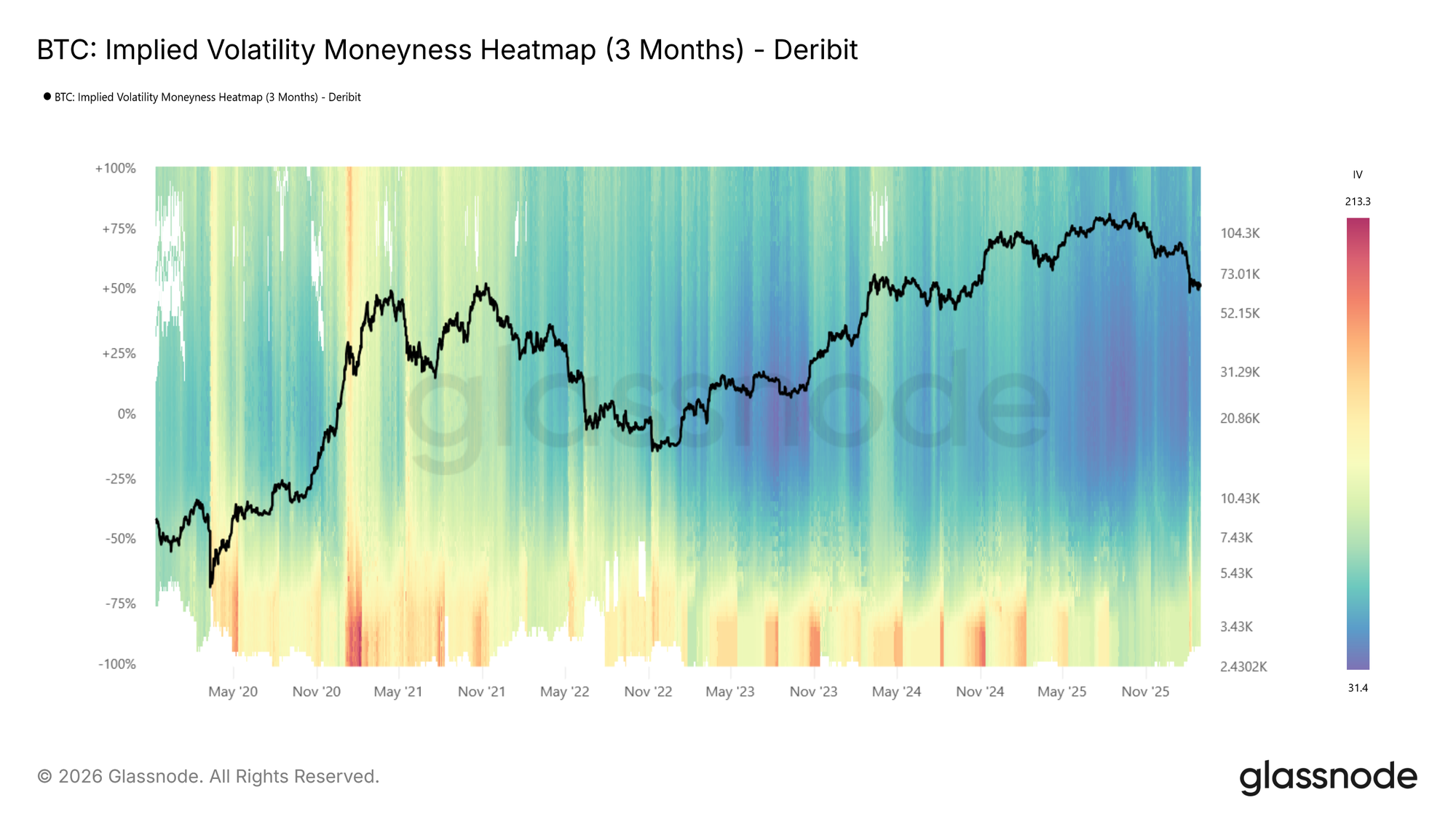
The moneyness heatmap plots implied volatility as a function of distance from spot price (% from spot) over time. Moneyness ranges from -100% to +100%, with puts below the center line (negative moneyness) and calls above it (positive moneyness). The at-the-money level runs horizontally through the middle. Warmer colors (red to dark red) indicate higher IV, while cooler colors (blue to dark blue) indicate lower IV.

IV is sampled at each target maturity and interpolated across moneyness to produce a smooth, continuous surface. The metric is available at four standardized tenors (1 week, 1 month, 3 months, and 6 months) with lookback windows ranging from 1 month to the full available history.
Visit live chart

Looking at the BTC moneyness heatmap (3m tenor), volatility regimes are clearly visible: elevated IV in 2021, a return to high volatility in spring 2024 and again around the turn of 2025, followed by a sharp compression into a very low-vol environment (dark blue).

How to read it:

  • Dark blue across both sides indicates a low-volatility regime, where the market expects limited movement.
  • Red bands on the put side (below center) signal elevated demand for downside protection.
  • Asymmetry between the put and call sides reflects directional skew, showing how much more the market is willing to pay for protection versus upside exposure.
  • Vertical color shifts, or abrupt changes in intensity across all moneyness levels, mark regime transitions.

The IV Delta Heatmap

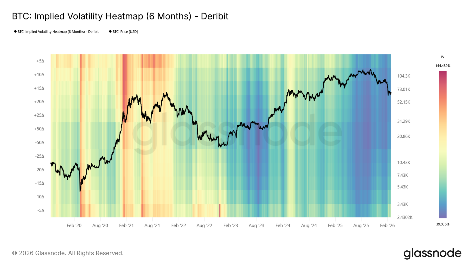
The moneyness heatmap shows IV at fixed distances from spot, a natural and intuitive way to view the surface. The same information can also be expressed in terms of delta, which normalizes each strike by its probability of expiring in the money. The IV Delta Heatmap applies this representation, built on the interpolated IV metrics described in this metric launch article. Deltas range from 5D puts to 50D (at-the-money) to 5D calls, across the same tenors and lookback windows.
Visit live chart

Examining the BTC delta heatmap (6m tenor), one notable feature emerges: during the 2021 bull run, call-side IV (above center, particularly the 5D call region) was significantly elevated compared to put-side IV. The market was pricing in large upside moves, reflecting the euphoric momentum of that period. This call-side dominance is a pattern that tends to appear during strong rallies and is clearly visible in the delta representation.

Reading the Heatmap: Patterns and Implications

Below, we identify some of the primary observable patterns in the heatmaps, describe how they present, and outline their practical relevance.

Elevated Put-Side IV: Risk Hedging in Action
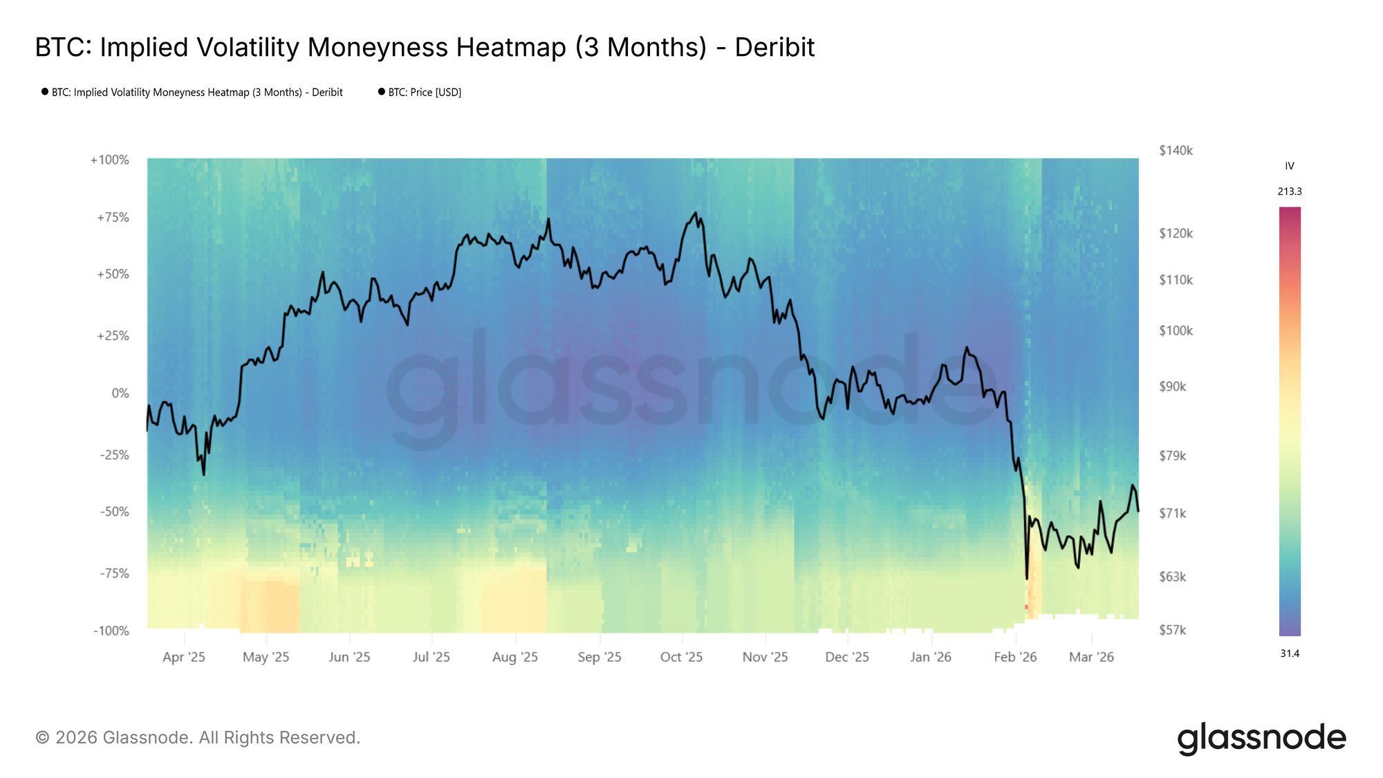
During the recent drop to $60k the put side IVs spiked strongly, shown by the transition to warm colours on the put side as price moved lower in the BTC moneyness heatmap (3m tenor) above.

During sharp drawdowns, risk hedging activity increases. Put demand rises as participants seek downside protection, pushing implied volatility higher on the put side. On the heatmap, this appears as a warm band emerging below the center line where colors were previously neutral, often intensifying to dark red as price falls further.

This is also reflected in rising expected price dispersion. Higher IV across a broader range of strikes signals growing uncertainty about where price will settle.

📈 Trading implications: Elevated put-side IV during drawdowns confirms active hedging demand. If the red band persists, the market is pricing continued risk. If it fades quickly, fear may be receding.

Tail Risk Repricing: When Outer Strikes Light Up

Sometimes the most telling signal is not where IV is already elevated, but where it wasn’t and suddenly is. During calm markets, deep OTM strikes tend to show very low IV because few participants are actively pricing or hedging at those levels. When that changes, and previously dark regions of the heatmap begin to brighten, the market is repricing tail risk.

This is distinct from a general rise in volatility. A broad increase lifts the entire surface. Tail repricing, by contrast, shows up as the warm band widening vertically into moneyness levels that had been ignored. Participants are starting to consider outcomes they had previously deemed too unlikely to hedge against.

📈 Trading implications: Watch the edges of the heatmap. If warm colors begin creeping into deep OTM levels that were previously dark blue, the market is assigning meaningful probability to larger moves. On the put side, this typically accompanies severe stress as participants hedge against outsized drawdowns. On the call side, the same pattern can emerge during euphoric rallies as the market starts pricing in large upside moves.

Low-Volatility Regimes: Cheap Protection, Expensive Later

Extended periods of subdued IV appear as dark blue across the heatmap. These regimes often correspond to consolidation phases, where the market expects limited movement in either direction.

📈 Trading implications: Crucially, low IV means option premiums are compressed. For hedgers, this presents an opportunity: downside protection via puts is relatively cheap, making it an attractive time to insure portfolios. For directional traders, buying options (calls or puts) in a low-vol environment is a pure volatility play: if IV expands, the position benefits regardless of direction.

However, prolonged compression often precedes volatility expansion. Here, it makes sense to watch for the first signs of color shifting from dark blue toward red as an early warning.

High-Volatility Regimes: Income Generation

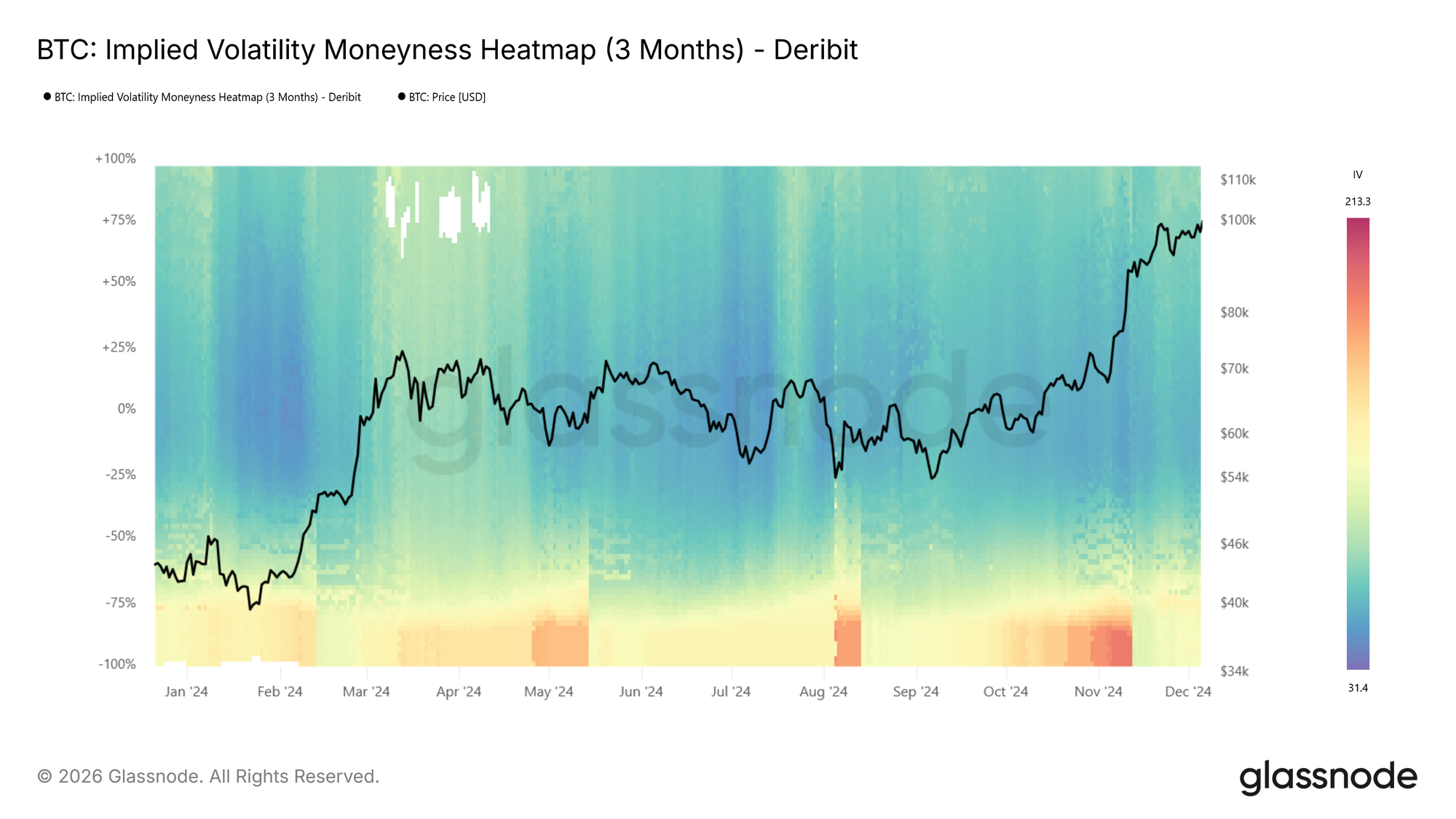
The inverse holds as well. When the heatmap is dominated by warm colors across a wide range of strikes, option premiums are elevated. This creates opportunities for income-oriented strategies: selling options (covered calls, cash-secured puts) captures rich premiums, and benefits from the eventual mean-reversion of volatility back toward lower levels.

At BTC moneyness heatmap (3m tenor) below, we see an example showing a transition from hot (red) to cool (blue), e.g., the local top in spring 2024 followed by IV compression.
Regime Transitions

The most actionable signals often come at transition points: when the heatmap shifts from blue to red (or vice versa) across multiple moneyness levels simultaneously. Unlike a transient spike that fades within a day or two, a regime transition is a sustained shift in the baseline level of expected volatility.

📈 Trading implications: Regime shifts warrant reassessing position sizing, hedge ratios, and strategy selection. A transition from low to high vol may favor momentum and long-volatility positions, while the reverse may favor mean-reversion and premium-selling strategies.

Vol Regime Quick Reference
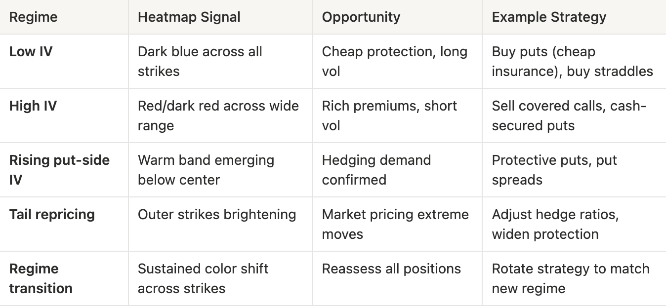
What to look for:

  • Color intensity changes: Shifts in the overall level of expected volatility
  • Put/call asymmetry: Directional risk sentiment. Is the market more concerned about downside or upside?
  • Term structure divergence: Compare the 1-week heatmap to the 3-month heatmap. If front-end IV spikes while longer-dated IV stays flat, the market sees the stress as temporary
  • Width of elevated regions: A narrow red band at specific moneyness levels suggests targeted hedging; broad red indicates widespread uncertainty

Conclusion

The IV Moneyness Heatmap and IV Delta Heatmap bring a temporal dimension to volatility analysis. Rather than asking “what does the vol surface look like now?”, you can now ask “how has it changed, and what regime are we in?”

Whether you are a discretionary trader identifying volatility regimes, or a systematic fund screening for vol regime transitions via our API, these heatmaps provide a structured, visual lens into how the options market prices risk over time.

If you want to learn more about our options data and metric offering, or gain access to these metrics, contact our dedicated team today.


  • Follow us on X for timely market updates and analysis
  • Join our Telegram channel for regular market insights
  • For on-chain metrics, dashboards, and alerts, visit Glassnode Studio

Disclaimer: This report is for informational and educational purposes only. The analysis represents a limited case study with significant constraints and should not be interpreted as investment advice or definitive trading signals. Past performance patterns do not guarantee future results. Always conduct thorough due diligence and consider multiple factors before making investment decisions.


Câu hỏi Liên quan

QWhat are the two new metrics introduced in the article for tracking implied volatility over time?

AThe two new metrics are the IV Moneyness Heatmap and the IV Delta Heatmap.

QHow does the IV Moneyness Heatmap visually represent different levels of implied volatility?

AIt uses a color scale where warmer colors like red to dark red indicate higher implied volatility, and cooler colors like blue to dark blue indicate lower implied volatility.

QAccording to the article, what does a persistent red band on the put side of the heatmap typically indicate?

AA persistent red band on the put side indicates elevated demand for downside protection, signaling that the market is pricing in continued risk or fear.

QWhat trading opportunity does a low-volatility regime (dark blue on the heatmap) present for hedgers?

AIn a low-volatility regime, option premiums are compressed, making downside protection via puts relatively cheap. This presents an attractive opportunity for hedgers to insure their portfolios at a lower cost.

QWhat is a key difference between a general rise in IV and the repricing of tail risk as shown on the heatmap?

AA general rise in volatility lifts the entire IV surface uniformly. In contrast, tail risk repricing appears as a warm band widening vertically into deep out-of-the-money strikes that were previously dark blue, indicating the market is starting to assign meaningful probability to larger, previously ignored moves.

Nội dung Liên quan

Chỉ số Sáng tạo 50 tăng mạnh 10,73%, Vì sao thị trường A-share diễn ra 'Đảo chiều hình chữ V'?

Sau nhiều phiên điều chỉnh liên tiếp, thị trường chứng khoán Trung Quốc đã có một ngày tăng điểm mạnh mẽ vào ngày 21/7 với mô hình phục hồi hình chữ V. Chỉ số Kechuang 50 (Sci-Tech Innovation Board 50) dẫn đầu với mức tăng kỷ lục 10,73% trong gần một năm, trong khi ba chỉ số chính của Thượng Hải và Thâm Quyến cũng đồng loạt tăng. Khối lượng giao dịch đạt 2.970 tỷ nhân dân tệ, với hơn 3.100 cổ phiếu tăng giá. Lực lượng dẫn dắt đợt phục hồi là toàn bộ chuỗi ngành bán dẫn, bao gồm thiết bị, bộ nhớ, wafer và HBM. Các quỹ ETF chủ đề bán dẫn liên quan cũng tăng mạnh, nhiều quỹ tăng trên 10%. Sự bật tăng mạnh này được cho là nhờ sự cộng hưởng của ba yếu tố chính: 1. **Dòng tiền đổ vào:** Tín hiệu tích cực từ việc các "đội quân quốc gia", công ty bảo hiểm, công ty niêm yết và các quỹ công/tư tăng mua vào, giúp nâng đỡ thanh khoản và lòng tin thị trường. Các ETF chỉ số rộng đã chứng kiến dòng tiền ròng lớn. 2. **Hỗ trợ từ chính sách:** Các cam kết từ Ủy ban Giám sát Chứng khoán Trung Quốc (CSRC) về việc duy trì thị trường ổn định đã tạo tâm lý tích cực. 3. **Môi trường bên ngoài ổn định:** Sự phục hồi của thị trường chứng khoán toàn cầu, đặc biệt là ở Hàn Quốc, đã tạo điều kiện thuận lợi cho đợt bật lại của cổ phiếu công nghệ Trung Quốc. Các tổ chức phân tích nhận định rằng giai đoạn hoảng loạn nhất của ngành công nghệ nhiều khả năng đã qua đi sau đợt điều chỉnh sâu. Mặc dù thị trường ngắn hạn vẫn có thể biến động, nhưng xu hướng công nghiệp dài hạn như nhu cầu AI, bán dẫn thay thế trong nước vẫn nguyên vẹn. Các nhà đầu tư được khuyến nghị tập trung vào các phân khúc then chốt với nguồn cung vẫn còn hạn chế trong chuỗi AI, đồng thời theo dõi kết quả báo cáo tài chính và động thái của các nhà đầu tư tổ chức.

marsbit24 phút trước

Chỉ số Sáng tạo 50 tăng mạnh 10,73%, Vì sao thị trường A-share diễn ra 'Đảo chiều hình chữ V'?

marsbit24 phút trước

Cổ Phiếu Công Nghệ Có Động Lực Mạnh Tại Mỹ Ghi Nhận Phiên Tăng Mạnh Nhất Lịch Sử, Nhưng Đợt Sụt Giảm Đã Kết Thúc?

Bài viết phân tích đợt bật tăng mạnh mẽ của cổ phiếu công nghệ theo đà tăng trưởng (momentum) trên thị trường chứng khoán Mỹ vào ngày 21/7. Dù các chỉ số như yếu tố động lượng TMT của Morgan Stanley và chỉ số động lượng beta cao của Goldman Sachs ghi nhận mức tăng mạnh kỷ lục, đặc biệt là ở lĩnh vực bán dẫn với sự đóng góp của các mã như Micron và Intel, bối cảnh tổng thể vẫn tiềm ẩn nhiều rủi ro. Đợt phục hồi này được cho là xuất phát từ việc các nhà đầu tư bán khống bị buộc phải mua lại cổ phiếu (short squeeze) sau khi nhóm cổ phiếu này đã lao dốc tới 33%. Tuy nhiên, nhiều chuyên gia tỏ ra thận trọng. BTIG cảnh báo đây có thể chỉ là đợt bật tăng kỹ thuật trong bối cảnh thị trường có độ rộng yếu (số cổ phiếu giảm giá nhiều hơn tăng giá) và khối lượng giao dịch thấp, khuyến nghị nhà đầu tư nên bán ra khi giá lên cao. Trong khi đó, Goldman Sachs và UBS lạc quan hơn, cho rằng đợt bán tháo đã gần kết thúc và đây là cơ hội để mua vào từng bước, đặc biệt là các cổ phiếu AI, mặc dù khuyến cáo nên sử dụng các công cụ phòng ngừa rủi ro. Triển vọng tiếp theo của thị trường phụ thuộc lớn vào mùa báo cáo tài chính, với trọng tâm là kết quả của Alphabet và định hướng chi tiêu vốn cho AI. Đồng thời, thị trường trái phiếu cũng đang cảnh báo khi lợi suất trái phiếu dài hạn tăng lên, cùng với giá dầu leo thang do căng thẳng địa chính trị, có thể gây áp lực lên cổ phiếu trong thời gian tới.

marsbit30 phút trước

Cổ Phiếu Công Nghệ Có Động Lực Mạnh Tại Mỹ Ghi Nhận Phiên Tăng Mạnh Nhất Lịch Sử, Nhưng Đợt Sụt Giảm Đã Kết Thúc?

marsbit30 phút trước

Cổ phiếu 'Động lượng Công nghệ' Mỹ ghi nhận mức tăng trong ngày lớn nhất lịch sử, nhưng đã kết thúc đợt sụt giảm mạnh chưa?

Cổ phiếu động lực công nghệ Mỹ đã bật tăng mạnh nhất trong lịch sử vào ngày 21/7, với chỉ số yếu tố động lượng TMT của Morgan Stanley tăng hơn 12%. Đợt phục hồi này diễn ra sau ba phiên giảm liên tiếp và mức sụt giảm tích lũy 33% từ mức đỉnh, được thúc đẩy chủ yếu bởi lĩnh vực bán dẫn và hiện tượng "bán tháo ép" (short squeeze) khi các nhà đầu tư bán khống phải đóng vị thế. Tuy nhiên, sức mạnh của đợt bật tăng bị nghi ngờ do khối lượng giao dịch thấp hơn mức trung bình và sự phân hóa rộng rãi trên thị trường - chỉ số chính tăng nhưng số cổ phiếu giảm giá lại nhiều hơn số tăng giá. Các quan điểm chiến lược trái ngược nhau: BTIG khuyến nghị "bán ra khi giá lên" vì lực cản kỹ thuật mạnh, trong khi Goldman Sachs và UBS cho rằng đợt bán tháo đã gần kết thúc và đề xuất mua vào từng phần. Mùa báo cáo kết quả kinh doanh, đặc biệt là từ Alphabet, cùng với diễn biến lợi suất trái phiếu kho bạc tăng cao và giá dầu leo thang do căng thẳng địa chính trị, sẽ là những yếu tố then chốt quyết định tính bền vững của đợt phục hồi này.

链捕手33 phút trước

Cổ phiếu 'Động lượng Công nghệ' Mỹ ghi nhận mức tăng trong ngày lớn nhất lịch sử, nhưng đã kết thúc đợt sụt giảm mạnh chưa?

链捕手33 phút trước

Bitcoin xuất hiện 3 tín hiệu đáy vĩ mô – Nhưng liệu BTC có thể đạt 70.000 USD?

Thị trường đang dần chuyển hướng nhận định từ "đáy cục bộ" sang "đáy vĩ mô" đối với Bitcoin. Từ góc độ kỹ thuật, việc BTC vượt ngưỡng 66.000 USD đã thổi bùng tâm lý lạc quan. Nhà phân tích Ali Martinez chỉ ra rằng Bitcoin một lần nữa xuất hiện ba tín hiệu kỹ thuật trùng khớp với các đáy chu kỳ vĩ mô trong lịch sử: RSI hàng tháng giảm xuống ~43.65, Chande Momentum Oscillator (CMO) đạt ~-71 và giá giao dịch quanh đường trung bình động 50 tháng. Mô hình tương tự từng xuất hiện vào các năm 2015, 2019 và 2022, thường báo hiệu giai đoạn tích lũy mạnh trước những đợt tăng giá lớn. Tuy nhiên, tính bền vững của đà tăng vẫn phụ thuộc vào thanh khoản. Dữ liệu on-chain cho thấy một nghịch lý: giá phá vỡ nhưng dòng tiền không theo kịp. Vốn hóa thị trường stablecoin đã giảm hơn 10 tỷ USD trong tháng qua, và stablecoin tiếp tục rời khỏi các sàn giao dịch trong 35 ngày liên tiếp, trong khi hoạt động tích lũy Bitcoin trên thị trường giao ngay chưa có dấu hiệu tăng mạnh. Do đó, dù tín hiệu kỹ thuật lạc quan, việc chuyển dịch sang đáy vĩ mô và một đợt bứt phá quyết định lên vùng 70.000 USD vẫn cần được xác nhận thêm bởi dòng thanh khoản mới.

ambcrypto37 phút trước

Bitcoin xuất hiện 3 tín hiệu đáy vĩ mô – Nhưng liệu BTC có thể đạt 70.000 USD?

ambcrypto37 phút trước

Hợp lâu tất phân, phân lâu tất hợp: Khi L1 trở thành Rollup của chính nó, cục diện cuối cùng của Ethereum là gì?

Từ lâu, cộng đồng Ethereum đã lo lắng về việc L2 làm suy yếu giá trị và tính kết hợp toàn cầu của L1. Bài viết thảo luận về sự tiến hóa trong mối quan hệ giữa L1 và L2, nhấn mạnh rằng lộ trình mở rộng quy mô của Ethereum đang thay đổi. Trọng tâm trước đây của L2 là cung cấp không gian giao dịch rẻ hơn, nhưng khi L1 tự nâng cao khả năng xử lý thông qua tăng Gas Limit, statelessness và zkEVM, vai trò của L2 đang được định vị lại. Trong tương lai, L2 sẽ cần cung cấp các giá trị khác biệt như tối ưu hóa ứng dụng cụ thể, tính riêng tư và mô hình quản trị linh hoạt, thay vì chỉ là không gian thực thi chi phí thấp. L1 sẽ đóng vai trò là trung tâm toàn cầu mạnh mẽ cho việc giải quyết, trạng thái chia sẻ và thanh khoản. Một thách thức lớn là sự phân mảnh do nhiều L2 gây ra, cắt nhỏ tính thanh khoản và trải nghiệm người dùng. Giải pháp nằm ở việc cải thiện khả năng tương tác, chẳng hạn thông qua các khung Intent mở (như Open Intents Framework) và Lớp Tương tác Ethereum (EIL), nhằm tạo trải nghiệm xuyên chuỗi liền mạch. Rút ngắn thời gian xác nhận cuối cùng (finality) của L1 từ cấp phút xuống cấp giây cũng rất quan trọng để tăng tốc các tương tác xuyên chuỗi. Một quan điểm thú vị được đưa ra bởi nhà nghiên cứu Barnabé Monnot: với sự phát triển của hệ thống chứng minh (như zkEVM), bản thân L1 cuối cùng có thể trở thành một dạng "Rollup của chính nó". Điều này không có nghĩa là L1 bị "hạ cấp", mà mô tả một kiến trúc nơi việc xác thực bằng chứng mật mã có thể thay thế việc thực thi lại toàn bộ giao dịch bởi mọi node, từ đó làm mờ ranh giới truyền thống giữa L1 và L2. Các Native Rollup trong tương lai có thể kế thừa khả năng xác minh một cách nguyên bản hơn từ L1. Tóm lại, tương lai của Ethereum không phải là L1 thay thế L2 hay ngược lại, mà là sự hình thành của một hệ sinh thái gồm nhiều môi trường thực thi đa dạng (L2) với các chức năng và mô hình khác nhau, nhưng cùng chia sẻ nền tảng bảo mật, thanh khoản và trạng thái từ một L1 vững chắc. Thách thức lớn nhất là kết nối lại những thứ đã bị phân mảnh do mở rộng quy mô, để Ethereum một lần nữa cảm thận như một chuỗi thống nhất cho người dùng.

链捕手47 phút trước

Hợp lâu tất phân, phân lâu tất hợp: Khi L1 trở thành Rollup của chính nó, cục diện cuối cùng của Ethereum là gì?

链捕手47 phút trước

Giao dịch

Giao ngay
活动图片