Glassnode metrics have mainly been explored on a per-asset basis, providing useful insight into capturing the unique market cycles, liquidity patterns, and on-chain activity of individual assets. While this approach has proven extremely useful, it remains limited when trying to understand the market as a whole.
As liquidity and attention continue to spread beyond Bitcoin and Ethereum, market behaviour is increasingly shaped by collective movements across the broader altcoin landscape, a segment that remains underexplored yet crucial for investors and traders to understand.
To address this, we've developed a multi-asset framework that includes the Multi-Asset Explorer – an experimental dashboard that visualizes Glassnode metrics for over 1,000 assets simultaneously. Aggregating and comparing on-chain and market data across assets provides a broader perspective and a more comprehensive understanding of the crypto ecosystem's dynamics. The framework combines Glassnode’s on-chain and market metrics to help users identify liquidity trends, sentiment shifts, and structural changes across the market.
On-Chain and Market Data: A Unified Framework
How to use the dashboard:
At the core of the Explorer is a heatmap interface. Each row represents an asset, each column a day, and each cell shows the value of the selected metric. Above the heatmap sits a context panel displaying Bitcoin’s price (black), the chosen metric for Bitcoin (orange), and the median or other aggregate across the selected assets (blue).
This layout makes it immediately clear whether Bitcoin is behaving in line with the broader market or diverging from it. Users can customize the time window and the summary statistic, switching between median, mean, sum, percentiles, or standard deviation, and choose the number or types of assets to include. Additionally, users can sort the heatmaps using each individual metric. This results in a single interface that connects data streams previously viewed separately.
Sector View: Understanding Inter-Sector Rotations
The Multi-Asset Explorer also introduces a Sector View on our data. This aggregates metrics across groups of related tokens. Users can analyse trends within categories such as Layer-1s, Ethereum ecosystem tokens, DeFi, memes, or stablecoins, and compare their behaviour over time.
This lens makes it easy to see where liquidity and risk are flowing. For instance, funding rates may surge first in meme coins before spreading into DeFi, or realised profits might cluster in Layer-1s while smaller sectors remain under pressure. By collapsing a large number of assets into a handful of market narratives, the Sector View helps to turn scattered activity into clear structural insight, showing when enthusiasm is isolated versus when it becomes systemic.
Tracking Market-Wide Speculation
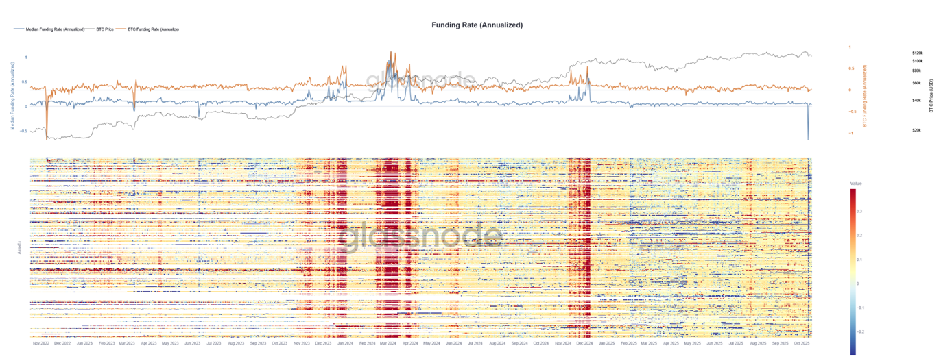
The Funding Rate heatmap (Figure 1) shows funding rates for perpetual futures across the top 500 assets by market capitalisation. The top panel shows Bitcoin’s price, its own funding rate, and the market-wide median. The bottom heatmap highlights periods of broad speculative excess (red) and funding compression or capitulation (blue).
Funding rates in perpetual futures are a useful measure of speculative bias. Positive rates signal long-dominant markets, while negative rates point to short pressure and pessimism.
In the Multi-Asset Explorer, we expand upon our existing funding rate metrics (funding rates & funding rate heatmap). This familiar metric becomes even more powerful when viewed across assets and with summary statistics. Figure 1 shows funding rates across the top 500 assets by market capitalization.
In the upper panel, Bitcoin’s price (black), Bitcoin’s funding rate (orange), and the median funding rate across all assets (blue) move in tandem during broad market rallies. Periods where the median surges ahead of Bitcoin often indicate capital rotating into higher-risk coins, a common sign of overheating.
The lower heatmap turns these dynamics into a visual narrative: red bands mark widespread speculative excess, while blue zones show funding compression and capitulation. The dense red clusters of early 2024 preceded multi-month drawdowns as leverage built across the market and later unwound dramatically.
Recently, funding rates have been very muted, signaling limited speculation across the market. During the recent crash, however, we observed an extreme downward spike across nearly all coins, with the median funding rate reaching -60% annualised – one of the largest market-wide negative readings on record.
Mapping Market Cycles
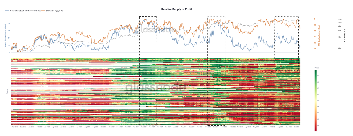
The Relative Supply in Profit heatmap (Figure 2) maps across the top 500 assets, showing the share of supply held at a gain. High values (green) mark broad unrealised profits and distribution pressure, while low values (red) indicate capitulation and loss.
This second example, shown in Figure 2, applies the same framework to an on-chain metric: relative supply in profit, which measures the share of each asset’s circulating supply held at a gain. High readings signal broad unrealised profits and potential distribution pressure, while low readings indicate capitulation.
Around March and April 2024, this metric flashed a clear warning. Nearly every asset displayed high relative profits, the heatmap showing uniform green across the entire market. The result was a broad six-month correction across Bitcoin and altcoins as sustained profit taking occurred. The same pattern re-emerged around December 2024 and January 2025, again preceding a market-wide top. A deep altcoin correction followed for several months, with relative profit across the board steadily trending toward the lows. Looking back to 2023, we see similar patterns: periods of broad relative profitability mark market-wide tops.
In contrast, the most recent data show a split picture. A small cluster of large-cap assets like Bitcoin, Ethereum, and a few others remains strongly green, while most of the market sits deep red. Bitcoin is at all-time highs, yet the wider landscape shows exhaustion rather than euphoria.
This divergence highlights how the Multi-Asset Explorer surfaces asymmetric strength and rotation, where capital concentrates in majors while the rest of the market consolidates.
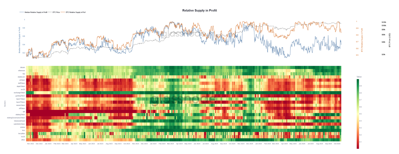
Figure 3 shows the agggregate relative profitability by sector. Profits are concentrated in Bitcoin, Ethereum, and large caps, while sectors such as DeFi, AI, and gaming remain deep in loss.
By enabling the Sector View, we can immediately identify in which sectors, on aggregate, the relative profits currently lie. Bitcoin, Ethereum, and top market cap coins are showing high relative profits, while categories such as memes, DeFi, AI, and gaming tokens are deeply red, indicating a very low amount of relative supply in profit and a lot of pain for investors. We can also identify periods during which profits rotate from one sector to another.
Identifying Capitulation and Market Bottoms
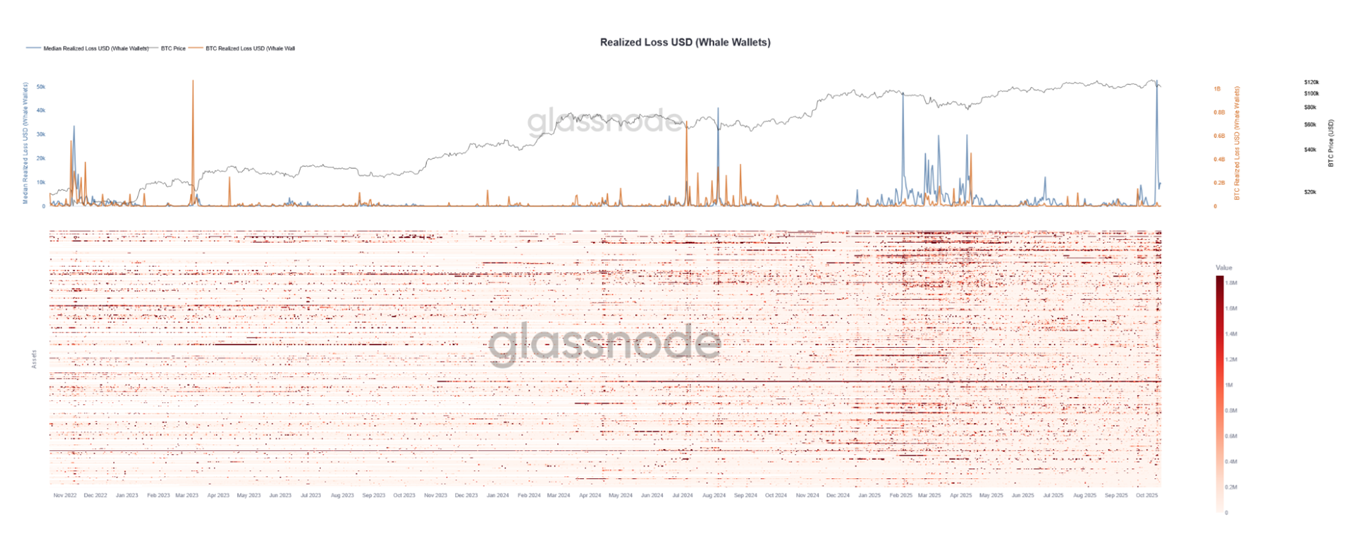
In our next example, Figure 4 maps out the aggregate realised losses for large holders across major assets. Sharp spikes mark periods of capitulation, particularly among altcoin investors, while Bitcoin holders remained comparatively stable.
To identify when markets form local or global bottoms, we can observe periods in which large volumes of losses are realised, using Glassnode’s Realized Loss metric. In this case, we focus on holders with substantial balances (whales) for each asset. When these large entities are forced to capitulate into down-moves and significant losses are realised, it often creates conditions for new buyers to finally step in and reverse the downtrend.
As shown in Figure 4, the Multi-Asset Framework captures several events during which altcoin investors realise significant losses in aggregate, while Bitcoin holders do not. This highlights the value of viewing market stress through aggregate altcoin metrics rather than analysing Bitcoin in isolation.
Tracking Market Entrants and Exits
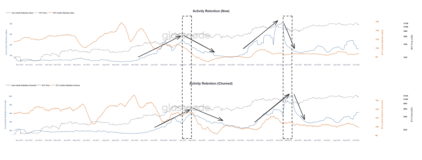
Here, we map the aggregate on-chain activity of new and departing participants across all altcoins. The top panel shows the inflows of new wallets late in market cycles, while the bottom panel captures their rapid exit during downturns and eventual stabilization near market bottoms. Heatmaps are omitted for simplicity.
Our final example demonstrates how a multi-asset view can reveal the behavioral dynamics of the market through on-chain activity. Figure 5 highlights the most recent 2 altcoin market tops, which were preceded by a significant, market-wide altcoin rally. It shows Activity Retention across altcoins ranked between 5 and 500 by market capitalization.
In the top panel (Activity Retention – New), we track the aggregate number of new wallets interacting with these altcoins. The spikes represent the arrival of new participants across the market. Historically, such surges tend to occur in the later stages of market cycles, as enthusiasm peaks and retail inflows accelerate. These new entrants often arrive near local or global tops, while experienced holders take profits and liquidity rotates out of higher-risk assets.
The bottom panel (Activity Retention – Churned) reflects the opposite dynamic, showing wallets that drop out of activity after entering the market. Sharp increases in churn usually follow the peaks in new participation, illustrating how late entrants are quickly washed out during downtrends.
Notably, periods where the churn curve flattens, when most of the new participants have already exited, often align with market bottoms. At these points, speculative excess has been cleared, leaving a more stable base of long-term holders and setting the stage for renewed growth.
Together, the two panels outline a full participation cycle: the inflow of new demand at the top and the capitulation of that same cohort at the bottom. These patterns become visible only through an aggregated, multi-asset perspective, a view uniquely enabled by the Multi-Asset Explorer.
It is also worth noting that Bitcoin’s participation profile looks markedly different. While the altcoin aggregate shows three distinct waves of new entrants, Bitcoin exhibits only a single large ramp followed by a smaller secondary wave. This contrast illustrates how on-chain behaviour varies across the market and why analysing altcoins separately can uncover dynamics that remain hidden in Bitcoin-focused views.
Sector-level and Market-wide Insight
The Multi-Asset Explorer brings together Glassnode’s full spectrum of data, including on-chain behaviour, derivatives activity, and sector-level structure, into a single analytical system. It complements our single asset charts with a coherent, comparative framework that helps users understand the market as a connected whole. This is a novel analytical approach, and early adopters have an edge in being the first to explore and interpret the data in this way.
We encourage users to explore the tool, experiment with sectors and metrics, and share feedback as we continue to expand its capabilities. New metrics can also be added, provided they are available for a sufficiently large number of assets. The Multi-Asset Explorer is currently limited to daily resolution, but users can make use of Glassnode’s bulk endpoint to conveniently obtain multi-asset data with up to 10 minute resolution.
Analysts and traders can apply this framework to build market-wide strategies and signals, identifying crowding, dispersion, or cyclical extremes. We also welcome collaboration on which metrics best serve different use cases and invite users to engage with these datasets through the bulk data endpoints, designed specifically for such research.
- Follow us on X for timely market updates and analysis
- Join our Telegram channel for regular market insights
- For on-chain metrics, dashboards, and alerts, visit Glassnode Studio
Disclaimer: This report is for informational and educational purposes only. The analysis represents a limited case study with significant constraints and should not be interpreted as investment advice or definitive trading signals. Past performance patterns do not guarantee future results. Always conduct thorough due diligence and consider multiple factors before making investment decisions.