Executive Summary
- Market demand-side remains lacklustre for digital assets, with the magnitude of both capital inflows and outflows remaining small in scale.
- HODLing remains the primary investor dynamic, with all measures of actively tradable supply declining and large volumes of coins maturing into Long-Term Holder status.
- Price action has been remarkably stagnant over the past six months, driving all variants of the Sell-Side Risk Ratio to low levels, suggesting an expectation for higher volatility ahead.
Demand Side Wanes
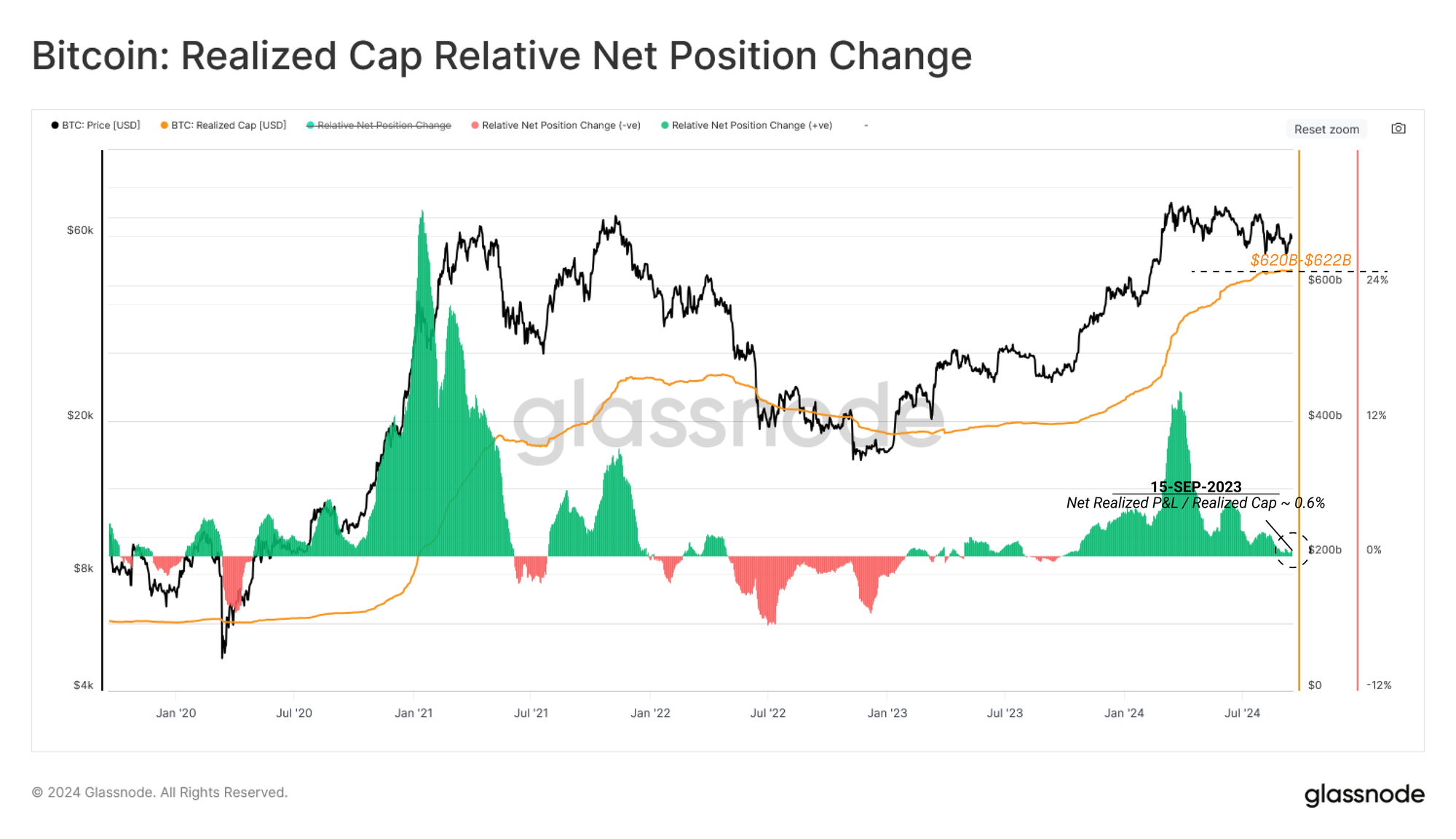
The Realized Cap is a foundational metric that provides an assessment of the cumulative capital netflow into and out of the Bitcoin network.
With the market trading in a downward but range-bound manner for the last six months, both capital inflows and outflows have ground to a halt. The Realized Cap has peaked and plateaued at $622B in the previous two months. This suggests that the majority of coins that are being transacted are doing so within proximity of their original acquisition price.
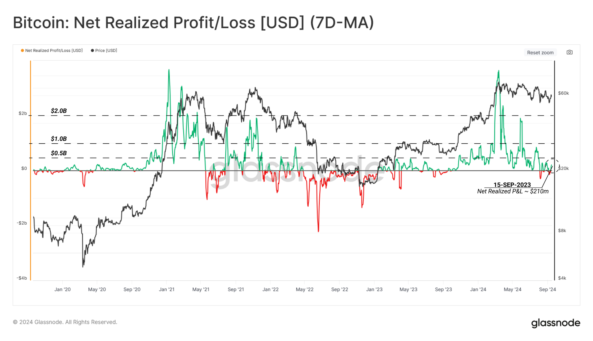
By assessing the Net Realized Profit / Loss metric, we can visualize the Realised Cap's first derivative, the daily change in onchain capital flows for Bitcoin. When this metric is positive, it represents net capital creation (coins transacting in profit) or destruction when the metric is negative (coins moving at a loss).
At present, we can see that both profit and loss forces are largely equal, resulting in a marginal netflow and a general oscillation around the zero bound. This alludes to a degree of equilibrium being established in the market and has some similarities to the Aug-Sep period in 2023.
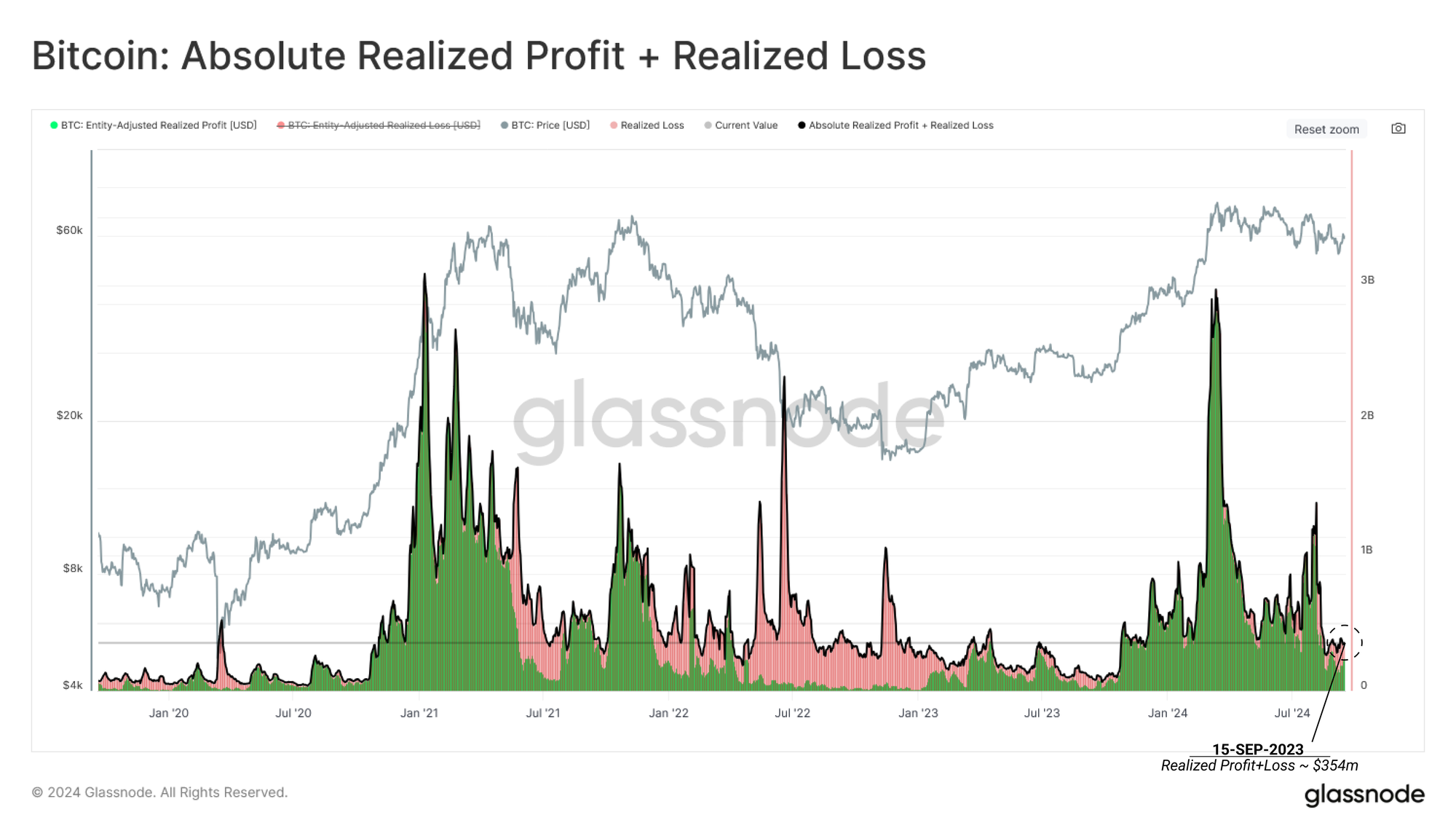
We can consider the Realized Profit and Loss as a measure of the excess capital required for a seller to part ways with their coin. Thus, under this framework, we can utilize this metric as a proxy for gauging market demand by evaluating the seller's willingness to transact at a premium (profit) or a discount (loss).
The absolute Realized Profit plus Loss has declined significantly since the March ATH, implying that there has been a reduction in overall buy-side pressure within the current price range.
Supply Side Constricts
Having assessed the demand side of the market, it becomes prudent to gauge measures of the supply side to provide a holistic analysis of the two opposing market forces.
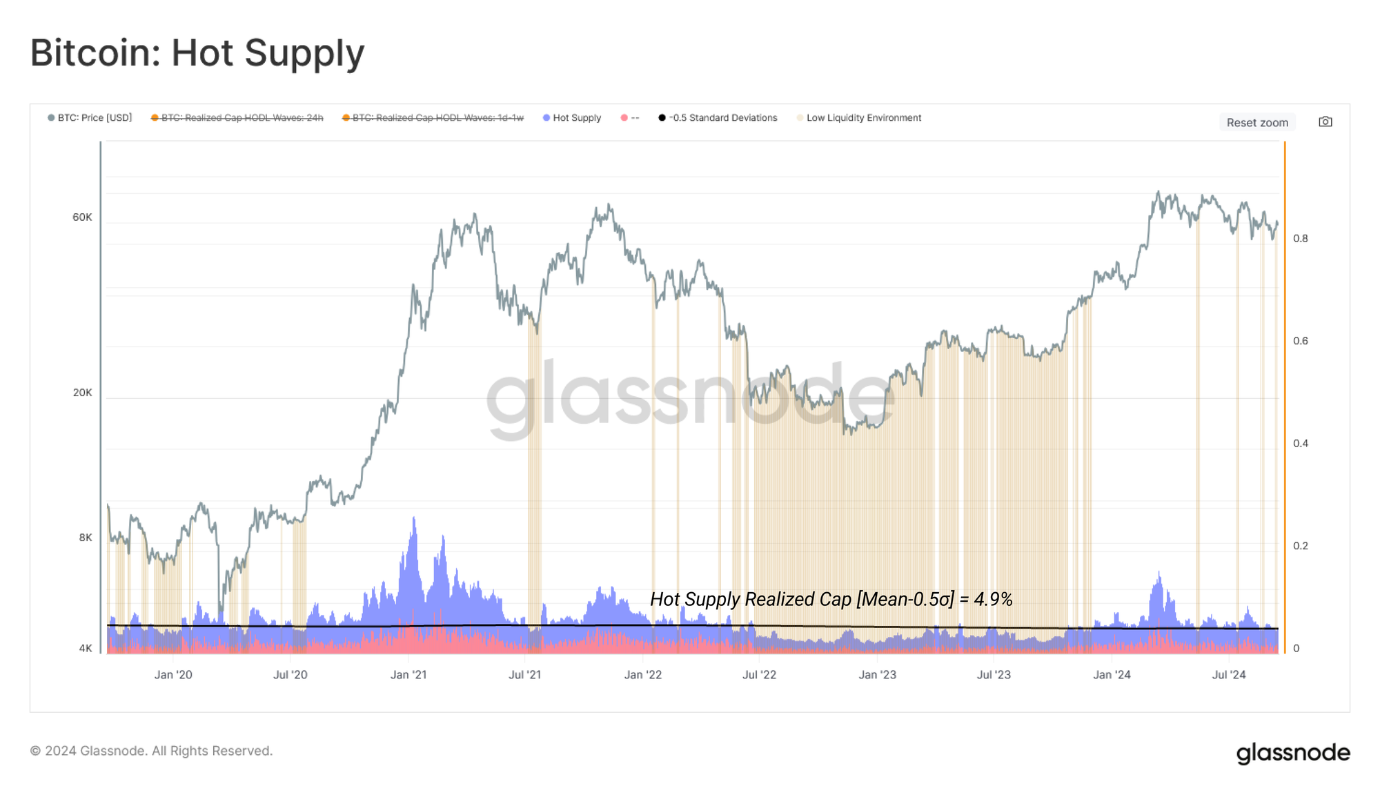
The ‘Hot Supply’ metric is one proxy we can use to estimate the coins readily available to trade and transact. This supply volume represents the wealth held within coins aged one week or less. Leaning on the assumption that a short holding time in the market increases the probability that the coin will transact again, as discovered in our study of Long and Short-Term Holders, we consider this distinct age group as one of the most readily available in response to market fluctuations.
The wealth currently held by coins aged less than one week has declined into the low liquidity zone, accounting for just 4.7% of the aggregate network wealth. This highlights a continually constricting supply side, as the vast majority of coins are aged older than one week.
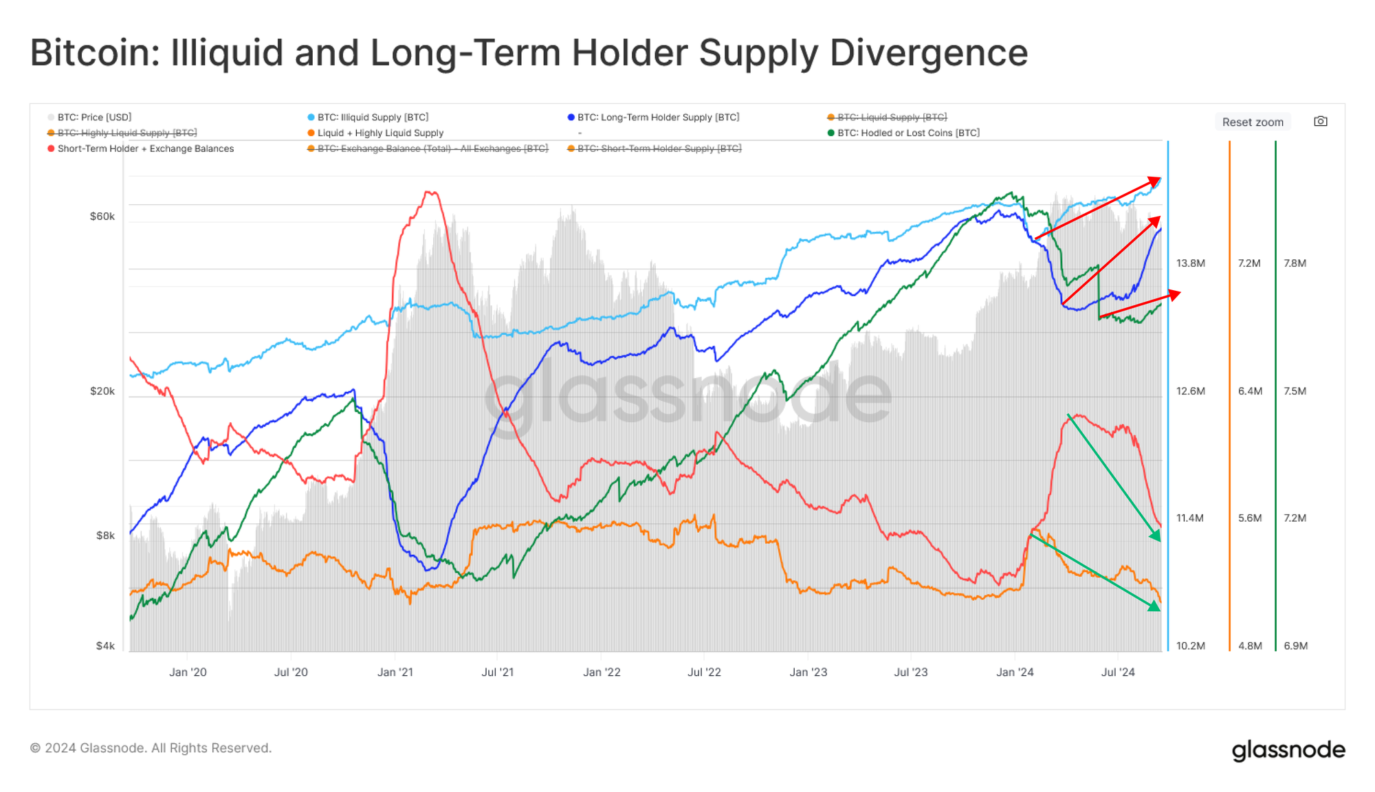
We see a similar story told via the supply divergences chart. Here, we profile several measures of ‘available supply,’ such as Short-Term Holder and Highly Liquid supply. We compare this against measures of ‘saved or stored supply’ such as Long-Term Holder or Vaulted supply.
One observation is the prevalence and dominance of HODLing behaviour amongst market participants, leading to a rapid increase in ‘stored supply.’ This speaks to an overall tightening supply side as the volume of coins available to actively transact continues to reduce.
Stablecoin Liquidity Rises
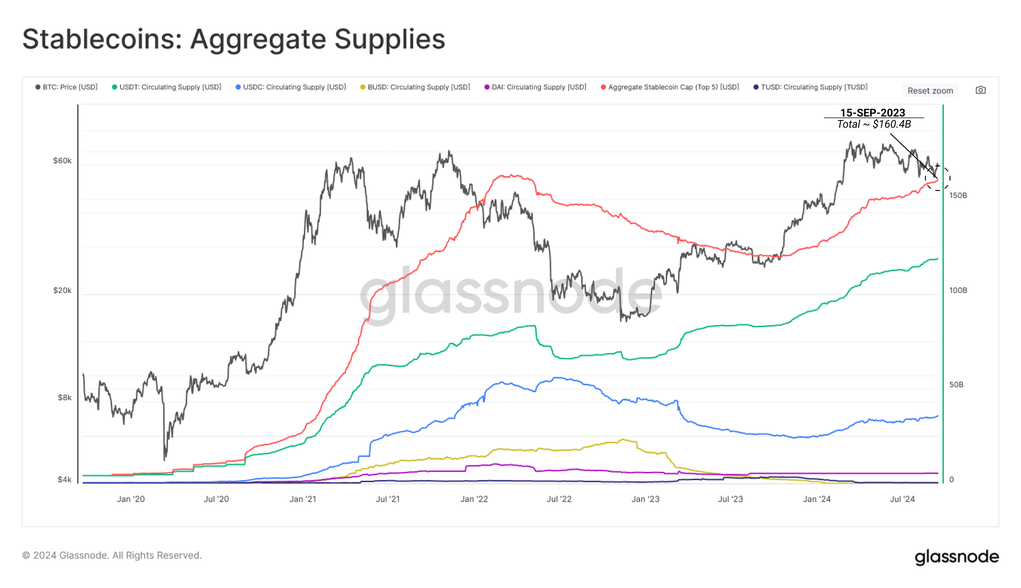
Stablecoins remain the preferred quote currency on both centralized and decentralized exchanges. As such, the growth in total stablecoin capital can be utilized as a proxy for investor demand and appetite.
The Aggregate Stablecoin Supply is on the rise, residing just under the ATH at $160.4B. This can be considered as a constructive sign suggesting the build-up of crypto-native dollar-denominated capital, which is easily able to be exchanged into digital assets. However, we can also infer that this Stablecoin capital is not actively rotating into risk assets at this stage.
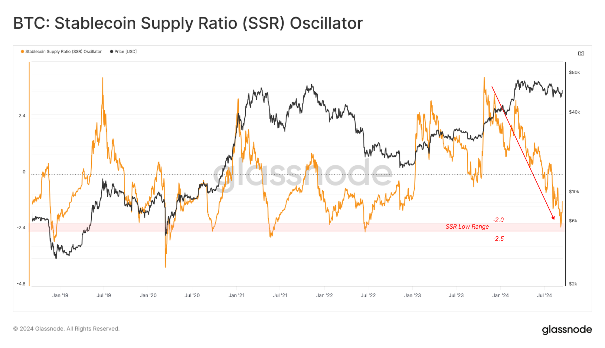
The SSR Oscillator compares the Market Capitalization of Bitcoin against the total circulating stablecoin supply. This can be considered under the following interpretation:
- When the SSR is low, the current stablecoin supply has more "buying power" to purchase BTC
- When the SSR is high, the current stablecoin supply has less "buying power" to purchase BTC
The divergence between a range-bound Bitcoin market cap and a growing stablecoin supply has pushed the SSR Oscillator to a historic low. This suggests that investor stablecoin-based buying power is increasing, with a recursive effect where higher purchasing power can lead to an improving demand side in the future.
Heightened Volatility Expectations
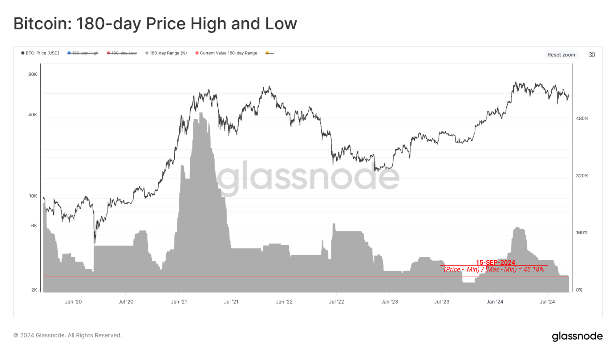
With price action oscillating within a well-defined range over the last six months, volatility begins to tighten and compress, akin to a coiling spring. After such a lengthy period without a significant macro movement, there is a growing expectation for higher volatility on the road ahead.
We can gauge the compression of market volatility by measuring the percent range between the highest and lowest price ticks over the last 180 days. By this metric, only Aug 2023 and May 2016 exhibit a tighter 180-day price range. This highlights the relative tightness of the current market structure.
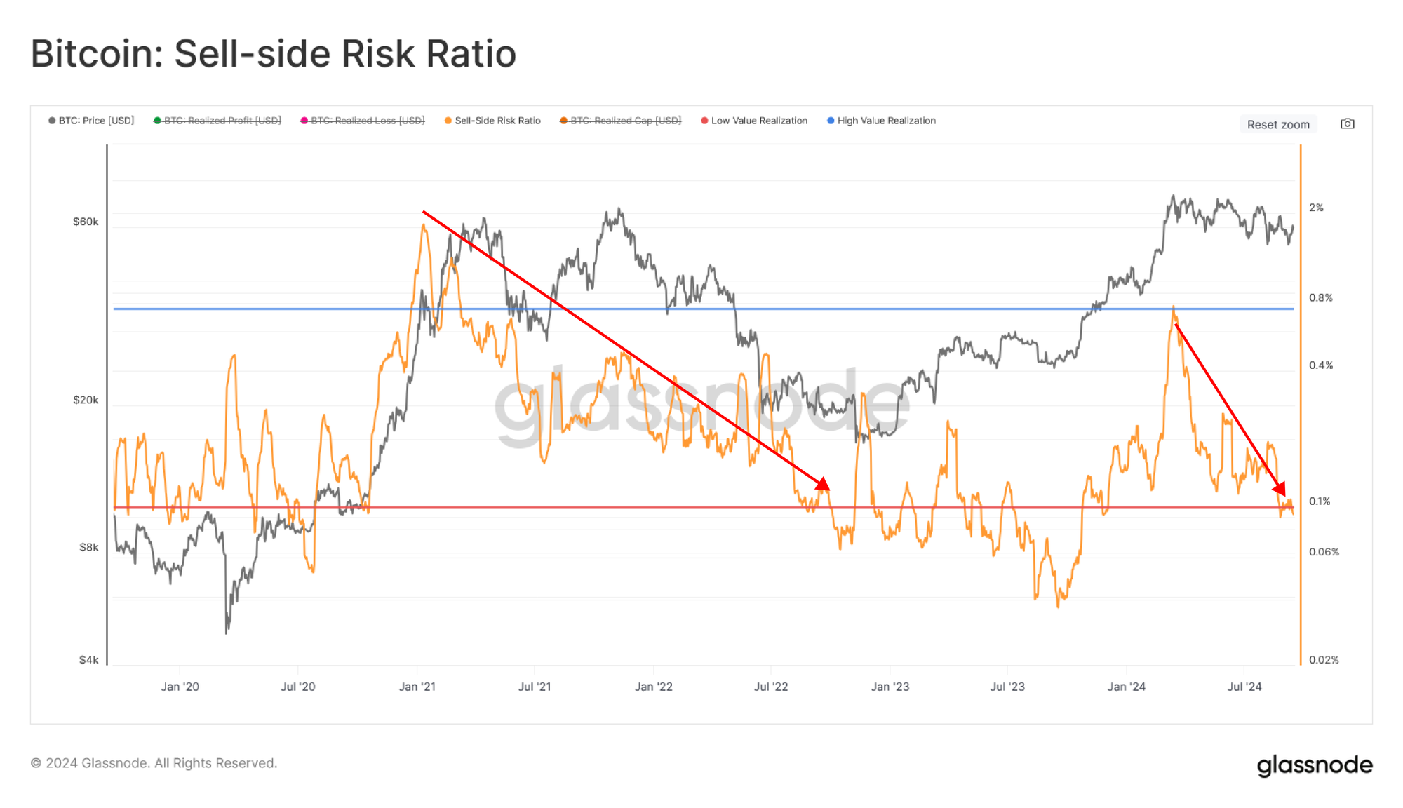
We can support this volatility assessment by using the Sell-Side Risk Ratio. This tool assesses the absolute sum of realized profit and loss locked in by investors relative to the asset size (the Realized Cap). We can consider this metric under the following framework:
- High values indicate that investors spend coins at a significant profit or loss relative to their cost basis. This condition indicates that the market likely needs to re-find equilibrium and usually follows a high volatility price move.
- Low values indicate that most coins are being spent relatively close to their break-even cost basis, suggesting a degree of equilibrium has been reached. This condition often signifies an exhaustion of ‘profit and loss’ within the current price range and usually describes a low volatility environment.
The Sell-Side Risk Ratio has now dropped below the low-value band, suggesting minimal profit and loss-taking is occurring within the current range. The interpretation here is that equilibrium has been reached, and there is a need for further range expansion to incentivize investors to spend their coins (take profit or loss).
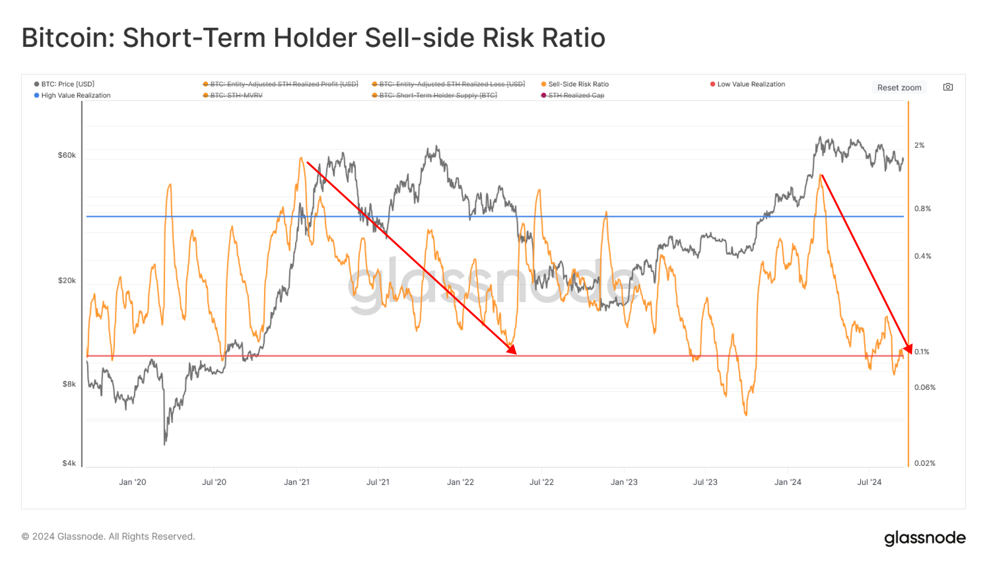
The above assessment is held solely when assessing the Short-Term Holder cohort. Historically, the STH Sell-Side Risk is at one of its lowest values, highlighting a remarkable absence of demand for new investors.
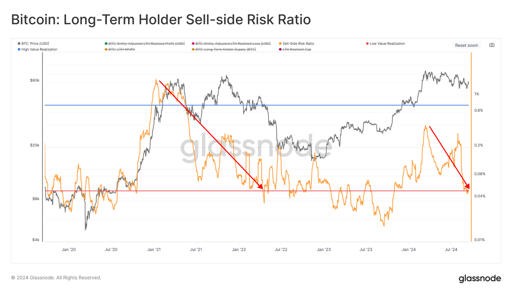
Similarly, the Long-Term Holder Sell-Side Risk Ratio has also dropped below its low-valuation band, suggesting that even mature investors have slowed their onchain interactions within the current price range.
Summary and Conclusions
The current state of the Bitcoin market is one of equilibrium and reduced activity. On the demand side, capital flows have slowed significantly, and the Realized Cap remained effectively unchanged over the last two months.
Simultaneously, the supply side is tightening, and there is a notable decline in readily available coins. However, the uptick in stablecoin supplies carries more future purchasing power, creating tension between current inactivity and potential future demand. This creates a sort of coiled-spring effect in the market and alludes to a regime of higher volatility on the road ahead.
Disclaimer: This report does not provide any investment advice. All data is provided for information and educational purposes only. No investment decision shall be based on the information provided here and you are solely responsible for your own investment decisions.
Exchange balances presented are derived from Glassnode’s comprehensive database of address labels, which are amassed through both officially published exchange information and proprietary clustering algorithms. While we strive to ensure the utmost accuracy in representing exchange balances, it is important to note that these figures might not always encapsulate the entirety of an exchange’s reserves, particularly when exchanges refrain from disclosing their official addresses. We urge users to exercise caution and discretion when utilizing these metrics. Glassnode shall not be held responsible for any discrepancies or potential inaccuracies. Please read our Transparency Notice when using exchange data.
- Join our Telegram channel.
- For on-chain metrics, dashboards, and alerts, visit Glassnode Studio
- For automated alerts on core on-chain metrics and activity on exchanges, visit our Glassnode Alerts Twitter