# Пов'язані статті щодо Visual Identity

Центр новин HTX надає останні статті та поглиблений аналіз на тему "Visual Identity", що охоплює ринкові тренди, оновлення проєктів, технологічні розробки та регуляторну політику в криптоіндустрії.

From Logo to Bo Niu: TRON Further Perfects Its Brand Visual Assets

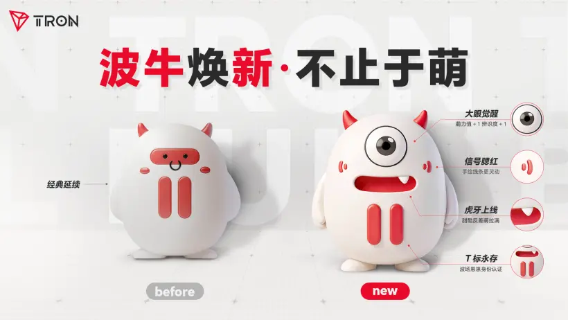
On June 23rd, TRON completed a significant upgrade to its official mascot, Bo Niu. The revamped character features larger, brighter eyes, more expressive facial details, and a clearer "T" structural motif, while retaining its signature red-and-white color scheme and horned design. This refresh aims to enhance Bo Niu's approachability, emotional range, and versatility for use across social media, community interactions, offline events, and branded merchandise. The redesign focuses on creating a stronger first impression. A more open facial structure with distinct, expressive eyes and the addition of a mouth with a small fang make the character friendlier and more suitable for dynamic content like animations and emojis. Subtle brand elements are integrated, such as stylized cheek lines inspired by "signal" icons, referencing the "wave" in "TRON," and a "T" shape formed by its smile and chest markings. Bo Niu has also been given a more defined personality as "TRON's Chief Luck Officer," with traits like being playful and sweet. This persona provides a more accessible and emotionally resonant entry point to the TRON brand, contrasting with often technical Web3 narratives. This mascot upgrade is part of TRON's ongoing effort to build a comprehensive and extensible visual identity system, following its recent logo refresh. Bo Niu is positioned as a key asset to connect with users, foster community, and convey brand warmth in everyday contexts.

marsbit06/23 06:46

From Logo to Bo Niu: TRON Further Perfects Its Brand Visual Assets

marsbit06/23 06:46

TRON Refreshes the Bull Image, Creating a More Approachable Brand Character

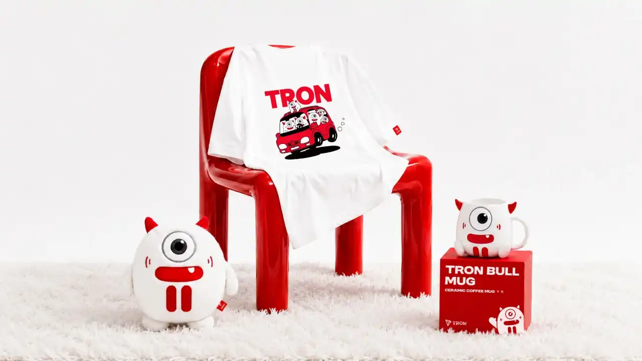
TRON's official mascot "BONiu" (Wave Bull) has received a comprehensive visual upgrade. Retaining its core red-and-white color scheme, horned silhouette, and brand DNA, the refreshed character features larger, brighter eyes, more expressive facial details including a mouth with a small fang, and enhanced emotive capabilities. The redesign aims to strengthen the mascot's亲和力, emotional expressiveness, and adaptability across various scenarios. Key updates include a clearer facial structure for instant recognition, a simplified and more intuitive五官 design, and the integration of subtle brand language. The cheek blushes are now inspired by a "signal" icon, while the smile and chest lines form a stable "T" structure, creating a cohesive超级符号 for the brand. The character has also been equipped with a 12-phoneme lip-sync system to support future动画 and interactive content. Beyond its visual role, BONiu's persona has been enriched. Now titled "TRON's Chief Luck Officer," it carries playful personality tags like "foodie enthusiast" and "full-of-tricks," allowing it to engage with the community in a more approachable and relatable manner. This update provides a lower-barrier, emotionally warm entry point for users amidst the often technical and abstract narratives of Web3. This mascot revamp is part of TRON's ongoing effort to refine its visual asset system, following the earlier logo update. By evolving from a static visual into a dynamic, expressive brand角色, the new BONiu is positioned to become a key asset for connecting with users, building brand记忆, and conveying TRON's personality across社交传播, community互动,线下活动, and merchandise.

链捕手06/23 06:30
TRON Refreshes the Bull Image, Creating a More Approachable Brand Character

链捕手06/23 06:30

活动图片