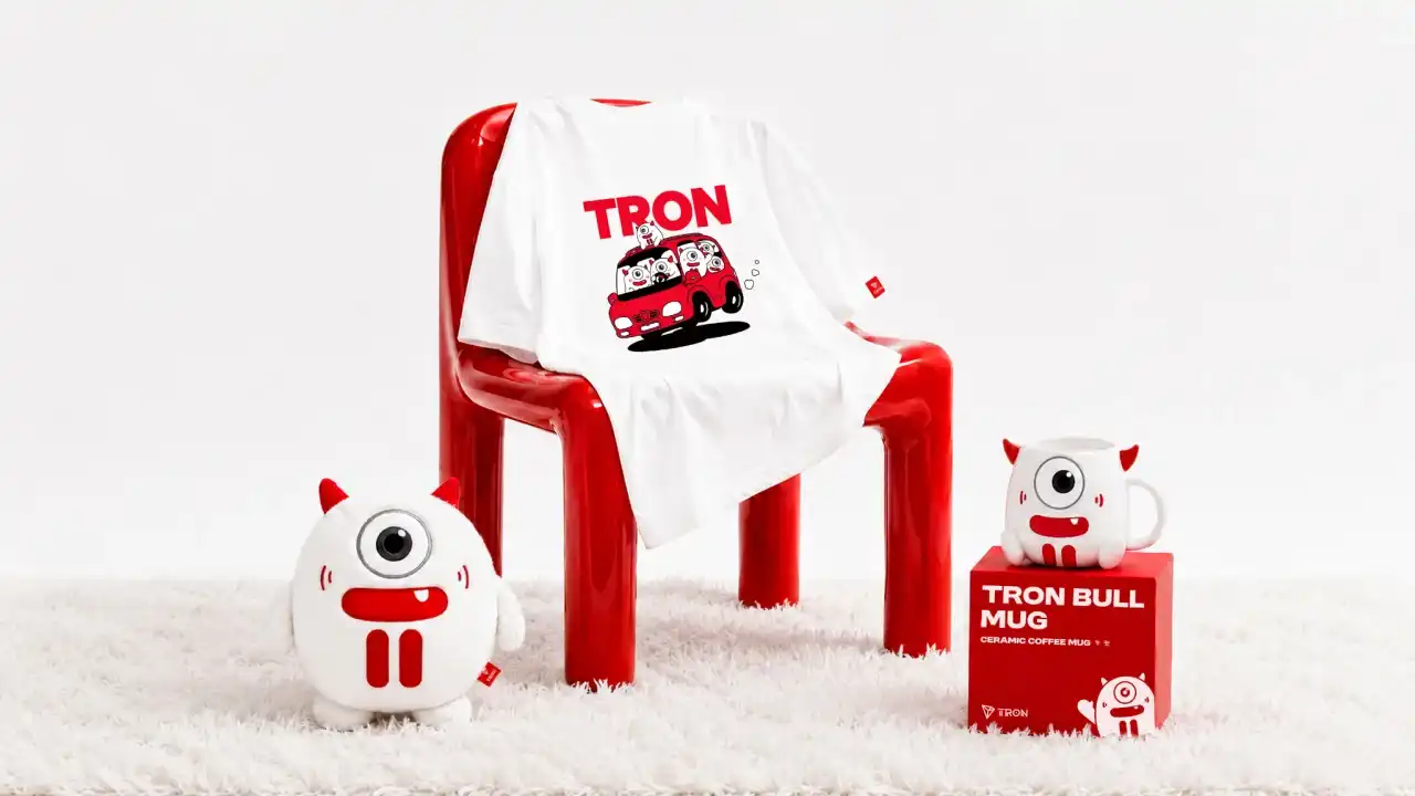
From Logo to Bo Niu: TRON Further Perfects Its Brand Visual Assets
On June 23rd, TRON completed a significant upgrade to its official mascot, Bo Niu. The revamped character features larger, brighter eyes, more expressive facial details, and a clearer "T" structural motif, while retaining its signature red-and-white color scheme and horned design. This refresh aims to enhance Bo Niu's approachability, emotional range, and versatility for use across social media, community interactions, offline events, and branded merchandise.
The redesign focuses on creating a stronger first impression. A more open facial structure with distinct, expressive eyes and the addition of a mouth with a small fang make the character friendlier and more suitable for dynamic content like animations and emojis. Subtle brand elements are integrated, such as stylized cheek lines inspired by "signal" icons, referencing the "wave" in "TRON," and a "T" shape formed by its smile and chest markings.
Bo Niu has also been given a more defined personality as "TRON's Chief Luck Officer," with traits like being playful and sweet. This persona provides a more accessible and emotionally resonant entry point to the TRON brand, contrasting with often technical Web3 narratives.
This mascot upgrade is part of TRON's ongoing effort to build a comprehensive and extensible visual identity system, following its recent logo refresh. Bo Niu is positioned as a key asset to connect with users, foster community, and convey brand warmth in everyday contexts.
marsbit06/23 06:46