Options markets encode information about how participants expect prices to move. With the release of our interpolated IV metrics earlier this year, users gained access to a clean, structured volatility surface across deltas and maturities.
Now, we are extending that foundation with a new set of metrics that track how implied volatility evolves over time: the IV Moneyness Heatmap and the IV Delta Heatmap.
These metrics allow you to observe how the market prices expected movement across strikes and maturities; not just at a single point in time, but across weeks, months, and years.
Explore the live metrics in Glassnode Studio. Now available to Professional plan users for all major liquid markets, with 10-minute, hourly, and daily resolutions.
From Snapshots to Regimes
A single IV curve gives insight into how the market is pricing risk right now. But since markets are dynamic, a snapshot view misses the broader context: Was volatility rising or falling into this point? Has the skew been shifting gradually or did it change suddenly?
The IV Heatmap captures these dynamics by plotting implied volatility across strikes over time. Instead of a single curve, it provides a continuous map that reveals volatility regimes: extended periods of calm, episodes of stress, and the transitions between them.
This allows us to observe how the market priced the buildup to a major move, how quickly fear dissipated after a drawdown, or whether elevated put demand persisted for days or weeks. Such patterns are hidden in a single snapshot view.
The IV Moneyness Heatmap
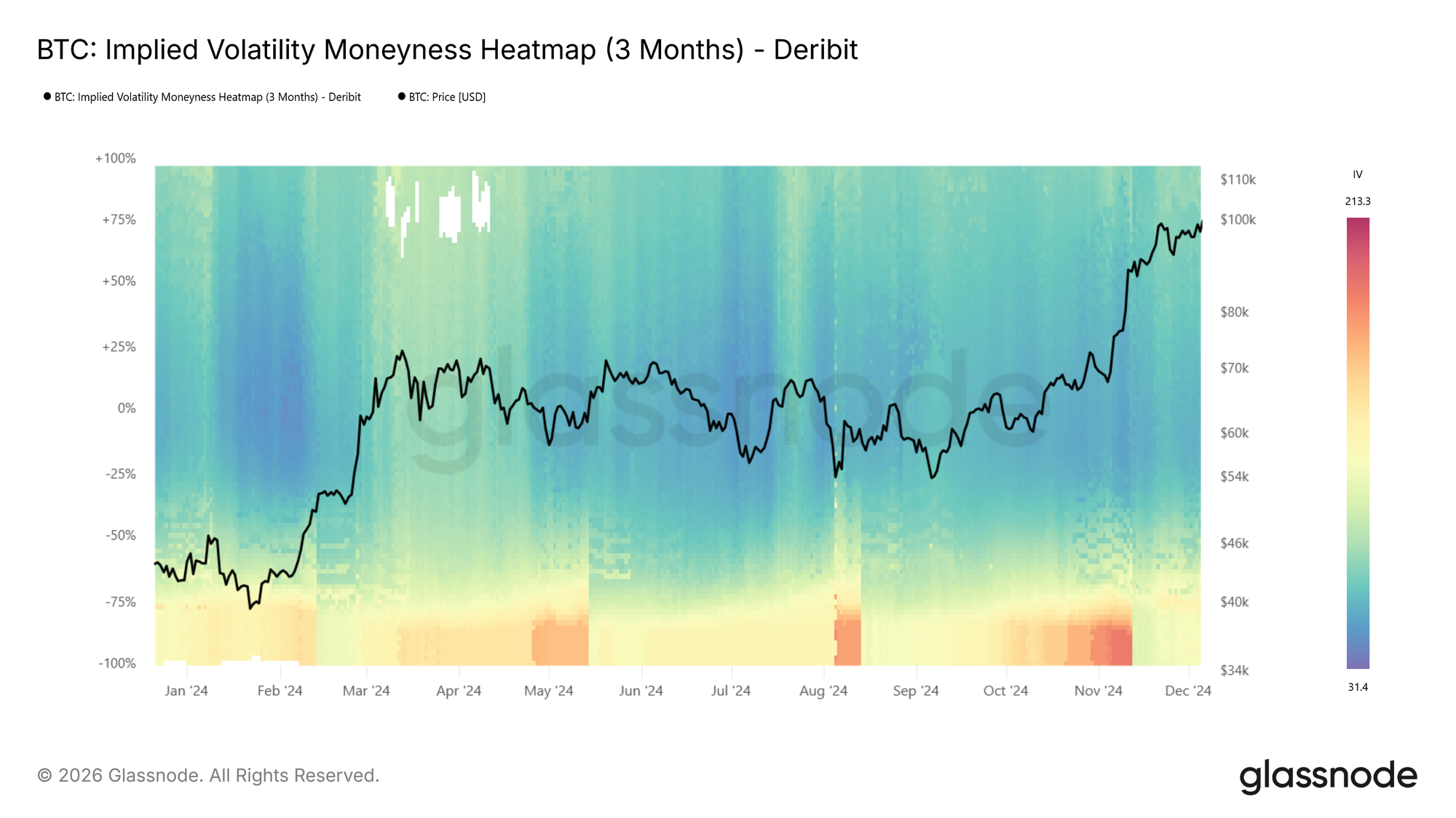
The moneyness heatmap plots implied volatility as a function of distance from spot price (% from spot) over time. Moneyness ranges from -100% to +100%, with puts below the center line (negative moneyness) and calls above it (positive moneyness). The at-the-money level runs horizontally through the middle. Warmer colors (red to dark red) indicate higher IV, while cooler colors (blue to dark blue) indicate lower IV.
IV is sampled at each target maturity and interpolated across moneyness to produce a smooth, continuous surface. The metric is available at four standardized tenors (1 week, 1 month, 3 months, and 6 months) with lookback windows ranging from 1 month to the full available history.
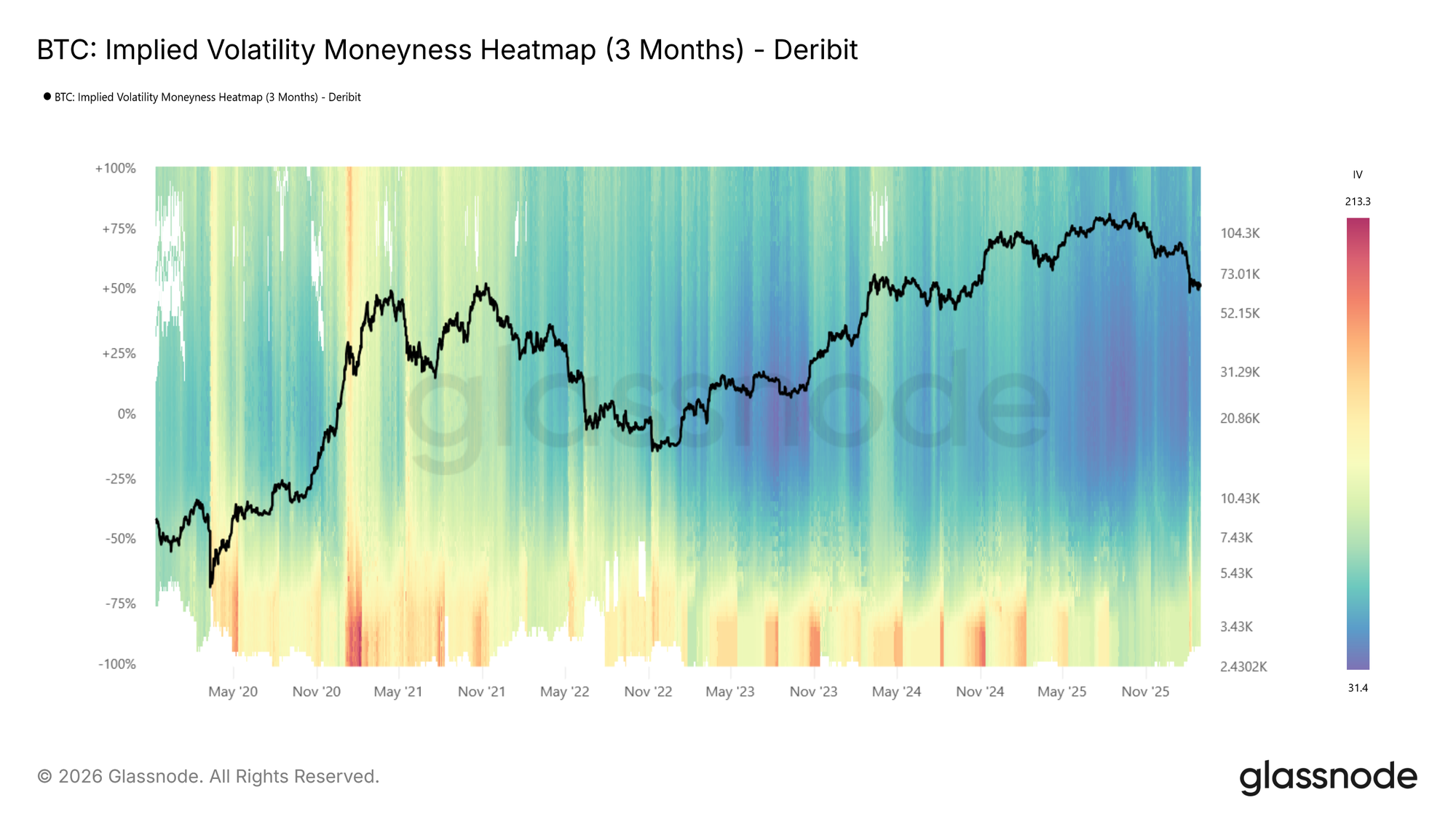
Looking at the BTC moneyness heatmap (3m tenor), volatility regimes are clearly visible: elevated IV in 2021, a return to high volatility in spring 2024 and again around the turn of 2025, followed by a sharp compression into a very low-vol environment (dark blue).
How to read it:
- Dark blue across both sides indicates a low-volatility regime, where the market expects limited movement.
- Red bands on the put side (below center) signal elevated demand for downside protection.
- Asymmetry between the put and call sides reflects directional skew, showing how much more the market is willing to pay for protection versus upside exposure.
- Vertical color shifts, or abrupt changes in intensity across all moneyness levels, mark regime transitions.
The IV Delta Heatmap
The moneyness heatmap shows IV at fixed distances from spot, a natural and intuitive way to view the surface. The same information can also be expressed in terms of delta, which normalizes each strike by its probability of expiring in the money. The IV Delta Heatmap applies this representation, built on the interpolated IV metrics described in this metric launch article. Deltas range from 5D puts to 50D (at-the-money) to 5D calls, across the same tenors and lookback windows.
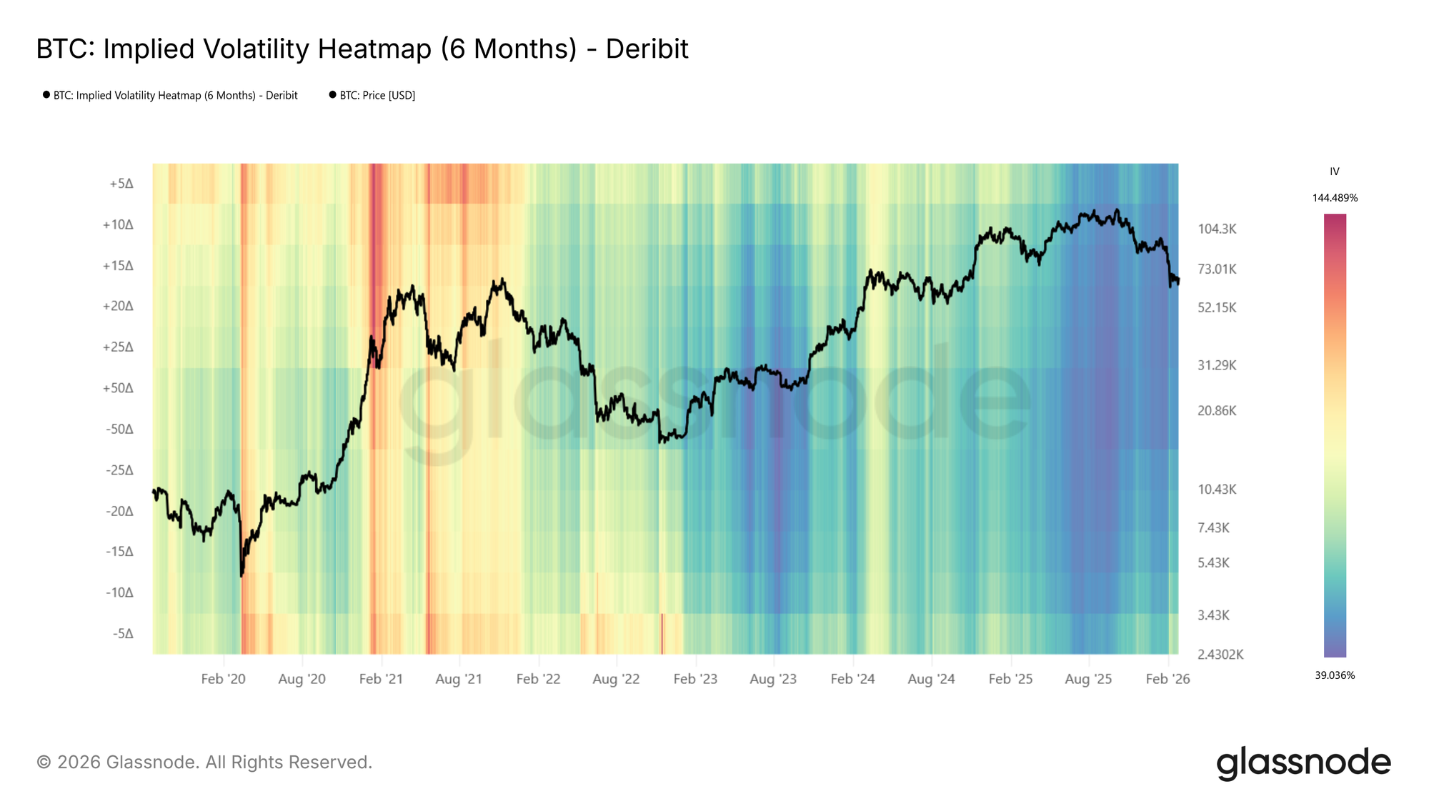
Examining the BTC delta heatmap (6m tenor), one notable feature emerges: during the 2021 bull run, call-side IV (above center, particularly the 5D call region) was significantly elevated compared to put-side IV. The market was pricing in large upside moves, reflecting the euphoric momentum of that period. This call-side dominance is a pattern that tends to appear during strong rallies and is clearly visible in the delta representation.
Reading the Heatmap: Patterns and Implications
Below, we identify some of the primary observable patterns in the heatmaps, describe how they present, and outline their practical relevance.
Elevated Put-Side IV: Risk Hedging in Action
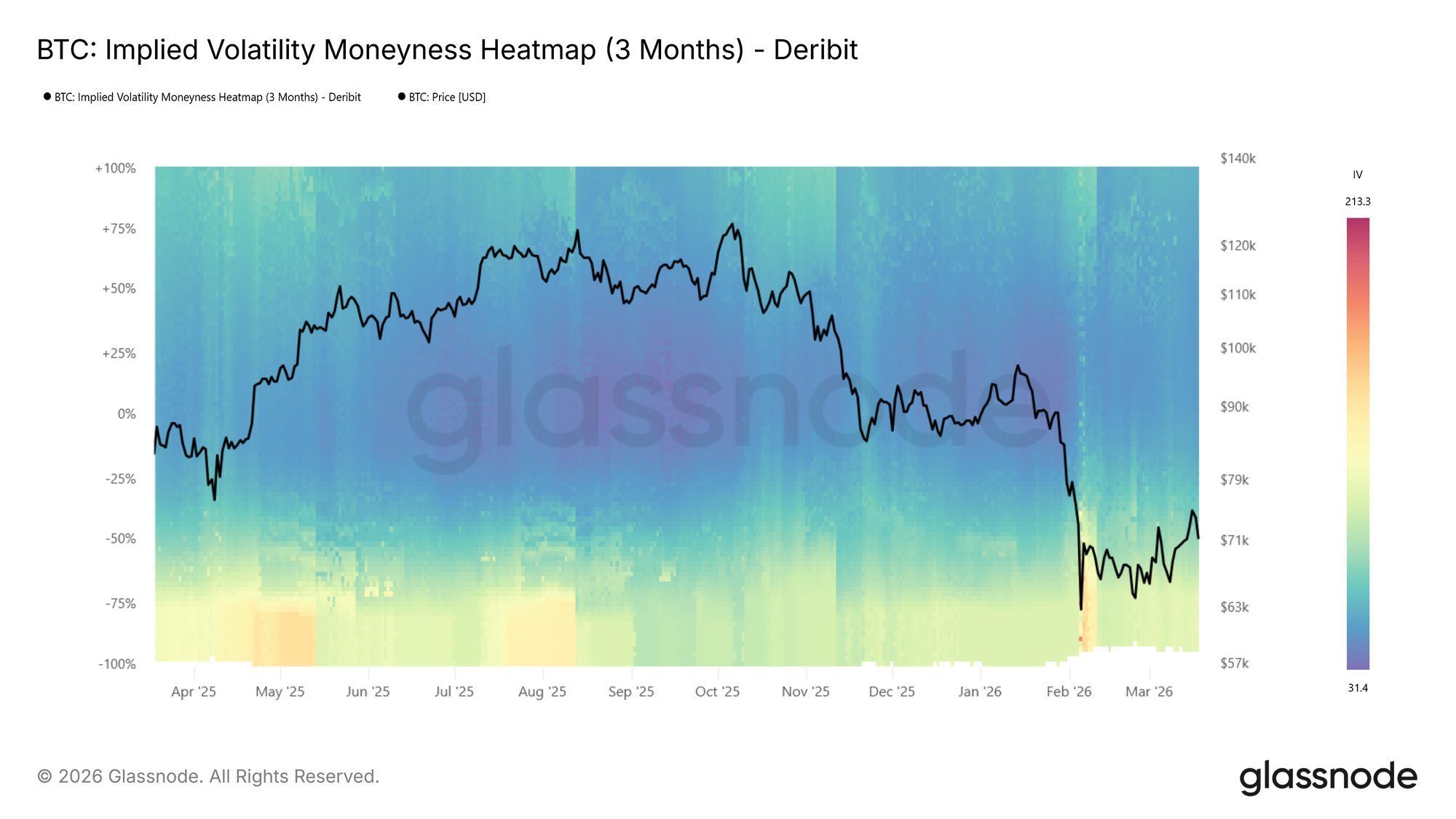
During the recent drop to $60k the put side IVs spiked strongly, shown by the transition to warm colours on the put side as price moved lower in the BTC moneyness heatmap (3m tenor) above.
During sharp drawdowns, risk hedging activity increases. Put demand rises as participants seek downside protection, pushing implied volatility higher on the put side. On the heatmap, this appears as a warm band emerging below the center line where colors were previously neutral, often intensifying to dark red as price falls further.
This is also reflected in rising expected price dispersion. Higher IV across a broader range of strikes signals growing uncertainty about where price will settle.
📈 Trading implications: Elevated put-side IV during drawdowns confirms active hedging demand. If the red band persists, the market is pricing continued risk. If it fades quickly, fear may be receding.
Tail Risk Repricing: When Outer Strikes Light Up
Sometimes the most telling signal is not where IV is already elevated, but where it wasn’t and suddenly is. During calm markets, deep OTM strikes tend to show very low IV because few participants are actively pricing or hedging at those levels. When that changes, and previously dark regions of the heatmap begin to brighten, the market is repricing tail risk.
This is distinct from a general rise in volatility. A broad increase lifts the entire surface. Tail repricing, by contrast, shows up as the warm band widening vertically into moneyness levels that had been ignored. Participants are starting to consider outcomes they had previously deemed too unlikely to hedge against.
📈 Trading implications: Watch the edges of the heatmap. If warm colors begin creeping into deep OTM levels that were previously dark blue, the market is assigning meaningful probability to larger moves. On the put side, this typically accompanies severe stress as participants hedge against outsized drawdowns. On the call side, the same pattern can emerge during euphoric rallies as the market starts pricing in large upside moves.
Low-Volatility Regimes: Cheap Protection, Expensive Later
Extended periods of subdued IV appear as dark blue across the heatmap. These regimes often correspond to consolidation phases, where the market expects limited movement in either direction.
📈 Trading implications: Crucially, low IV means option premiums are compressed. For hedgers, this presents an opportunity: downside protection via puts is relatively cheap, making it an attractive time to insure portfolios. For directional traders, buying options (calls or puts) in a low-vol environment is a pure volatility play: if IV expands, the position benefits regardless of direction.
However, prolonged compression often precedes volatility expansion. Here, it makes sense to watch for the first signs of color shifting from dark blue toward red as an early warning.
High-Volatility Regimes: Income Generation
The inverse holds as well. When the heatmap is dominated by warm colors across a wide range of strikes, option premiums are elevated. This creates opportunities for income-oriented strategies: selling options (covered calls, cash-secured puts) captures rich premiums, and benefits from the eventual mean-reversion of volatility back toward lower levels.
At BTC moneyness heatmap (3m tenor) below, we see an example showing a transition from hot (red) to cool (blue), e.g., the local top in spring 2024 followed by IV compression.
Regime Transitions
The most actionable signals often come at transition points: when the heatmap shifts from blue to red (or vice versa) across multiple moneyness levels simultaneously. Unlike a transient spike that fades within a day or two, a regime transition is a sustained shift in the baseline level of expected volatility.
📈 Trading implications: Regime shifts warrant reassessing position sizing, hedge ratios, and strategy selection. A transition from low to high vol may favor momentum and long-volatility positions, while the reverse may favor mean-reversion and premium-selling strategies.
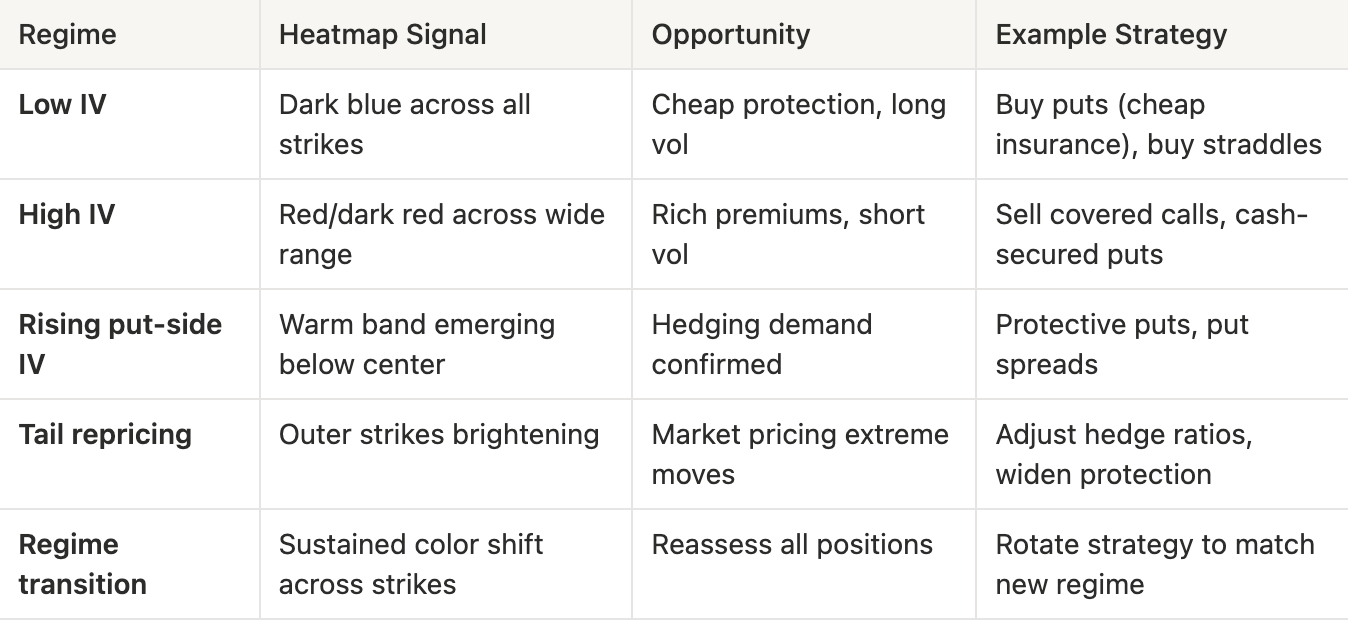
Vol Regime Quick Reference
What to look for:
- Color intensity changes: Shifts in the overall level of expected volatility
- Put/call asymmetry: Directional risk sentiment. Is the market more concerned about downside or upside?
- Term structure divergence: Compare the 1-week heatmap to the 3-month heatmap. If front-end IV spikes while longer-dated IV stays flat, the market sees the stress as temporary
- Width of elevated regions: A narrow red band at specific moneyness levels suggests targeted hedging; broad red indicates widespread uncertainty
Conclusion
The IV Moneyness Heatmap and IV Delta Heatmap bring a temporal dimension to volatility analysis. Rather than asking “what does the vol surface look like now?”, you can now ask “how has it changed, and what regime are we in?”
Whether you are a discretionary trader identifying volatility regimes, or a systematic fund screening for vol regime transitions via our API, these heatmaps provide a structured, visual lens into how the options market prices risk over time.
If you want to learn more about our options data and metric offering, or gain access to these metrics, contact our dedicated team today.
- Follow us on X for timely market updates and analysis
- Join our Telegram channel for regular market insights
- For on-chain metrics, dashboards, and alerts, visit Glassnode Studio
Disclaimer: This report is for informational and educational purposes only. The analysis represents a limited case study with significant constraints and should not be interpreted as investment advice or definitive trading signals. Past performance patterns do not guarantee future results. Always conduct thorough due diligence and consider multiple factors before making investment decisions.