With the historically brutal bear market of 2022-23 as our backdrop, it is natural for investors and analysts to seek evidence for whether a robust and convincing cycle floor is being established. By leveraging the transparency of the Bitcoin blockchain, and with an overlay of market psychology, we can begin to model typical investor behaviors that historically signal when a sustainable market recovery is underway.
In this report, we will explore a suite of ten indicators that provide a useful toolbox for navigating the later stages of Bitcoin bear markets. These metrics have been selected and developed using a variety of both technical and on-chain concepts. The suite has a goal of spotting confluence and consistency across several fundamental market properties and human behavior patterns, drawing upon the following broad concepts:
Technical: Mean reversion with respect to popular technical analysis tools.
On-chain Activity: Positive upticks in on-chain activity and network utilization.
Supply Dynamics: Saturation of the coin supply held by Long-Term Holders.
Profit/Loss: A return of profitable on-chain spending and exhaustion of sellers.
Following the definition of each indicator, the status of the current market as of the time of writing will be summarized using the following terms:
❌ Not Triggered
⏳ In Progress
✅ Fully Confirmed
Note: These indicators and this report is specifically aimed identifying a market recovery after a prolonged bear market. These tools may find application elsewhere, however this is beyond the scope of this analysis report.
🪟 All indicators covered in this report are available in this Dashboard.
Indicator #1 - Finding Floors
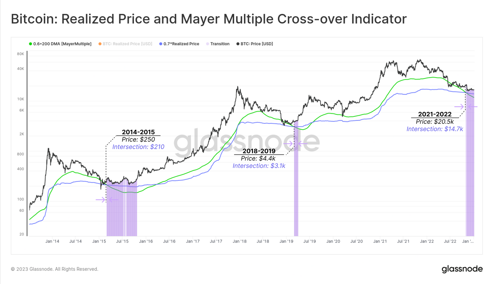
The first tool we introduce is a floor-detection model, based on both the 200D-SMA technical indicator, and the on-chain cost basis in the Realized Price.
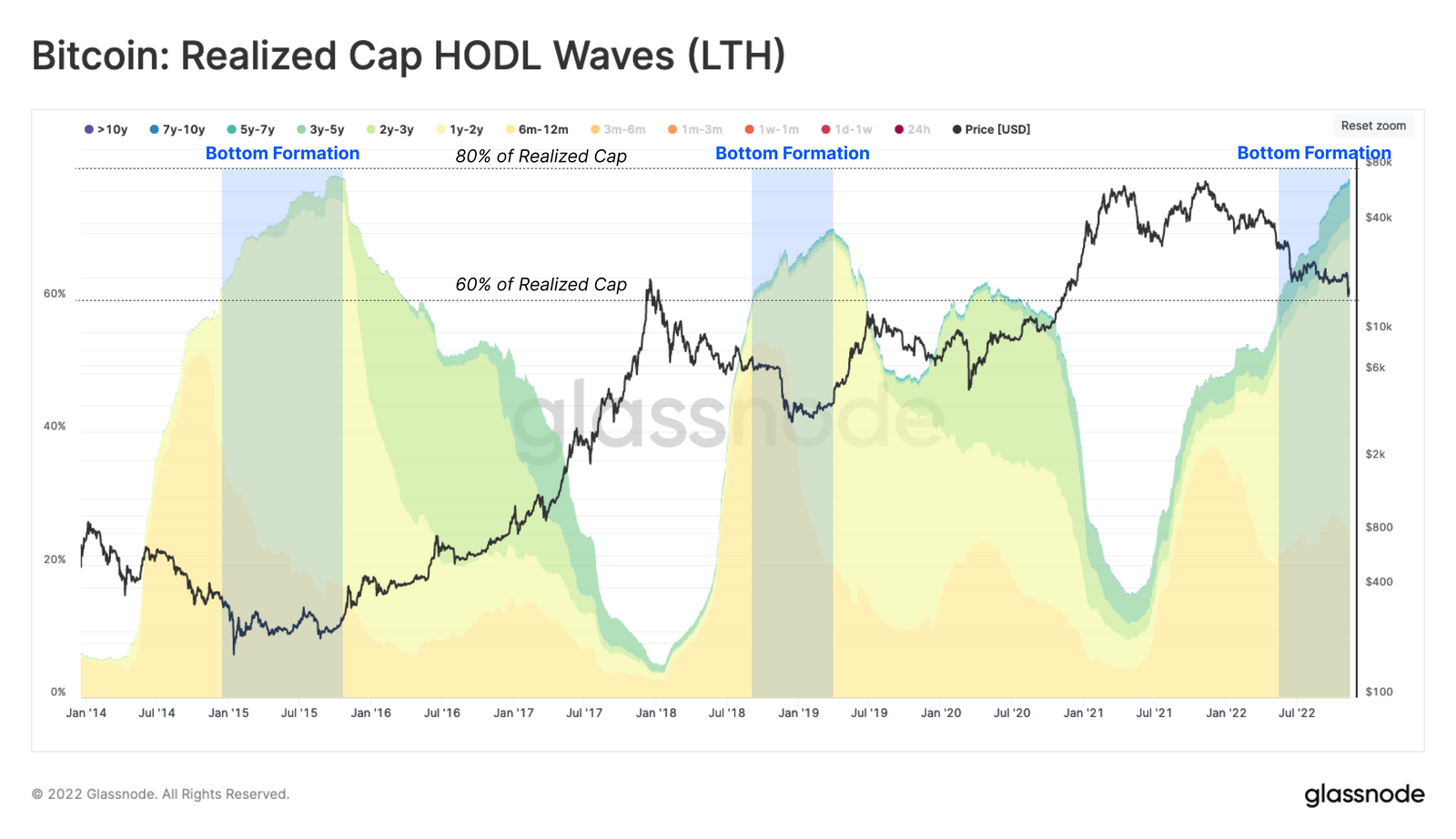
The first observation is that the cohort of investors holding coins for at least 6-months typically HODL between 60% to 80% of the Realized Cap late bear markets. As such, we will select a multiple of 0.7 and apply it as a weighting factor to the Realized Price. This takes a view on a minimum valuation the represents investors with the 'firmest grip'.
There have been fewer than 1.6% of all trading days with spot prices closing below this level.
The second observation pertains to the Mayer Multiple, which tracks the deviation of spot prices relative to the widely observed 200D-SMA. Historical performance for Bitcoin indicates that fewer than 4.3% of Bitcoin trading days have a Mayer Multiple trading below 0.6, which reflects prices at a > 40% discount to the 200D-SMA.
📟 Indicator: Historically, an intersection between the Realized Price * 0.7 🔵 and the 200D-SMA * 0.6 🟢 pricing models occurs during deepest phases of bear markets. This is a result of the on-chain volume weighted Realized Price stabilizing due to investor accumulation, whilst the unweighted 200DMA continues to decline due to the macro price downtrend.
🔎 STATUS: Fully Confirmed ✅
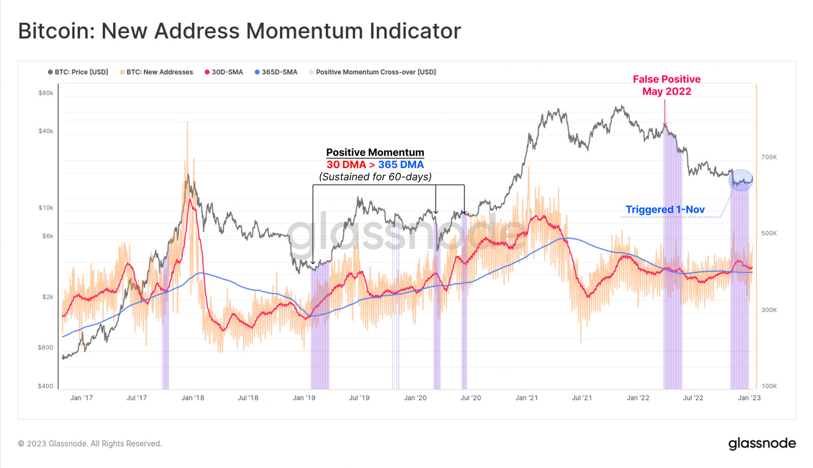
Indicator #2: A Hike in Demand
A sustainable market recovery is usually accompanied by a by growth in network on-chain activity. Here, we consider the number of unique New Addresses that appeared for the first time. We compare the monthly average 🔴 against the yearly average 🔵 to identify relative shifts in momentum, seeking to identifying when the tides are turning for on-chain activity.
📟 Indicator: When the 30D-SMA 🔴 of New Addresses crosses above the 365D-SMA 🔵, and sustains it for at least 60-days 🟪, it signals a constructive uptick in network growth and activity is underway.
🔎 STATUS: In Progress ⏳. An initial burst of positive momentum occurred in early November 2022. However, this has been sustained for only one month so far.
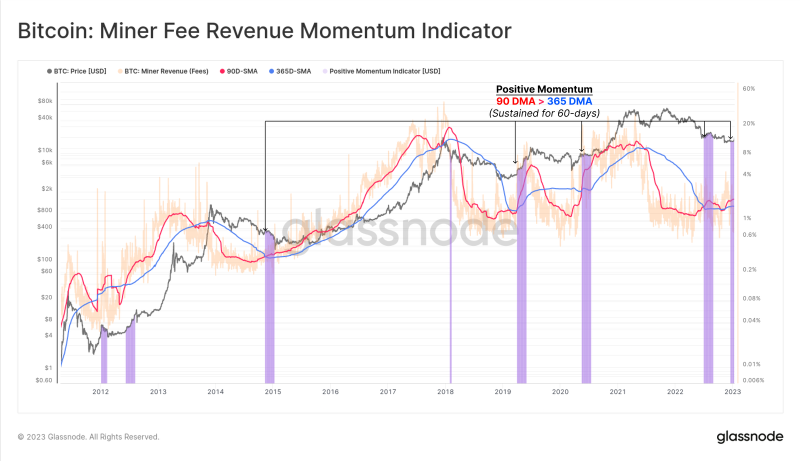
Indicator #3 - A Competitive Fee Market
Another indication of growing network demand is a healthy uptick in Miner Revenue sourced from Fees. This is a result of blocks becoming congested, and fee pressures rising. The following indicator uses a slower but higher conviction momentum indicator, comparing the quarterly average 🔴 for miner fee revenue, against the yearly moving average 🔵.
These momentum indicators are powerful when applied to on-chain activity metrics as they help capture regime shifts in network utilization and demand.
📟 Indicator: When the 90D-SMA 🔴 of Miner Fee Revenue crosses above the 365D-SMA 🔵, it signals a constructive uptick in blockspace congestion and fee pressure is underway.
🔎 STATUS: Fully Confirmed ✅
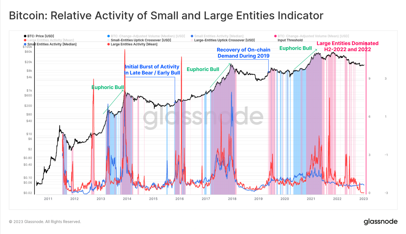
Indicator #4 - Broad Recovery of Activity
In our prior work (WoC 28, 2022), we demonstrated how the frequency of small-size transactions are significantly larger than larger-size transactions. From this, we developed a framework for assessing the relative transaction behavior of both small (shrimps 🔵), and large-size (whales 🔴) entities.
The oscillators below are constructed such that higher values indicate more activity is occurring, and lower values mean less activity by the target cohort.
📟 Indicator: Bear markets tend to lead to a notable decline in on-chain activity by entities of all sizes. Values above 1.2 tend to define a threshold for both initial reccovery, and an elevated level of on-chain demand. Thus, the recovery of both small and large entities back above 1.20 provides a signal that network demand is recovering across the board.
🔎 STATUS: Not Triggered ❌. Both entities remain relatively inactive on-chain, however smaller entities are gradually increasing their activity.
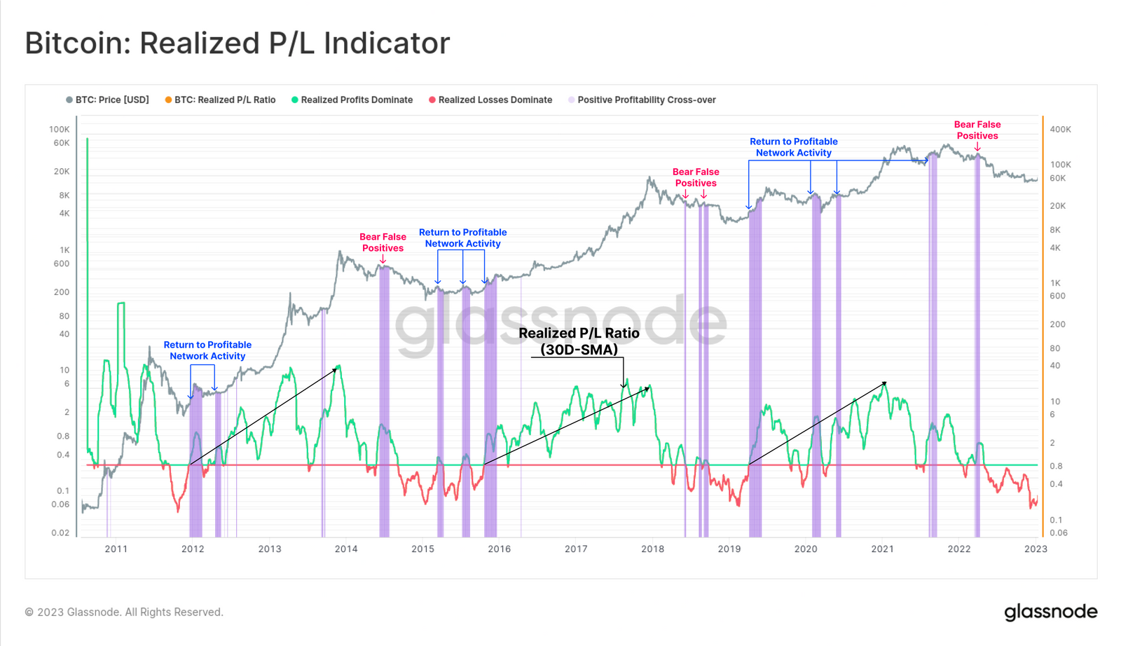
Indicator #5 - A New Wave of Capital
One of the most powerful tools in on-chain analysis is the assessment of Realized Profit and Loss, calculated as the difference in a coins value at disposal, compared to the time of acquisition. The Realized Profit/Loss Ratio provides an oscillator tracking whether the aggregate volume of realized profits exceed the volume of realized losses 🟢, or vice-versa 🔴.
Here, we use a longer-term 30D-SMA of this ratio to both smooth out daily noise, and also to better identify larger scale macro shifts in network profitability. Due to the volatility of markets, false positives do occur, but may be accounted for by considering the larger scale indicator trend.
📟 Indicator: Recovery of the 30D-SMA of the Realized P/L Ratio back above 1.0 it indicates that the macro trend shift is back towards profitable on-chain volume. This suggests that investors holding unrealized losses are becoming exhausted, and a new wave of demand is capable of absorbing the profits taken.
🔎 STATUS: Not Triggered ❌
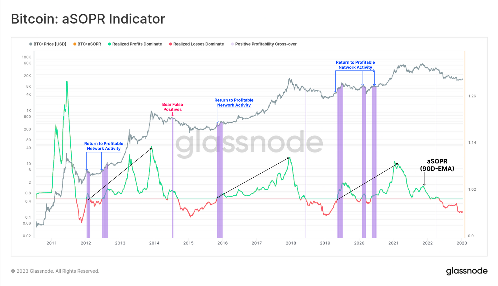
Indicator #6 - Taking the Loss
A similar network profitability model is aSOPR, which monitors the profitability on a per spent output basis. aSOPR is a popular tool for shorter-term market analysis, often being quite responsive to macro changes in market sentiment as it reflects shrimps and whales on equal footing.
Here we have applied a much longer term 90D-EMA to better identify macro trend shifts across a wide cross section of the market.
📟 Indicator: Recovery of the 90D-SMA of the aSOPR back above 1.0 it indicates that the macro trend shift is back towards profitable on-chain spending. This indicates that a wide proportion of market on-chain activity is profitable.
🔎 STATUS: Not Triggered ❌
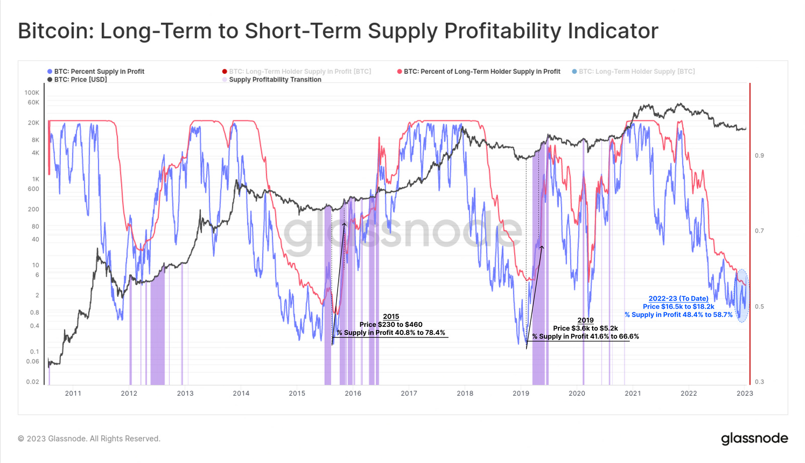
Indicator #7 - A Robust Foundation
In order to establish a robust bear market floor, a large volume of supply generally needs to change hands, at lower prices. This reflects both an expulsion of sellers (capitulation), and an equal and opposite influx of new accumulation demand. The result is a resetting of the average market cost basis to more favourable and lower prices.
An early indication of a macro trend reversal coming off such a foundation tends to be a sharp surge in the Percent of Total Supply in Profit. This usually occurs upon relatively small price increase. Of even more interest is when the aggregate market outperforms the Long-Term Holder cohort, typical only occurring after a major flush out of cycle top buyers has taken place.
📟 Indicator: Due to heavy supply redistribution at bear market lows, the percent of supply held by newer buyers 🔵 tends to be very responsive to price compared to Long-Term Holders 🔴 . Thus, when the percent of supply in profit breaks above that of LTHs, if often signifies a large scale supply redistribution has occurred over recent months.
🔎 STATUS: Fully Confirmed ✅
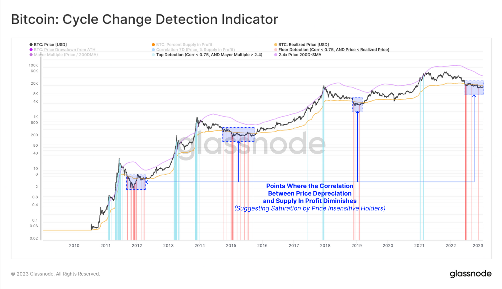
Indicator #8 - Hitting Rock Bottom
In a recent piece, we developed a framework to assess the resilience of investors to price volatility, and how it affected the proportion of supply in profit. This allows us to model points where seller exhaustion may be reached, and where price declines are having a diminishing effect on motivating additional sell-side activity.
📟 Indicator: Periods where the correlation between price, and the percent of supply in profit deviates below 0.75 indicates that a saturation of the holder base, by relatively price insensitive holders, has taken place.
🔎 STATUS: Fully Confirmed ✅
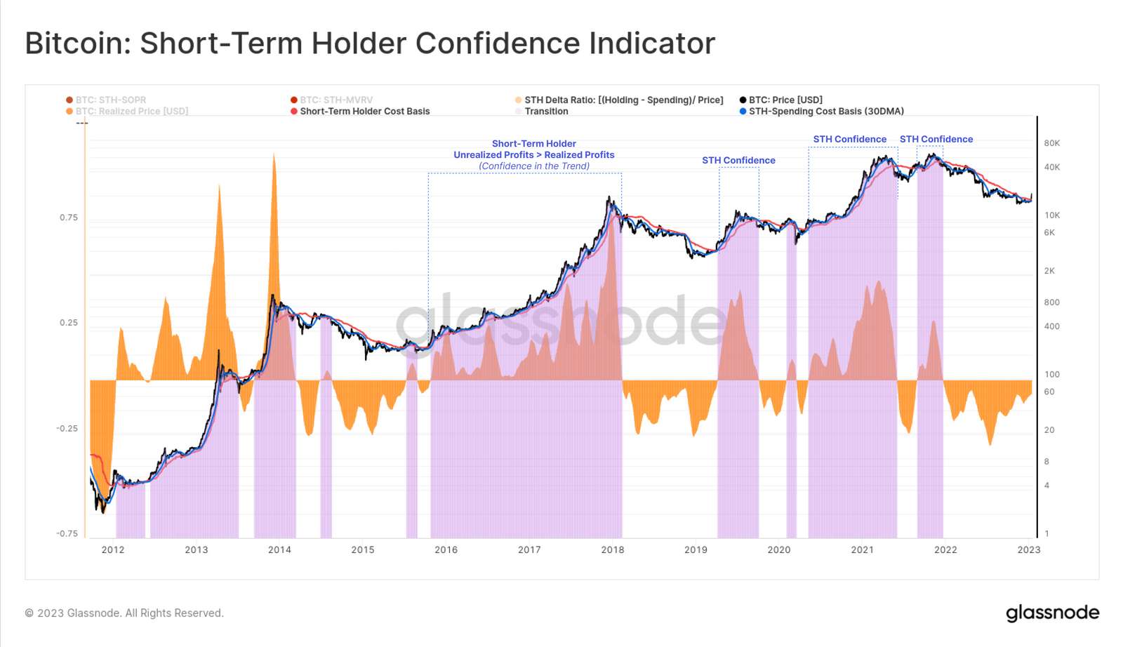
Indicator #9 - Confidence in the Trend
An observation which aides in identifying a reversal of a macro bearish trend, is when the confidence of newer investors is elevated. This is often as expressed via their spending patterns. A practical way to gauge this is by comparing the magnitude of unrealized profit held within newly acquired (and HODLed) coins, to that being realized by spent ccoins.
The metric below takes the difference between the cost basis of short-term holders that are spending 🟢, and those that are holding 🔵. Positive values indicate that a greater degree of profit is held in HODLed coins, than those by investors that are spending.
📟 Indicator: When the spending entities have a higher cost basis than the holding entities 🟪, we can conclude that a majority of new investors are expressing a preference to hold on, and thus have more confidence in a sustained rally.
🔎 STATUS: Not Triggered ❌, however it is approaching a positive breakthrough.
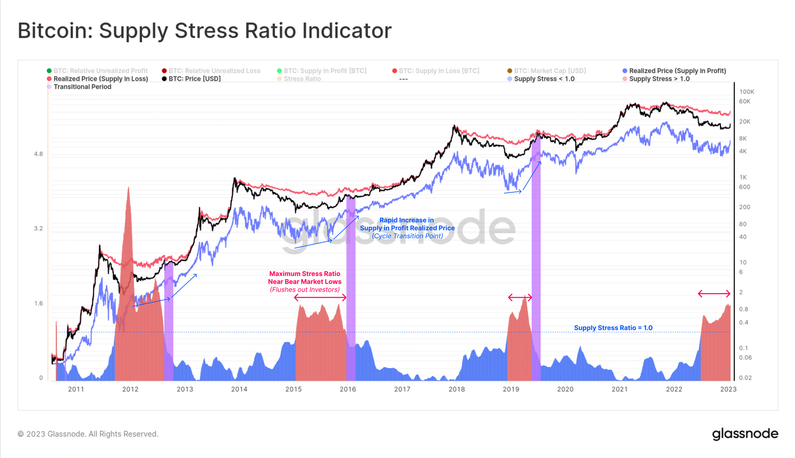
Indicator #10 - Measuring Maximum Stress
The cost basis of a specific cohort of market investors is equal to the aggregated USD value held, divided by the volume of coins owned by that cohort. From this, the following chart demonstrates the cost basis of two supply clusters:
Cost Basis of Supply in Loss 🔴
Cost Basis of Supply in Profit 🔵
After hitting a cycle ATH, the market enters a phase of deteriorating demand, and the net wealth held at an unrealized loss increases. We can measure this financial stress across the market via the Supply Stress Ratio , a methodology we introduced in our prior report.
📟 Indicator: During deep bear market periods, this ratio reaches values well above 1.5, reflecting a level of financial pain that has shaken out investors in the past. These peaks are usually followed by a sharp fall back below 1.0 🟪 which can be interpreted as a reduction in financial stress, and a saturation of investors with a lower cost basis.
🔎 STATUS: In Progress⏳. This ratio is currently within the peak market stress regime that has historically been sufficient to shake out out a majority of investors.
Summary and Conclusions
Identifying cycle changes is no easy feat, and there remains no single silver bullet to accomplish this task. However thanks to the transparency of the Bitcoin blockchain, we can observe cyclical behavior patterns on-chain, and then visualise them as indicators.
In this piece, we describe ten such indicators covering a broad range of fundamental market properties and human behavior patterns. This suite of tools aides in finding periods that align with a sustainable recovery from a bear market. By seeking confluence between many models, we can reduce our reliance on any one metric or concept, and establish a more robust gauge of market sentiment.
A summary table of these ten metrics is provided below as of the time of publication. The Bitcoin market has not yet triggered a majority of these indicators, but we now have a toolbox to monitor as new trends develop.