Mapping Volatility Through Time: Implied Volatility Heatmaps

insights.glassnodePublicado a 2026-03-23Actualizado a 2026-03-23

Resumen

Glassnode introduces two new implied volatility (IV) heatmap metrics—IV Moneyness Heatmap and IV Delta Heatmap—that visualize how options markets price risk across strikes and maturities over time, rather than at a single point. These tools help identify volatility regimes, such as periods of calm, stress, and transitions between them. The heatmaps display IV using color gradients, with red indicating high volatility and blue indicating low volatility. Key patterns include elevated put-side IV during drawdowns (signaling hedging demand), tail-risk repricing in deep out-of-the-money options, and regime shifts that inform trading strategies like hedging in low-vol environments or selling premium in high-vol periods. Available in Glassnode Studio, these metrics provide a dynamic view of market expectations and risk sentiment.

Options markets encode information about how participants expect prices to move. With the release of our interpolated IV metrics earlier this year, users gained access to a clean, structured volatility surface across deltas and maturities.

Now, we are extending that foundation with a new set of metrics that track how implied volatility evolves over time: the IV Moneyness Heatmap and the IV Delta Heatmap.

These metrics allow you to observe how the market prices expected movement across strikes and maturities; not just at a single point in time, but across weeks, months, and years.

Explore the live metrics in Glassnode Studio. Now available to Professional plan users for all major liquid markets, with 10-minute, hourly, and daily resolutions.

Explore heatmaps

From Snapshots to Regimes

A single IV curve gives insight into how the market is pricing risk right now. But since markets are dynamic, a snapshot view misses the broader context: Was volatility rising or falling into this point? Has the skew been shifting gradually or did it change suddenly?

The IV Heatmap captures these dynamics by plotting implied volatility across strikes over time. Instead of a single curve, it provides a continuous map that reveals volatility regimes: extended periods of calm, episodes of stress, and the transitions between them.

This allows us to observe how the market priced the buildup to a major move, how quickly fear dissipated after a drawdown, or whether elevated put demand persisted for days or weeks. Such patterns are hidden in a single snapshot view.

The IV Moneyness Heatmap

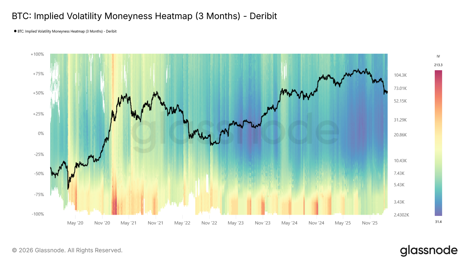
The moneyness heatmap plots implied volatility as a function of distance from spot price (% from spot) over time. Moneyness ranges from -100% to +100%, with puts below the center line (negative moneyness) and calls above it (positive moneyness). The at-the-money level runs horizontally through the middle. Warmer colors (red to dark red) indicate higher IV, while cooler colors (blue to dark blue) indicate lower IV.

IV is sampled at each target maturity and interpolated across moneyness to produce a smooth, continuous surface. The metric is available at four standardized tenors (1 week, 1 month, 3 months, and 6 months) with lookback windows ranging from 1 month to the full available history.
Visit live chart

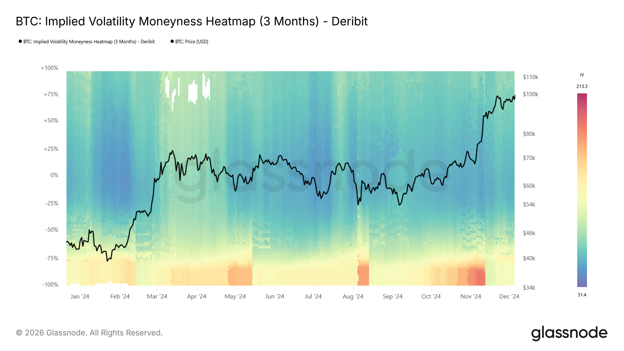
Looking at the BTC moneyness heatmap (3m tenor), volatility regimes are clearly visible: elevated IV in 2021, a return to high volatility in spring 2024 and again around the turn of 2025, followed by a sharp compression into a very low-vol environment (dark blue).

How to read it:

  • Dark blue across both sides indicates a low-volatility regime, where the market expects limited movement.
  • Red bands on the put side (below center) signal elevated demand for downside protection.
  • Asymmetry between the put and call sides reflects directional skew, showing how much more the market is willing to pay for protection versus upside exposure.
  • Vertical color shifts, or abrupt changes in intensity across all moneyness levels, mark regime transitions.

The IV Delta Heatmap

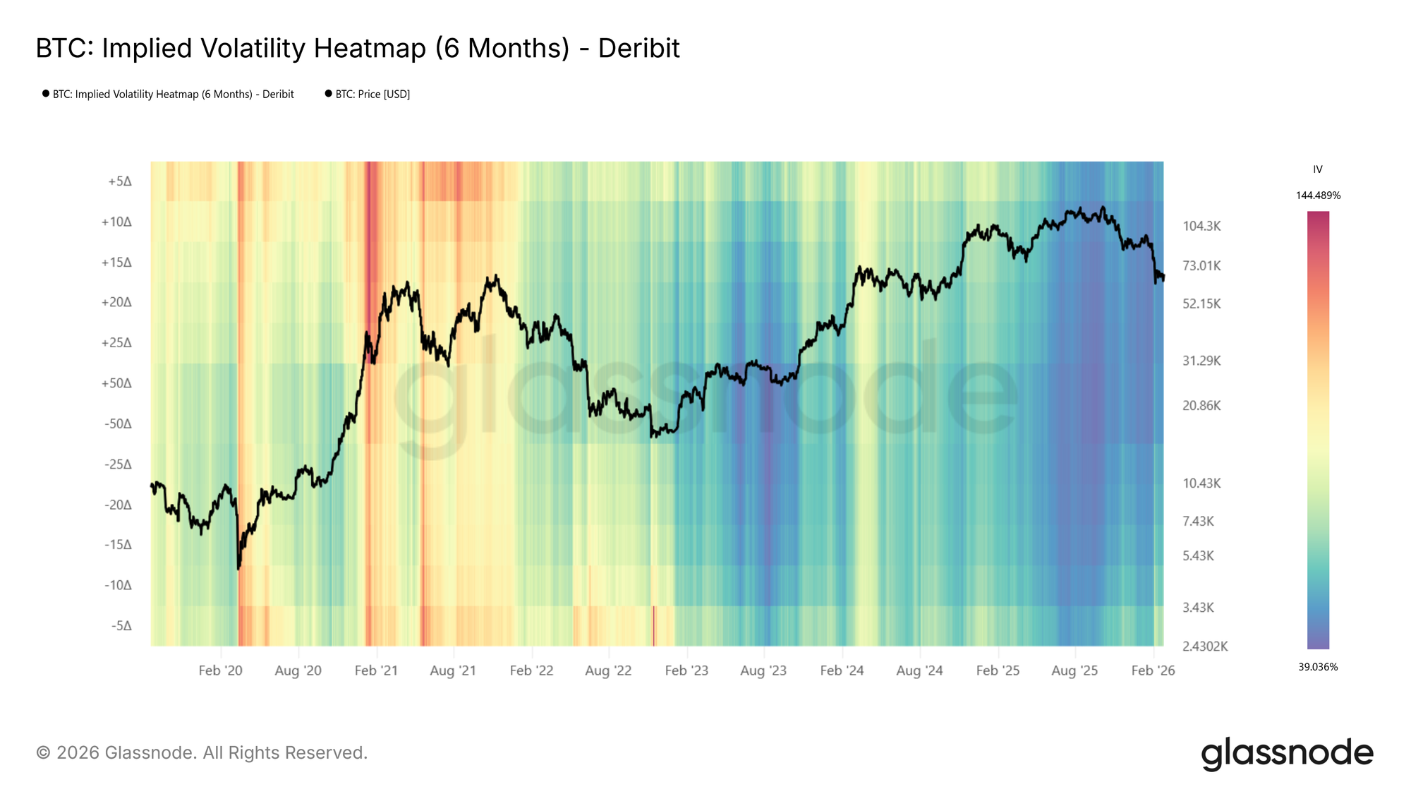
The moneyness heatmap shows IV at fixed distances from spot, a natural and intuitive way to view the surface. The same information can also be expressed in terms of delta, which normalizes each strike by its probability of expiring in the money. The IV Delta Heatmap applies this representation, built on the interpolated IV metrics described in this metric launch article. Deltas range from 5D puts to 50D (at-the-money) to 5D calls, across the same tenors and lookback windows.
Visit live chart

Examining the BTC delta heatmap (6m tenor), one notable feature emerges: during the 2021 bull run, call-side IV (above center, particularly the 5D call region) was significantly elevated compared to put-side IV. The market was pricing in large upside moves, reflecting the euphoric momentum of that period. This call-side dominance is a pattern that tends to appear during strong rallies and is clearly visible in the delta representation.

Reading the Heatmap: Patterns and Implications

Below, we identify some of the primary observable patterns in the heatmaps, describe how they present, and outline their practical relevance.

Elevated Put-Side IV: Risk Hedging in Action
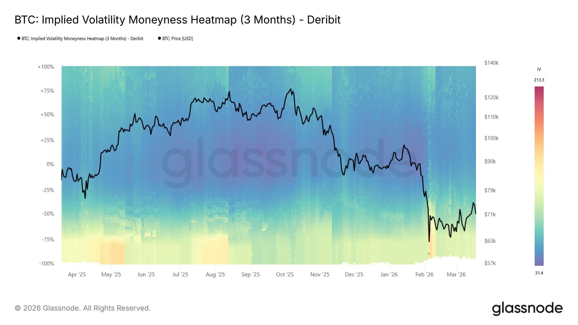
During the recent drop to $60k the put side IVs spiked strongly, shown by the transition to warm colours on the put side as price moved lower in the BTC moneyness heatmap (3m tenor) above.

During sharp drawdowns, risk hedging activity increases. Put demand rises as participants seek downside protection, pushing implied volatility higher on the put side. On the heatmap, this appears as a warm band emerging below the center line where colors were previously neutral, often intensifying to dark red as price falls further.

This is also reflected in rising expected price dispersion. Higher IV across a broader range of strikes signals growing uncertainty about where price will settle.

📈 Trading implications: Elevated put-side IV during drawdowns confirms active hedging demand. If the red band persists, the market is pricing continued risk. If it fades quickly, fear may be receding.

Tail Risk Repricing: When Outer Strikes Light Up

Sometimes the most telling signal is not where IV is already elevated, but where it wasn’t and suddenly is. During calm markets, deep OTM strikes tend to show very low IV because few participants are actively pricing or hedging at those levels. When that changes, and previously dark regions of the heatmap begin to brighten, the market is repricing tail risk.

This is distinct from a general rise in volatility. A broad increase lifts the entire surface. Tail repricing, by contrast, shows up as the warm band widening vertically into moneyness levels that had been ignored. Participants are starting to consider outcomes they had previously deemed too unlikely to hedge against.

📈 Trading implications: Watch the edges of the heatmap. If warm colors begin creeping into deep OTM levels that were previously dark blue, the market is assigning meaningful probability to larger moves. On the put side, this typically accompanies severe stress as participants hedge against outsized drawdowns. On the call side, the same pattern can emerge during euphoric rallies as the market starts pricing in large upside moves.

Low-Volatility Regimes: Cheap Protection, Expensive Later

Extended periods of subdued IV appear as dark blue across the heatmap. These regimes often correspond to consolidation phases, where the market expects limited movement in either direction.

📈 Trading implications: Crucially, low IV means option premiums are compressed. For hedgers, this presents an opportunity: downside protection via puts is relatively cheap, making it an attractive time to insure portfolios. For directional traders, buying options (calls or puts) in a low-vol environment is a pure volatility play: if IV expands, the position benefits regardless of direction.

However, prolonged compression often precedes volatility expansion. Here, it makes sense to watch for the first signs of color shifting from dark blue toward red as an early warning.

High-Volatility Regimes: Income Generation

The inverse holds as well. When the heatmap is dominated by warm colors across a wide range of strikes, option premiums are elevated. This creates opportunities for income-oriented strategies: selling options (covered calls, cash-secured puts) captures rich premiums, and benefits from the eventual mean-reversion of volatility back toward lower levels.

At BTC moneyness heatmap (3m tenor) below, we see an example showing a transition from hot (red) to cool (blue), e.g., the local top in spring 2024 followed by IV compression.
Regime Transitions

The most actionable signals often come at transition points: when the heatmap shifts from blue to red (or vice versa) across multiple moneyness levels simultaneously. Unlike a transient spike that fades within a day or two, a regime transition is a sustained shift in the baseline level of expected volatility.

📈 Trading implications: Regime shifts warrant reassessing position sizing, hedge ratios, and strategy selection. A transition from low to high vol may favor momentum and long-volatility positions, while the reverse may favor mean-reversion and premium-selling strategies.

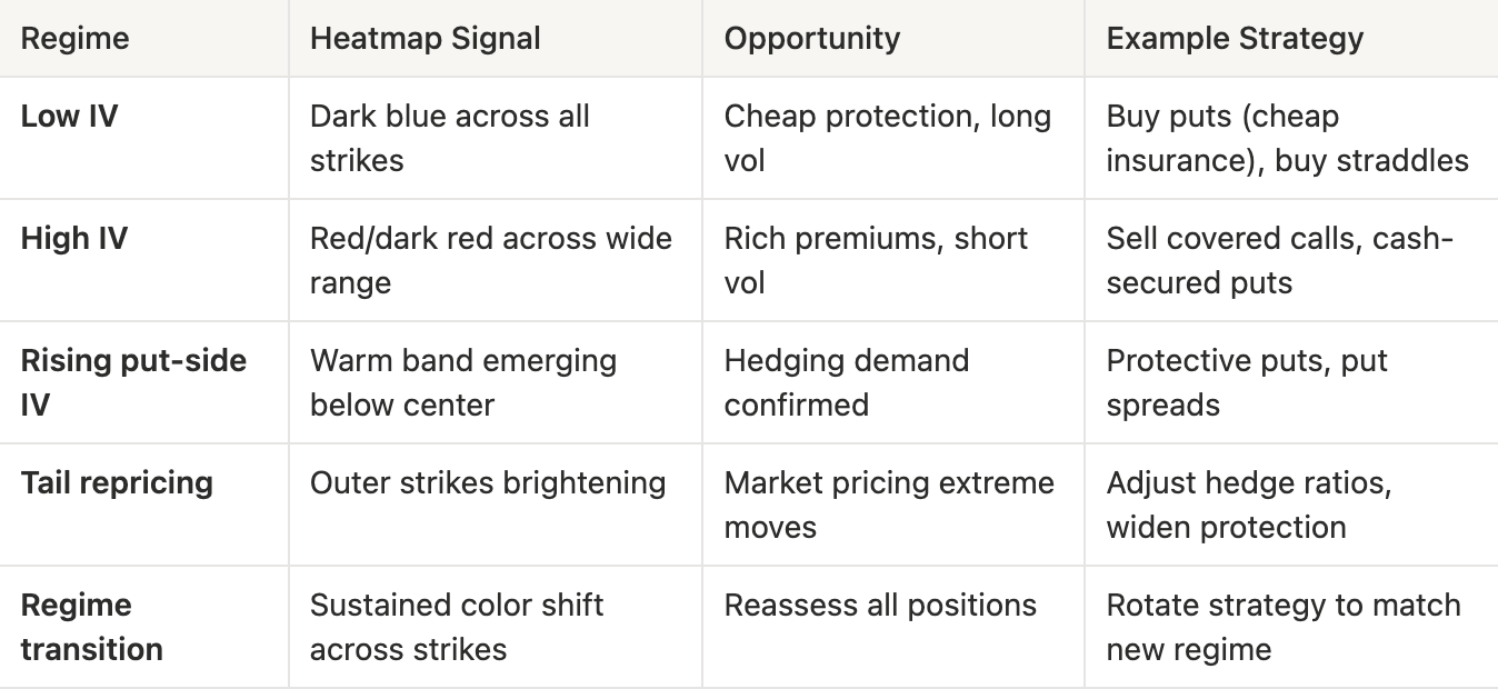
Vol Regime Quick Reference
What to look for:

  • Color intensity changes: Shifts in the overall level of expected volatility
  • Put/call asymmetry: Directional risk sentiment. Is the market more concerned about downside or upside?
  • Term structure divergence: Compare the 1-week heatmap to the 3-month heatmap. If front-end IV spikes while longer-dated IV stays flat, the market sees the stress as temporary
  • Width of elevated regions: A narrow red band at specific moneyness levels suggests targeted hedging; broad red indicates widespread uncertainty

Conclusion

The IV Moneyness Heatmap and IV Delta Heatmap bring a temporal dimension to volatility analysis. Rather than asking “what does the vol surface look like now?”, you can now ask “how has it changed, and what regime are we in?”

Whether you are a discretionary trader identifying volatility regimes, or a systematic fund screening for vol regime transitions via our API, these heatmaps provide a structured, visual lens into how the options market prices risk over time.

If you want to learn more about our options data and metric offering, or gain access to these metrics, contact our dedicated team today.


  • Follow us on X for timely market updates and analysis
  • Join our Telegram channel for regular market insights
  • For on-chain metrics, dashboards, and alerts, visit Glassnode Studio

Disclaimer: This report is for informational and educational purposes only. The analysis represents a limited case study with significant constraints and should not be interpreted as investment advice or definitive trading signals. Past performance patterns do not guarantee future results. Always conduct thorough due diligence and consider multiple factors before making investment decisions.

Preguntas relacionadas

QWhat are the two new metrics introduced in the article for tracking implied volatility over time?

AThe two new metrics are the IV Moneyness Heatmap and the IV Delta Heatmap.

QHow does the IV Moneyness Heatmap visually represent different levels of implied volatility?

AIt uses a color scale where warmer colors like red to dark red indicate higher implied volatility, and cooler colors like blue to dark blue indicate lower implied volatility.

QAccording to the article, what does a persistent red band on the put side of the heatmap typically indicate?

AA persistent red band on the put side indicates elevated demand for downside protection, signaling that the market is pricing in continued risk or fear.

QWhat trading opportunity does a low-volatility regime (dark blue on the heatmap) present for hedgers?

AIn a low-volatility regime, option premiums are compressed, making downside protection via puts relatively cheap. This presents an attractive opportunity for hedgers to insure their portfolios at a lower cost.

QWhat is a key difference between a general rise in IV and the repricing of tail risk as shown on the heatmap?

AA general rise in volatility lifts the entire IV surface uniformly. In contrast, tail risk repricing appears as a warm band widening vertically into deep out-of-the-money strikes that were previously dark blue, indicating the market is starting to assign meaningful probability to larger, previously ignored moves.

Lecturas Relacionadas

STAR 50 Soars 10.73%, Why Did A-Shares Stage a "V-Shaped Reversal"?

After a prolonged decline, the Chinese A-share market staged a strong rally on July 21. The STAR 50 index surged 10.73%, its largest single-day gain in nearly a year, leading a broad-based "V-shaped" reversal. The Shanghai Composite Index rose 1.79%, the Shenzhen Component Index gained 4.81%, and the ChiNext Index jumped 7.05%. Total market turnover reached 2.97 trillion yuan, an increase of 256.1 billion yuan from the previous session, with over 3,100 stocks advancing. The semiconductor sector spearheaded the rebound, with related ETFs posting significant gains. Analysts attribute the surge to three converging factors. First, coordinated capital inflows from "national team" institutions, insurance funds, listed company buybacks, and fund house self-purchases have bolstered market liquidity and confidence. Second, supportive policy signals, including commitments from regulators to ensure stable market operations, provided a favorable backdrop. Third, a stabilization and recovery in overseas markets, notably South Korea, created a positive external environment. Institutions suggest the most severe panic selling phase for the tech sector has likely passed, following a significant digestion of crowded positions and leveraged funds. While short-term volatility may persist, the medium to long-term outlook remains underpinned by enduring trends like AI computing demand expansion and semiconductor localization. The market's focus now shifts to the sustainability of supportive fund flows, earnings reports, and upcoming catalysts from the global AI industry chain.

marsbitHace 27 min(s)

STAR 50 Soars 10.73%, Why Did A-Shares Stage a "V-Shaped Reversal"?

marsbitHace 27 min(s)

U.S. Tech Momentum Stocks Post Largest Single-Day Gain Ever, But Is the Plunge Over?

US tech momentum stocks staged a sharp rebound on Tuesday (July 21st). Morgan Stanley's TMT Momentum Factor surged over 12%, marking its largest single-day gain on record, exceeding even peaks from the 2000 dot-com bubble. Key momentum indices from Goldman Sachs also posted their strongest daily performances in years. The rally was led by semiconductors, with the Philadelphia Semiconductor Index jumping 4.6%. This rebound followed three consecutive down days and a cumulative 33% plunge in momentum stocks, one of the steepest drawdowns since the dot-com era. Analysts attribute the surge largely to a short squeeze. Heavy selling had pushed high-beta momentum stocks into deeply oversold territory, forcing many short sellers, particularly in Asia, to cover their positions, creating a self-reinforcing buying spiral. However, the rebound's internals appear weak. Trading volume was notably low, and advancing stocks still lagged decliners on the S&P 500, indicating a narrow, concentrated rally rather than broad market participation. Diverging views emerge on the outlook. BTIG warns the bounce has hit key resistance and recommends selling into strength, citing extreme volatility and historical parallels to past market tops. Conversely, Goldman Sachs and UBS believe the momentum unwind is nearing its end, suggesting it may be time to gradually add exposure, as positioning has been significantly reduced. They caution, however, that high volatility warrants a measured approach, potentially using defined-risk strategies. The upcoming earnings season, particularly reports from major tech firms like Alphabet, is seen as a critical test for the rally's sustainability. Simultaneously, bond markets flashed a warning, with yields rising partly due to spiking oil prices. Analysts note that if long-term Treasury yields break decisively higher, it could pose a significant headwind for equities, especially growth stocks.

marsbitHace 34 min(s)

U.S. Tech Momentum Stocks Post Largest Single-Day Gain Ever, But Is the Plunge Over?

marsbitHace 34 min(s)

U.S. Tech Momentum Stocks Record Largest Single-Day Gain Ever, but Has the Rout Ended?

U.S. tech momentum stocks staged a dramatic rebound on Tuesday, July 21st. Key momentum indices like the Morgan Stanley TMT Momentum Factor and Goldman Sachs' High Beta Momentum Long Index posted historic or near-historic single-day gains, fueled largely by semiconductor stocks. This sharp rally followed a severe three-day sell-off that saw momentum stocks plunge 33%, marking one of the steepest pullbacks since the dot-com bubble. Analysts attribute the bounce primarily to a short squeeze, as forced covering from over-leveraged traders, particularly in Asia, created a buying spiral. However, the rally's health is questioned due to weak market breadth—overall trading volume was low, and decliners outnumbered advancers in the S&P 500 despite the index's gain—suggesting a narrow, concentrated surge rather than broad recovery. Opinions on the sustainability diverge. BTIG strategists warn the rebound has hit key resistance levels, citing extreme volatility and historic stock dispersion as signs of an ongoing broader correction, and recommend selling into strength. Conversely, Goldman Sachs and UBS view the aggressive momentum unwinding as nearing its end, noting reduced positioning and a lack of new fundamental catalysts. They suggest the sell-off presents a selective opportunity to add exposure, albeit cautiously and gradually using defined-risk strategies. The immediate trajectory hinges on the ongoing earnings season, with market focus on Alphabet's capital expenditure guidance for AI investment clarity. Meanwhile, bond markets present a risk, with rising Treasury yields—potentially heading toward 5.5%—and widening credit spreads for mega-cap tech companies posing a threat to equity valuations. The combination of technical factors, earnings results, and macro conditions leaves the durability of the rebound in doubt.

链捕手Hace 36 min(s)

U.S. Tech Momentum Stocks Record Largest Single-Day Gain Ever, but Has the Rout Ended?

链捕手Hace 36 min(s)

Long-Divided Must Unite, Long-United Must Divide: When L1 Becomes Its Own Rollup, What Is Ethereum's Endgame?

"The Inevitable Cycle: When L1 Becomes Its Own Rollup – What is Ethereum's Endgame?" For years, the Ethereum community grappled with concerns that L2s were fragmenting the ecosystem and eroding L1's value. While L2s provided cheaper execution, they also splintered liquidity and the unified user experience of a single chain. This has prompted a fundamental reassessment of the relationship between L1 and L2. Ethereum's roadmap is evolving. The "Scale" initiative merges L1 and L2 expansion into a holistic framework. L1 itself is advancing with higher gas limits, statelessness, and zkEVM verification, no longer content to be just a low-throughput settlement layer. Consequently, the primary value proposition of L2s is shifting from merely providing cheap blockspace to offering L1 cannot easily provide: application-specific optimizations, privacy features, and flexible governance models. L2s are becoming a spectrum of execution environments with varying degrees of security inheritance from Ethereum. A critical challenge in this multi-chain future is interoperability. The vision is to make Ethereum "feel like one chain again." This relies on advancements in native account abstraction (like EIP-7702) and intent-based architectures (Open Intents Framework), where users declare desired outcomes, and solvers handle the complex cross-chain execution. Furthermore, shortening Ethereum's finality time from minutes to seconds is crucial, as it underpins trust between chains for bridges, stablecoins, and cross-chain applications. Perhaps the most provocative idea is that Ethereum L1 itself could become a form of "its own Rollup." As zkEVM and proof systems mature, high-performance nodes could execute transactions and generate validity proofs. Regular validators would then verify these proofs instead of re-executing all transactions. This blurs the traditional L1/L2 hierarchy, making "Rollup" more of a general execution-verification architecture. Native Rollup aims to integrate L2 validation more directly into the Ethereum protocol, allowing L2s to inherit L1's security more fully and move away from reliance on security councils. In the end, L2s are not destined to replace L1 or be made obsolete by it. The likely future is a unified system where diverse execution environments—each optimized for specific use cases like DeFi, gaming, or privacy—coexist. They will share a common foundation of security, liquidity, and verifiable state, seamlessly connected to restore a cohesive user experience. The next phase for Ethereum is not just about scaling through separation, but about intelligently reintegrating what was separated back into a coherent whole.

链捕手Hace 52 min(s)

Long-Divided Must Unite, Long-United Must Divide: When L1 Becomes Its Own Rollup, What Is Ethereum's Endgame?

链捕手Hace 52 min(s)

Trading

Spot
活动图片